






Free branding for animal welfare NGOs: How to apply to 2bu design

Free branding for animal welfare NGOs: How to apply to 2bu design

Table of Contents

  1. Why we do this at all
  2. What a free branding project with us actually entails
  3. Who can apply
  4. What we expect in return
  5. And what if you aren't chosen?
  6. How the application process works

1. Why we’re doing this in the first place

At 2bu design, we call this ambitious, because standing still is not an option for us: We want to actively make the world a better place through giving and sharing. Behind this lies a second idea that is just as important to us: we prefer to work with Brands that care about more than just profit – works with like-minded organisations that treat people, animals and our planet with respect, and whose messages raise awareness and bring about lasting change.

In practical terms, this means that for this programme, we are looking for Animal welfare organisations, whose work moves us and who could make an even greater impact with a clearer brand identity.

2. What a free branding project with us actually entails

Starting from a shared Briefing meeting that is how it comes about sustainable branding for your organisation. You’ll receive the largest package from us. With the Package L you’ll get a clear Strategy Guideline and a comprehensive Design Guidelines, which you can use to set up and manage all your touchpoints yourselves.

The strategy includes your Brand essence, the Positioning and the Brand Personas. The design guidelines contain the Logo, the Colour scheme and typography, the Visual language as well as our own Pictograms and illustrations. It also contains the Fire Protection System, which uses visualisations to show what your brand looks and feels like.

The specific design of individual touchpoints (–) – that is, ready-made social media templates, a innovative website or various print applications, such as a appealing editorial design – is not included. You’ll gain that all-important foundation on which your organisation can build. If you already have strong branding and a sound strategy, we’d be happy to work with you to assess whether you might benefit from a Social media project is more effective.

3. Who can apply

How to tell if your project is suitable for this programme:

  • Your organisation is involved in Animal welfare, you rehome animals, look after strays, run a sanctuary or manage a wildlife rescue centre.
  • You are mainly funded by government funding or donations rather than through traditional sales.
  • Your location doesn’t matter for now – –, we’re working international, Applications from abroad are expressly welcome.

We want to make a difference. So, the clearer your mission and the greater the impact you could achieve with a stronger brand, the more suited you are to this programme. But please don’t be put off: first come, first served…

4. What we expect in return

A free branding project is, for us, not a one-way street. We believe in Collaboration on an equal footing – applies precisely when no fee is involved. A commitment is not created by an invoice, but by mutual respect; therefore, our fundamental wish is:

  • Getting to know each other openly right from the start – is the foundation for everything that comes after. It’s important to us that you’re just as keen on the project as we are.
  • After that, it’s up to you to decide – Whether you choose to play an active part in the process or leave the rest entirely to us is entirely up to you. Either option is fine by us.
  • Permission to publish –: The project may be featured as a case study on our website, in our magazine and on our social media channels.

As your project is completely free of charge, the following are also Reference modules an integral part of the collaboration. In the case of a standard, paid project, these same components would result in a discount of 40 % (see section 5 for more details):

  • A reference image for free use for us, for example, on our website, on social media or as an advert.
  • A social media post on your channels, in which our joint project is showcased.
  • A blog post on your website about the collaboration and shared on your channels.
  • Our acknowledgement as the author or branding agency iin the legal notice section of your website, with a link to our website

In addition, we’re of course always delighted to receive a positive review on Google or Facebook, or to collaborate on a joint press release. Neither is compulsory, but both are a lovely gesture.

„When we take on a project, it’s not just about the organisation we’re supporting and the animals that will hopefully benefit from it. It’s also about 2bu design –, about the work we’re able to put our heart and soul into, and about the attention that benefits both of us.“

Katrin Tindler-Kempen | Owner of 2bu design

5. What if you aren’t chosen?

I’m sure there’ll still be a trickle of applications even after the two free places We are still accepting applications. Therefore, every application that meets the specified requirements will receive a guaranteed discount of 20 % Here’s to our sustainable branding project –, regardless of how many of the following reference modules you can supply. For each additional module, there will be 10 % discount on top of that, totalling up to 60 % discount:


# Campaign Discount Applies to Repeatable
1Reference with image for free use10 %first projectYes, each time a new project is started
2Social media post on customer channels10 %first or next projectYes, each time a new project is started
3Blog post on the client’s website10 %first or next projectYes, at most once a year, up to a maximum of three times in total
4Crediting the author in the publication10 %respective touchpointYes, once per touchpoint, where appropriate
5Video testimonial for free use10 %next projectNo, one-off
6Review on Google or FacebookUnpaid——
7Press releaseUnpaid——


Our aim is to do something for Animals, People and the Environment to promote – beyond just animal welfare. Does this mean you’re not an animal welfare NGO, but are instead involved in vegan hospitality, environmental protection, coaching or the health sector, or running a sustainable start-up? The same reference modules and discounts from the – table above apply to you too, but without the guaranteed 20-% base rate, which applies specifically to animal welfare NGOs. You can find out more about the entire system in our article on Trust as a business strategy.

6. How the application process works

The first consultation is our standard one Coffee Date so we can get to know each other. You can simply book it via our website on Calendly e.g. here, below the article and please answer the questions about your organisation as fully as you can. The aim is to enable us to prepare for the meeting in advance so that none of us wastes any of our valuable time. Often, this initial conversation alone leads to the Briefing meeting, during which we’ll work together to determine the direction your brand, –, should take and whether both parties can actually meet the conditions set out.

Free, but not for nothing

For us, a free branding project is about more than just a one-off gesture: it’s about making a difference for animals in partnership with an animal welfare organisation – – – whilst also raising our own profile.

  • Twice a year let’s make a donation to an animal welfare organisation complete fire protection system – positioning, visual foundation and visualisations.
  • For us, ‘free’ means: Visibility, an open-minded introduction at the start and the Permission to showcase the project, are among them.
  • It’s up to you to decide whether you want to play an active part in the process afterwards or hand it over to us.
  • All applications that meet the requirements have a chance of 60 % discount – – so it’s almost always worth applying.
  • The application begins with a a real conversation.

Do you think your organisation could really do with this opportunity?

At 2bu design, we develop Brand identities for animal welfare organisations –: from positioning to the visual foundation of your brand. Two places per year are completely free of charge, all other eligible applications will receive 60 % discount.

Book a no-obligation appointment via our website Coffee date on Calendly and tell us about your mission. Together, we’ll work out whether your project is a good fit for this format – – is open and there’s no sales pressure.

Trust as a business strategy: how 2bu design puts its values into practice

Trust as a business strategy: how 2bu design puts its values into practice

Table of Contents

  1. The background: Why referrals deserve more than just a thank you
  2. The thought process: three approaches, three logics
  3. What came of it: The referral programme
  4. The result: support initiatives offering genuine value in return
  5. What has become of it: the NGO support project
  6. What we deliberately do not cover under – and why this is important
  7. What we have learnt from this

The background: Why referrals deserve more than just a thank you

A brand rarely grows through advertising alone. It grows through people who stand for the same cause and help each other to be seen. Anyone interested in Sustainability, Animal welfare Or, when striving for a more conscious economy, one rarely achieves the goal of – on their own, but rather through a network of people and organisations who support one another, recommend one another and stand up for one another. It was precisely this principle that we did not want to leave to chance, but rather to consciously incorporate into the way we work.

When someone opens up their own network to us and takes a risk in doing so – after all, they’re putting their own reputation on the line – then that’s more than just a footnote. It is Work, even if it doesn’t feel like it. And also a Reference It’s work: investing time, having your photograph taken or being filmed, and talking openly about the collaboration. Work that raises our profile or leads to a genuine project should also be remunerated accordingly.

This line of thinking did not result in a single programme, but in three – programmes – because not every form of support is the same, and because we did not want to treat everything in the same way.

The thought process: three approaches, three logics

The more interesting question wasn’t „How do we say thank you?", but „What exactly are we thanking them for?" A direct referral leading to a signed project is quite different from an honest Google review. And an honest review is, in turn, quite different from the generosity of an NGO that dares to apply for a free project, even though the competition is fierce.

So we have developed three logical frameworks:

  • Anyone who sends us a specific project brokers, bears the business risk with – – that deserves a Commission.
  • Anyone who follows us on another way Support, for example through a review or an article, deserves recognition in the form of a Discounts on your own collaboration with us.
  • And because animal welfare is particularly close to our hearts, we One full branding project free of charge twice a year in order to Non-profit organisation from the Animal welfare.

Three programmes, one shared philosophy: anyone who places their trust in us or helps us raise our profile should actually benefit from it – – is more than just a thank-you note.

What came of it: The referral programme

Anyone who introduces us to someone who is looking for exactly what we do, and where this contact leads to a genuine project, will receive 15 % Commission based on the value of the first project. The process is very simple: you make the contact, and the person books with us Coffee date, and you’ll receive your commission once the contract is signed.

So: a recommendation, a project, a commission. What is particularly important to us here is that we do not want to build a system that feels like network marketing. It’s all about genuine recommendations – because we stand for a common cause. And that’s not all. Perhaps your customers would also like to know that you work with brands and people who share the same values.

The result: support initiatives offering genuine value in return

Not every form of support can be converted into a commission. Some gestures are smaller, but just as valuable – –: a picture, a social media post, a blog article, a credit as the creator. To ensure that nobody has to do the maths or haggle over this, there’s a simple rule: Every action counts 10 %.


# Campaign Discount Applies to Repeatable
1Reference with image for free use10 %first projectYes, each time a new project is started
2Social media post on customer channels10 %first or next projectYes, each time a new project is started
3Blog post on the client’s website10 %first or next projectYes, at most once a year, up to a maximum of three times in total
4Crediting the author in the publication10 %respective touchpointYes, once per touchpoint, where appropriate
5Video testimonial for free use10 %next projectNo, one-off
6Review on Google or FacebookUnpaid——
7Press releaseUnpaid——


Ein Blog post It only counts if it’s also shared on social media – – – after all, the link should actually be visible, not just appear on your own website. The Crediting as the author is deliberately kept flexible and can appear wherever it makes sense in terms of content: in the website’s legal notice, on the call-to-action slide of a social media post, in the legal notice of an editorial project, or in the margin of an event roll-up. A Video testimonial This is only possible from the second project onwards. A video like this thrives on genuine support for –, and you can only do that if you’re truly convinced by the collaboration. 

What this might mean in practical terms: First project: A reference with an image (10 %) plus a social media post (10 %) plus a blog article (10 %) plus attribution as the author (10 %) add up to 40 % discount on the first project. Second project: If another project is added, the video testimonial is now also available. A reference with an image, a social media post, a blog article, a mention as the creator and a video testimonial together amount to up to 50 % discount to the new project.

Recommendations and Testimonials should always reflect the actual working relationship. We therefore never ask for a specific star rating or pre-written text (–), but solely for an honest, genuine opinion. Furthermore, we ask all project partners to comply with the respective guidelines of the platforms, particularly regarding the labelling of advertising or consideration.

With all our projects the following applies: Right of reference use. This means that, unless otherwise agreed in writing, we will publish the resulting work – as case studies on our website and across our communication channels. As a token of appreciation We grant our clients the agreed rights of use at no extra cost. For us, this is part of a fair working relationship: good work should be put to use by both sides.

"We wanted a system where nobody feels they have to do or sell anything –, but one that simply recognises what happens anyway out of genuine conviction."
Katrin Tindler-Kempen | Owner of 2bu design

What has become of it: the NGO support project

Some effects cannot be measured in percentages. That is why we twice a year a branding project, completely free of charge for a Non-profit organisation from the Animal welfare to. From among the applications, we will select the non-profit organisation whose cause and impact move us the most. Of course, it also matters whether you get in touch right at the start of the year or after the other places have already been allocated.

What is particularly important to us is that the application process should have been worthwhile even for the non-profit organisations that were not selected. In addition to the same support measures as regular customers, all NGOs that were not selected will receive a guaranteed additional discount of 20 % –, regardless of how many reference modules they can supply. In total, this means that non-selected NGOs can receive up to 60 % discount on her first branding project.

We explain this in more detail, along with exactly how the application process works, in our article on Free branding for animal welfare NGOs. In the end, what matters is not who wins, but that as many principled non-profit organisations as possible can afford a strong brand.

What we deliberately do not cover under – and why this is important

Perhaps the point here isn’t so much about rewarding as much as possible, but about staying true to ourselves. Likes, simple comments or small gestures on social media make us very happy – they’re part of a vibrant community, and that’s exactly what we want. Even a Review on Google or Facebook and a Press release are very welcome here. But we’re not paying for it.

Paid endorsements breach the platforms’ guidelines, and they would go against everything we stand for: honesty without marketing gimmicks. We still value reviews, though – just not in terms of percentages.

What we have learnt from this

Not every form of recognition is the same –, and this is precisely what is often overlooked in the corporate world. A few key insights from this process:

  • WEstimation works best when it suits the gesture in question: –, a Commission for a project secured through our agency, a Discount for an honest review, a a free project for an NGO on a tight budget.
  • Clear, simple rules build more trust than complicated tiered systems.
  • Transparency in reviews is not just a tedious compliance issue, but part of a honest brand ethos.
  • Not all support needs to be remunerated, to feel valued – – sometimes it’s enough just to say so openly.
  • Anyone who takes a relationship seriously also thinks of those who don’t come out on top in the end.

Are you wondering how a brand can be created that not only looks good, but also consistently reflects its values in every detail?

With 2bu design we develop Brandings for companies that operate sustainably, consciously and with integrity – from the Brand strategy up to visual identity, and sometimes even down to the small print of a referral scheme.

Take a look at our services or get in touch with us directly. Together, we’ll work out how to raise your brand’s profile – clearly, authentically and with long-term impact.

innocent transforms a simple, sustainable idea into a love brand

innocent transforms a simple, sustainable idea into a love brand

The story behind the brand

The brand Innocent Drinks was created in London in 1999. Three friends – Richard Reed, Jon Wright and Adam Balon – sold smoothies made from fresh fruit at a music festival. The visitors were asked to decide whether the founders should quit their jobs and start the company.

The vote took place with two rubbish bins:
„Yes“ or „No“.

The „Yes“ bucket was full.
The rest is brand history.

Innocent focussed on three things right from the start:

  • simple ingredients

  • Transparent communication

  • a human brand voice

Today, the company sells millions of smoothies every year and is one of the best-known beverage brands in Europe. At the same time, the original claim remains visible: Produce good products and take responsibility.

Sustainability as part of the corporate strategy

Sustainability is a marketing issue for many brands. At Innocent, it is part of the business strategy.

For example, the brand is part of the movement B Corporation. Companies with this certification undertake to comply with social and ecological standards and to undergo regular audits.

Innocent's key sustainability goals include

  • Climate-neutral production

  • Responsible sourcing of fruit

  • More sustainable packaging

  • Long-term partnerships with farmers

One important project is the new production facility in Rotterdam, the so-called „Blender“. The plant was designed so that it can run entirely on renewable energy.

The aim: to produce drinks without unnecessarily increasing the ecological footprint.

Of course, critical thinking remains important here too. Beverage production, transport and packaging always have an impact on the environment and resources. The question is therefore not: Is a company perfect?
But rather: Is it moving in the right direction?

Social commitment – the Innocent Foundation

In addition to environmental projects, Innocent is heavily involved in the social sector. Part of the company's profits flow into the Innocent Foundation.

This foundation supports projects worldwide that work against hunger and poverty – especially in regions where fruit is grown.

The foundation focuses on programmes that:

  • Improving food security

  • Promoting sustainable agriculture

  • Strengthen local communities

To date, the organisation has invested millions in social projects. An approach that shows: Corporate Social Responsibility can be more than just an image project if it is conceived for the long term.

The role of humour and humanity in branding

Another reason for the success of Innocent Drinks is the unique brand voice.

While many food brands communicate in a sterile or functional way, Innocent focuses on humour. Small texts, puns and friendly comments can be found on the packaging.

These seemingly small details fulfil several functions:

  • they make the brand approachable

  • they increase recognisability

  • they convey values without moralising

One example of this is the famous „Big Knit“ project. People knit small woollen hats for smoothie bottles. For every bottle with a hat sold, the company donates money to aid organisations for older people.

What appears playful at first glance is actually clever community branding.

Why this brand works so well strategically

Innocent's success lies not only in the product. It lies in the clear brand strategy.

The brand combines several elements into a consistent identity:

  • Simple, natural products

  • Transparent communication

  • Humour and personality

  • Social responsibility

The logo with the little halo is a good symbol for this. It does not signalise perfection, but an attitude: We try to do things better.

In keeping with this, the entrepreneur said Richard Reed once:

„If you try to build a business that is good for people and the planet, profit can follow.“

This perspective is also confirmed by research. Studies show that consumers trust brands more when they Clearly communicated values represented.

Why attitude is the strongest brand strategy

The history of Innocent Drinks shows that successful branding is more than just a nice logo or a good campaign.

It's about:

  • Clear values

  • Consistent communication

  • Credible commitment

Sustainability is only convincing if it is part of the corporate strategy – not just part of the marketing department.

This is a great opportunity for sustainable brands. Making attitude visible creates trust. And trust is one of the strongest brand currencies in the long term.

You want to build a brand that not only looks good, but also makes real values visible?

With 2bu design we develop branding strategies for companies that work sustainably, consciously and with attitude. From brand strategy to visual identity.

Take a look at our services or get in touch with us directly.
Together we will find out how your brand can become visible – clear, authentic and effective in the long term.

Oatly: How humour and tone of voice became the strongest brand strategy

Oatly: How humour and tone of voice became the strongest brand strategy

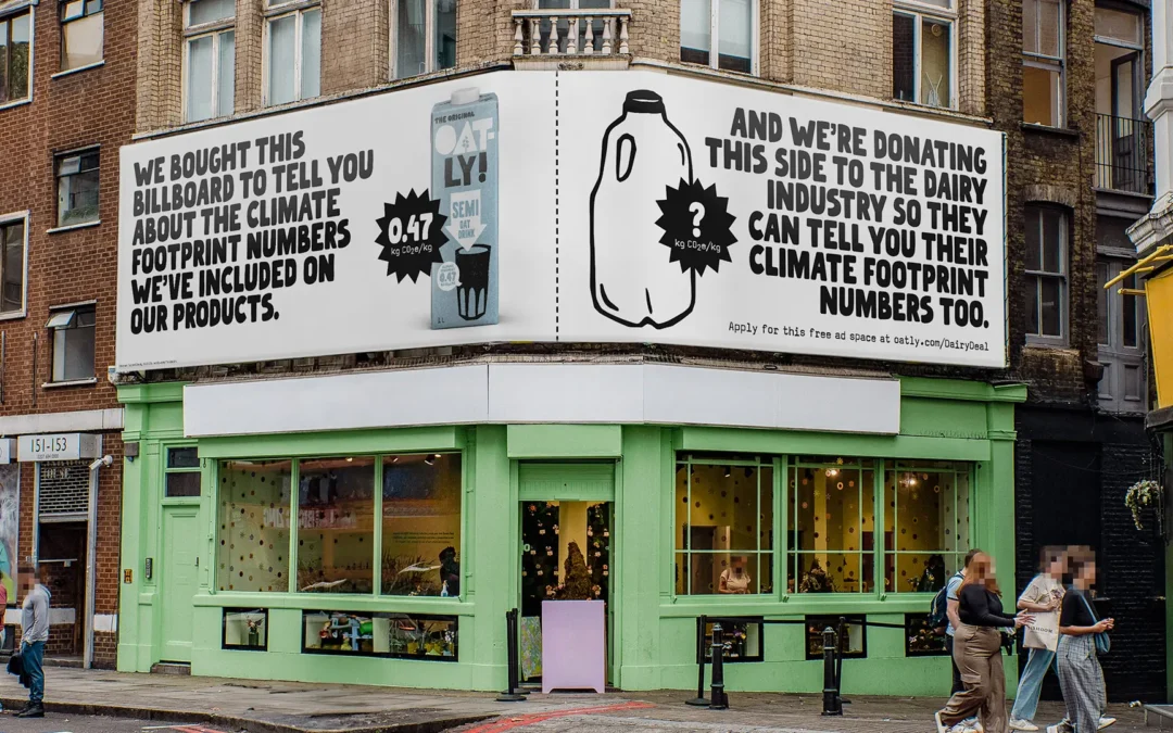
Oatly is not oat milk. Oatly is a statement.

Oatly does not sell a product. Oatly sells an attitude.
And this is not marketing speak, but a strategic decision.

While many food brands rely on Health Claims, and soft-pedalled promises of sustainability, Oatly does something completely different:
The brand speaks. And in the way that brands actually should not speak.

This is particularly evident in social media marketing. Here you can see how Brand Strategy becomes a living language. Humour is not a nice extra, but brand-defining element. Oatly uses language as a tool to reduce distance, generate attention and create cultural relevance.

Or to put it another way: Oatly doesn't want to please. Oatly wants to resonate.

Brand Strategy: The conscious decision in favour of the Challenger role

Every strong brand voice begins with a clear strategic stance. At Oatly, this is: We are the disruptive factor.

The brand strategy is based on a few basic assumptions that are implemented extremely consistently:

  • The market is full of interchangeable messages
  • People have had enough of slick brands
  • Sustainability needs honesty, not a glossy façade

Oatly deliberately positions itself as a Challenger Brand. That means:

  • Do not adapt, but question.
  • Not to explain, but to comment.
  • Don't try to convince, but allow discussion.

This strategy is directly reflected in social media marketing. Oatly does not communicate about the community, but with her. Comments are allowed to contradict. Campaigns can be offensive. Posts can be absurd.

The result: a brand with clear edge, which not everyone likes – but which remains relevant for precisely this reason.

Tone of Voice: Cheeky, self-deprecating, human – and maximally conscious

Oatly's Tone of Voice seems spontaneous. But it is not.
It is highly strategic.

The language follows clear principles:

  • Everyday language instead of marketing language
  • Irony instead of instruction
  • Personality instead of perfection

Oatly writes the way people think. Disorganised. Honest. Sometimes slightly annoyed. Sometimes overly reflective. Often with a humorous twist that breaks expectations.

Important: Humour is never just for entertainment. It is Signal transmitter.
He says: We don't take ourselves more seriously than the cause. 
And that is precisely what makes the brand credible.

In the social media context, this language ensures high Shareability, strong community loyalty and recognisability – even without a logo.

Humour as a brand tool – not as a gag

Many brands „do humour“. Oatly is humorous.
That is a big difference.

Humour at Oatly fulfils several functions at the same time:

  • It lowers the entry barrier to complex topics such as sustainability
  • It makes attitude accessible without appearing moralistic
  • It creates emotional closeness

The humour is often deliberately unwieldy. Texts are long. Statements seem almost too honest. Some messages read like internal thoughts made public by –.

That creates irritation.
And irritation generates attention.

Humour is therefore not an end in itself, but part of the communicative brand architecture. It helps to ensure that Oatly is not only seen, but also remembered.

Social media as an extension of the brand identity

Oatly does not use social media as a sales channel, but as a cultural platform.
Every post follows the same logic as packaging, OOH or website:

  • same language
  • same attitude
  • The same desire to break the rules

This also means:
No trending hashtags without meaning.
No copy-paste CTAs.
No empty sustainability claims.

Instead, content is created that feels like commentary on the zeitgeist. Social media becomes a stage for brand personality – not a discount wall.

This is a key realisation for sustainable brands:
Consistency beats volume.
And attitude beats reach.

„Your brand is what people say about you when you're not in the room.“

Jeff Bezos | US-American entrepreneur and investor

Oatly ensures this in a very targeted way, what – is said through language, tone of voice and the courage to be uncomfortable.

Why Oatly is a blueprint for value-orientated brands

Oatly impressively demonstrates that good social media marketing is not about tools, but about Decisions exists. Decisions in favour of attitude. For language. For personality.

The brand proves it:
Humour can be deep.
Sustainability can be loud.
Branding can be uncomfortable.

There is a clear lesson here for sustainable, animal-friendly and value-orientated companies:
A strong Brand Strategy needs an equally strong Tone of Voice. And this may sound – no, – should sound different from everything else in the feed.

You don't want an interchangeable brand voice, but a language with attitude?

With 2bu design we develop Brand strategy, branding and tone of voice not from trends, but from depth. We work with the Archetypes according to C. G. Jung and translate them into contemporary brand attitudes – as with Oatly, where the Challenger from the mixture of Rebel and hero is created.

Let's find out together how your brand can speak.

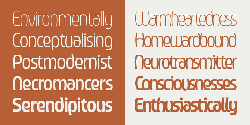
Pilar Font – Art deco typography for strong brand identities

Pilar Font – Art deco typography for strong brand identities

Art deco, but contemporary please

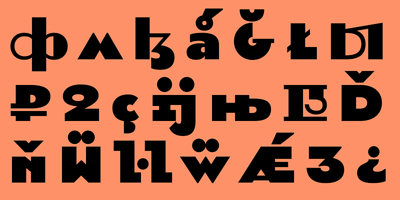
Art deco is one of those things. It's easy to slip into gold frames, Gatsby kitsch and overambitious nostalgia. Pilardoes it differently. The scripture takes the Formal rigour and geometry of European Art Deco, but leaves out everything superfluous.

Pilar was originally created in 2012 for the headlines of the magazine Bol'shoy Gorod (Big City). No coincidence. Editorial environments are mercilessly honest. Either a typeface carries – content or it fails. Pilar has passed and has been further developed.

The result is a geometric grotesque, that appears stable, but not rigid. Clearly constructed, but not cold. Ideal for brands that Attitude, intellect and aesthetics want to connect. Especially in the Branding, in Editorial Designs or on Websites, that want to say more than „we're here too“.

This is exciting for sustainable and value-orientated brands. Pilar doesn't shout. It stands. And that is often the louder statement.

Four stylistic movements – one system, many voices

Now it's getting typographically nerdy. And that's a good thing.

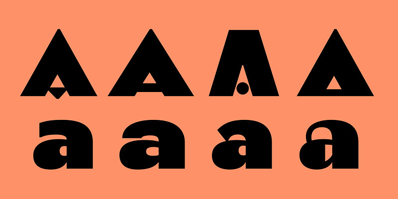
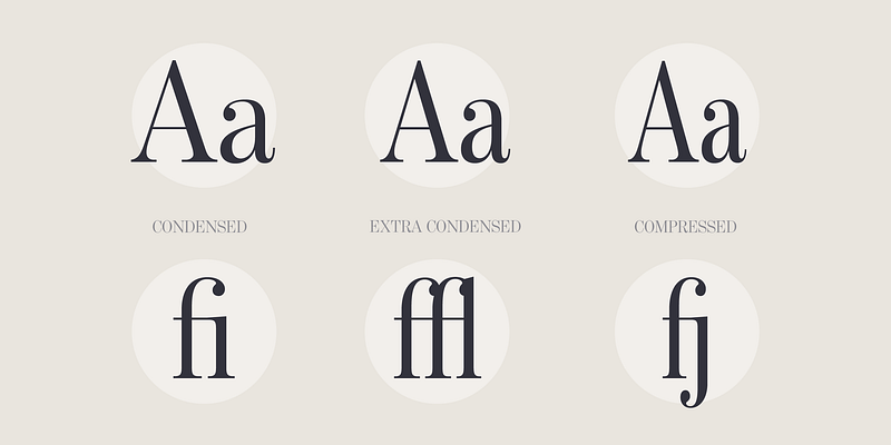
Pilar has four stylistic movements, each with its own alphanumeric glyphs. This means that each letter exists in several variants. These are not gimmicks, but real design options.

The four sets are called:

  • Regularly open

  • Wide closed

  • Narrow

  • Game

The highlight: you can vary within a word or sentence without breaking the visual system. Headlines become dynamic. Logos look customised. Campaigns remain consistent, but not monotonous.

Especially in the Brand design this is worth its weight in gold. A font that adapts without losing its identity saves time, discussions – and ultimately resources. Sustainability sometimes simply starts with good decisions.

For us as a branding agency, this means fewer compromises between aesthetics and function. More room for manoeuvre for real concepts.

Who is behind it?

Behind Pilar stands CSTM Fonts, founded in 2014 by Ilya Ruderman and Yury Ostromentsky. Both do not come from the „we also make fonts“ corner, but from a deep typographic practice.

Both have participated in the Moscow State University of Print studied graphic design. Ilya Ruderman later completed the renowned Master Type & Media at the Royal Academy of Art in The Hague. He has been a tutor, art director and type designer for international foundries and has worked on Neutraface, Graphic and Lava collaborated.

Yury Ostromentsky was for a long time Art Director of BigCity Magazine. Pilar is based on his personal typeface, which was used there. So: real application, real requirements, real feedback.

Her work has received several awards, including Granshan, Modern Cyrillic and the European Design Award. In short: this is not a trend font. This is substance.

Why we love Pilar

Because Pilar shows attitude, without being loud.
Because they Complex brand appearances instead of dominating them.
And because it proves that good typography doesn't need to be explained – it simply works.

For Sustainable, ethical and vegan businesses Pilar is particularly exciting. She comes across as reflective, mature and clear. No gimmickry. No eco-clichés. But design with ambition.

Exactly our thing.

Why we love Pilar

Because Pilar shows attitude, without being loud.
Because they Complex brand appearances instead of dominating them.
And because it proves that good typography doesn't need to be explained – it simply works.

For Sustainable, ethical and vegan businesses Pilar is particularly exciting. She comes across as reflective, mature and clear. No gimmickry. No eco-clichés. But design with ambition.

Exactly our thing.

Want to know if Pilar fits your brand?

Or are you looking for a font that Brand strategy, your Corporate Design and your Communication really wears?

Then let's talk about it. We don't think of typography in isolation, but as part of a meaningful overall system. For brands with attitude. And backbone.

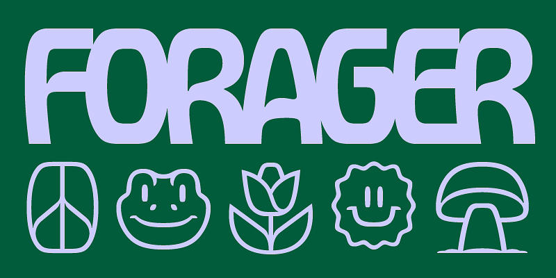
Forager Font - Expressive display font for bold branding with attitude

Forager Font - Expressive display font for bold branding with attitude

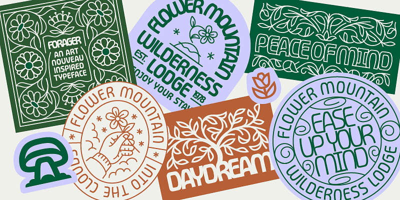
Forager: When typography starts to breathe

Forager is one of those typefaces where you immediately realise that nobody wanted to design „just another sans serif“.
This was about attitude. About rhythm. About visual friction.

The font unites three very different worlds:

  • the psychedelic opulence of the 70s,

  • the organic lines of Art Nouveau,

  • and the Reduction of modern grotesque fonts (sans serif fonts without small closing strokes).

That sounds like chaos. But it's not.
Forager balances these influences with surprising precision.

Overlapping as a design principle

The centrepiece of Forager is its Overlap. Letters share space, intersect, interlock. Normally a nightmare for legibility. Not here.

The trick lies in the design:
curved verticals meet Flat horizontal lines. This creates a rounded, slightly angular design language that makes overlapping clearly recognisable. The eye can separate the letters even though they are touching. Typographically clever. Almost cheeky.

The font family includes Five line widths, each in:

  • overlapping variants for maximum effect

  • and closely running versions for more controlled layouts

This makes Forager amazingly versatile – from bold branding and editorial headlines to experimental social media visuals.

Who is behind it?

Forager was designed by Jacob Cummings, published via Overlap Type – is still a young, but all the more exciting typo label under the direction of Kel Troughton.

Overlap Type started in 2023 with a radical rule: Only fonts with overlapping letterforms.

What began as a self-imposed restriction quickly became a creative playing field. Today, Overlap Type goes beyond pure overlap, but remains true to its mission: question conventional rules in font design.

And that's exactly what you can feel in Forager.
This writing does not aim to please. It wants to work.

Why we love Forager

Forager is the perfect fit for brands that don't want to be slick. For sustainable businesses, cultural projects, vegan labels or magazines with high standards.

She says:
We think differently.
We dare to do something.
And we mean it.

Typography is communication. But according to –, Forager does not speak arbitrarily.

Additional licence options –, for example for apps or enterprise use –, can be found on www.overlaptype.com.

You want to know if Forager fits your brand?

Or are you looking for a font that Brand strategy, your Corporate Design and your Communication really wears?

Then let's talk about it. We don't think of typography in isolation, but as part of a meaningful overall system. For brands with attitude. And backbone.

Call-to-actions in social media - how sustainable brands get people to take action

Call-to-actions in social media - how sustainable brands get people to take action

Why call-to-actions are more than marketing

Social media is not a monologue. It is a dialogue with interruptions, distractions and very short attention spans.
A CTA sets a point here. Or rather: an arrow pointing forwards.

A good Call-to-action does not say „buy now“, but:
„If you're interested, here it goes.“

Sustainable brands in particular are often hesitant. Too loud? Too promotional? Too pushy?
But the opposite is the case: no CTA often seems arbitrary and unclear.

CTAs help:

  • Provide orientation

  • Start conversations

  • Build reach organically

  • Deepening relationships

Or to put it more simply: if you share something, you can also say it, Why.

Why many CTAs do not work

Most bad CTAs are not meant to be bad. They are simply imprecise.

Typical stumbling blocks:

  • Very general requests without benefit

  • several CTAs in one post (overload sends its regards)

  • always the same CTA, no matter what it's about

  • CTAs that only benefit the company

A CTA only works if it matches the content of the post.
A knowledge post needs something different than a personal insight or an offer post.

Sustainable communication does not mean sacrificing clarity.
On the contrary.

These types of call-to-actions work particularly well

CTAs have different tasks. Those who understand this automatically write better ones.

Interaction CTAs

They invite opinion. Not for approval.

Examples:

  • „What do you think?“

  • „Which point is relevant for you right now?“

  • „How do you deal with it?“

These CTAs are quiet but effective. They create proximity and movement.

Value-added and educational CTAs

Ideal for explanatory content, guides or posture topics.

Examples:

  • „Save this post for later“

  • „Swipe for the summary“

  • „Read on if you want to understand sustainable marketing more deeply“

The CTA reinforces the benefit of the content here.

Relationship CTAs

They say: You are welcome here.

Examples:

  • „Follow us for honest marketing with attitude“

  • „Write us a DM if you are interested in the topic“

  • „If you find yourself here, feel free to stay“

These CTAs are essential for small, value-based brands in particular.

Offer CTAs

Yes, selling is allowed. Transparency makes the difference.

Examples:

  • „You can find out more about how we work here“

  • „How we support sustainable brands in branding“

  • „See if a collaboration is right for you“

No pressure. A clear invitation.

How CTAs don't sound like marketing

The tone decides.
Good CTAs feel like the logical last sentence of a post.

Helpful guidelines:

  • one CTA per post

  • actively, but calmly formulated

  • concrete instead of vague

  • honest instead of clever

A simple reality check:
Would you say this sentence in a real conversation?
If not, your community will also notice.

A fitting thought from Simon Sinek:

„People don't buy what you do; they buy why you do it.“

Simon Sinek

A CTA without an attitude falls flat. One with attitude works – even without an exclamation mark.

CTAs as part of your brand voice

Call-to-actions are not an appendage. They are part of your Brand Voice.
They should convey the same values as your design, your language and your offers.

For sustainable brands, this means

  • Less pressure, more invitation

  • Less tactics, more clarity

  • less volume, more substance

With 2bu design we always think about CTAs strategically. Not in isolation, but embedded in branding, content strategy and long-term visibility. Because a single post rarely works. A coherent system does.

Strong call-to-actions are not marketing tricks

They are a service. They help your community to understand:

  • Why your content is relevant

  • what you can do with it

  • how they connect with you

Sustainable brands in particular can learn, clearly visible to be – without losing their values.

CTAs are not a contradiction to mindfulness.
They are structure in a noisy world.

Do you want CTAs that fit your brand and don't feel like marketing?

If you like, we can take the next step:

  • concrete Instagram CTAs for your content formats develop

  • one 2bu-typical CTA library Build

  • or Integrate CTAs directly into existing posts and sharpen

Let's look together at how Sustainable branding and social media interact meaningfully for your business.

    Understanding website hosting: Which solution suits you and your budget

    Understanding website hosting: Which solution suits you and your budget

    1. large hosting providers: convenient, cheap – but not always smart

    Large hosting providers such as Strato, IONOS, All-Inkl or Hetzner are the first point of contact with websites for many people. Getting started is easy, the Prices from 5–10 € seem attractive and the promises are big: lots of memory, high availability, 24/7 support. This can be perfectly adequate for small projects or landing pages. It usually only becomes problematic when websites grow or become more customised.

    The biggest advantage lies in the Standardisation. These providers operate huge server structures on which thousands of websites run in parallel. This reduces costs – but also flexibility. Updates, server configurations or PHP versions are often predefined. For WordPress sites with Divi, WooCommerce or customised plugins, this can quickly lead to Performance losses or incompatibilities lead.

    Another point: Not all support is the same. There are hotlines, but rarely a fixed contact person. The people at the other end don't know your website and you don't understand the language. If something is broken, you usually have to hire a developer. Monitoring, security checks or SEO-relevant performance optimisation are not included in the scope of services.

    Advantages of large providers

    • Favourable entry
    • Simple set-up
    • Good basis for small, static websites

    Disadvantages

    • You have to buy your URL yourself
    • Emails are not set up for you
    • Shared server → fluctuating performance
    • No view of your specific website
    • Maintenance, updates and security remain with you

    2. developer hosting: when technology becomes part of the strategy

    When hosting via a Developer or an agency your website is not just „somewhere“, but deliberately in a supervised environment for 10–25 €. The server is customised to your system: WordPress version, Divi theme, plugins, PHP settings and caching all mesh together perfectly. This has a direct effect on Loading time, stability and SEO from.

    The decisive difference: Your developer knows your website. He or she knows which plugins are critical, which updates should be tested and where potential vulnerabilities lie. Instead of only reacting when something breaks, the system is regularly checked, updated and optimised. This reduces downtime, security vulnerabilities and stress.

    This is a real advantage, especially for entrepreneurs who are not particularly tech-savvy or brands with sensitive content, e.g. from coaches and therapists. Your website is not only online – it is supervised & safe. And usually for surprisingly little money, because many developers use shared servers or optimised setups.

    Typical services for developer hosting

    • URL is purchased in your name
    • Emails are set up for you
    • Regular updates (core, theme, plugins)
    • Safety monitoring
    • Performance checks
    • Backups & recovery
    • Technical contact who knows your setup

    3. monthly website maintenance: small hours, big impact

    Many developers also offer Maintenance or care packages on. They usually contain 1–2 hours per month for simple work included. Sounds small, but is strategically extremely valuable. Because this time can be used flexibly: small text adjustments, image changes or SEO fine-tuning. The Costs for this are €25 upwards. 

    The great advantage lies in the Plannability for both sides. You don't have to request, explain and wait for a new quote every time. Your developer has reserved time for you – and can react if something comes up at short notice. This is worth its weight in gold, especially for the self-employed and NGOs, where campaigns often arise spontaneously.

    In addition, the inhibition threshold for optimising things decreases. Instead of „It's not worth it now“, a continuous improvement process is created. And this is precisely what is crucial from an SEO and brand perspective.

    What monthly care makes possible

    • Immediate reactions without extra costs
    • New projects implemented more quickly
    • Continuous optimisation instead of individual actions
    • Less technical legacy
    • better performance & visibility

    Well-established team vs. constantly new contact persons

    A point that is often underestimated: Changing teams cost money. Every new team has to familiarise itself, understand the website and understand old decisions. This is not efficient – neither economical nor sustainable.

    2budesign therefore works with a well-rehearsed team. Decisions are made more quickly, problems are recognised earlier and solutions are implemented more appropriately. This not only saves time, but also budget. There are also fewer misunderstandings because there is context – something that cannot be written into ticket systems.

    For value-orientated companies in particular, this Long-term and trusting cooperation makes sense. That is why we are focussing on solutions 2 and 3 with our developers. Continuity and responsibility are not just buzzwords, but real success factors. Of course, we can also cater to the specific needs of your system on request.

    Why a fixed setup makes sense

    • Less coordination effort
    • Lower familiarisation costs
    • Consistent technical decisions
    • Long-term quality instead of short-term patchwork solutions

    Hosting is not a minor matter

    Hosting determines whether your website just exists – or works. Large providers are convenient, but rarely strategic. Developer hosting with a maintenance package creates stability, saves costs in the long term and takes the pressure off you mentally. Especially when branding, content and technology need to work together.

    You don't want to deal with servers, updates and technical details?

    We from 2bu design work closely with experienced developers and take a holistic approach to hosting, design and maintenance. Whether Divi website, WooCommerce shop or sustainable campaign pageWe make sure that technology works quietly in the background – and that your values are visible.

    Let's build a setup together that Stable, sustainable and future-proof is.

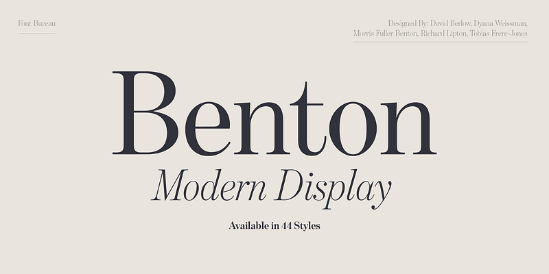
    Benton Modern - classic serif font for editorial design with attitude

    Benton Modern - classic serif font for editorial design with attitude

    A newspaper and that's exactly why it's so good

    Benton Modern was not designed to shine on Dribbble. It was built to be read. Day by day. Column by column.

    Font Bureau originally developed Benton Modern as a text font for the Boston Globe and the Detroit Free Press. Newspapers are mercilessly honest when it comes to typography. If a font doesn't work, you notice it immediately. Poor reading flow? Annoying shapes? Fatigue after a few paragraphs? Not a chance.

    The design basis is formed by Century Expanded, designed around 1900 by Morris Fuller Benton for ATF. A typeface from a time when typography was still a real craft. Proportions with meaning. Serifs with function. A calm grey tone that carries content instead of drowning it out.

    Benton Modern is a very respectful new edition of this idea. Historical at its core, technically realised in a contemporary way. It appears stable, clear and surprisingly modern – precisely because it is not orientated towards short-lived trends.

    For Editorial Design, Magazines, Blogs or extensive text sections, this is a gift. And also in the Brandingit plays to its strengths: It conveys credibility, seriousness and depth. Characteristics that sustainable and ethical brands urgently need.

    Quiet details instead of loud effects

    What makes Benton Modern special happens quietly. The font doesn't want to stand out. It wants to work.

    The Italics based on Century Schoolbook. Many people know it from school books. That's exactly why she feels so familiar. She comes across as human, approachable and honest. No academic arrogance. No typographical posturing.

    The family is completed by Display cuts, designed by Dyana Weissman and Richard Lipton. They bring a little more presence into play, but remain true to the basic approach. Ideal for headlines, quotes or editorial lead-ins. Clear. Calm. Confident.

    This restraint is a particular advantage for brands that want to communicate consciously. Benton Modern does not come between the sender and the message. It lets the content take effect.

    In practice, this means: fewer typographical corrections, less visual readjustment, more focus on the essentials. Sustainable in the best sense of the word.

    Who is behind it?

    The display sections of Benton Modern were created by Dyana Weissman and Richard Lipton developed. Both stand for functional, precise type design with attitude.

    Today the font is used by Monotype Studio is in charge. An international team with over 50 employees that supports brands worldwide in developing an independent visual voice. Since 2025 Fontworks Inc. to Monotype –, a merger that shows how strategically relevant typography has become.

    Why we love Benton Modern

    We love Benton Modern because it takes content seriously. Because it is not loud. And because it creates trust.

    For value-orientated branding, Editorial Design and well thought out Brand communication it is an excellent choice. It suits companies that think long-term. For brands that don't need to shout. And for everyone who knows that good typography is often at its best when you hardly notice it.

    Additional licence options –, for example for apps or enterprise use –, can be found on www.monotype.com/de.

    You want to know if Benton Modern fits your brand?

    Or are you looking for a font that Brand strategy, your Corporate Design and your Communication really wears?

    Then let's talk about it. We don't think of typography in isolation, but as part of a meaningful overall system. For brands with attitude. And backbone.