









A newspaper and that's exactly why it's so good
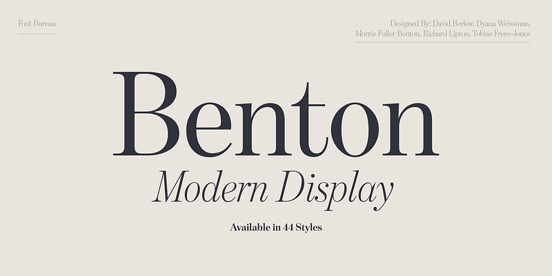
Benton Modern was not designed to shine on Dribbble. It was built to be read. Day by day. Column by column.
Font Bureau originally developed Benton Modern as a body typeface for the Boston Globe and the Detroit Free Press. Newspapers are brutally honest when it comes to typography. If a typeface doesn’t work, you notice it straight away. Poor readability? Annoying letterforms? Eye strain after just a few paragraphs? No chance.
The design is based on Century Expanded, designed around 1900 by Morris Fuller Benton for ATF. A typeface from a time when typography was still a true craft. Proportions with purpose. Serifs with a purpose. A subtle grey tone that carries the content rather than drowning it out.
Benton Modern is a very respectful new edition of this idea. Historical at its core, technically realised in a contemporary way. It appears stable, clear and surprisingly modern – precisely because it is not orientated towards short-lived trends.
For editorial design, magazines, blogs or extensive pieces of writing, this is a real asset. And it also comes into its own in branding: it conveys credibility, professionalism and depth. These are qualities that sustainable and ethical brands urgently need.
Quiet details instead of loud effects
What makes Benton Modern special happens quietly. The font doesn't want to stand out. It wants to work.
The Italic is based on Century Schoolbook. Many people recognise it from school textbooks. That is precisely why it feels so familiar. It comes across as human, approachable and honest. No academic arrogance. No typographical pretentiousness.
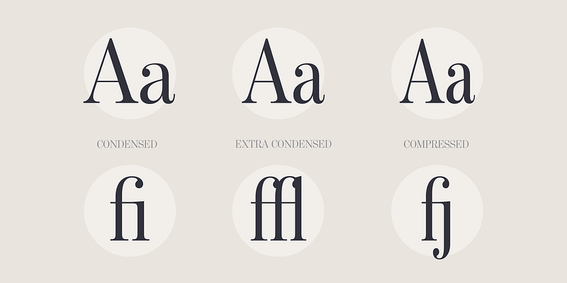
The family is complemented by Display styles, designed by Dyana Weissman and Richard Lipton. They add a little more presence to the design, whilst remaining true to the family’s core character. Ideal for headlines, quotations or editorial lead-ins. Clear. Calm. Confident.
This restraint is a particular advantage for brands that want to communicate consciously. Benton Modern does not come between the sender and the message. It lets the content take effect.
In practice, this means: fewer typographical corrections, less visual readjustment, more focus on the essentials. Sustainable in the best sense of the word.
Who is behind it?
The Benton Modern display styles were developed by Dyana Weissman and Richard Lipton. Both are known for their functional, precise type design with character.
Today, the typeface is managed by Monotype Studio. An international team of over 50 staff members that supports brands worldwide in developing a distinctive visual voice. Since 2025, Fontworks Inc. has also been part of Monotype – a merger that demonstrates just how strategically important typography has become.

Why we love Benton Modern
We love Benton Modern because it takes content seriously. Because it is not loud. And because it creates trust.
She is an excellent choice for values-driven branding, editorial design and well-thought-out brand communication. She is a good fit for companies that think long-term. For brands that don’t need to shout. And for anyone who knows that good typography is often at its best precisely when you hardly notice it.
Additional licence options – such as those for apps or enterprise use – can be found at www.monotype.com/de.
Would you like to know whether Benton Modern is a good fit for your brand?
Or are you looking for a typeface that truly supports your brand strategy, your corporate design and your communication?
Then let's talk about it. We don't think of typography in isolation, but as part of a meaningful overall system. For brands with attitude. And backbone.




 German
 English