by Katrin Tindler-Kempen | 28 Oct 2021
Basics Logos, typography, visual language, graphic elements Stationery Business cards, letterheads, stamps, envelopes, waiter’s notepad, map Environment Interior design consultancy Product Wine label, mulled wine glass, food and drinks menus for Rolands, the Rheinromantik Terrace and Freiligrath’s Schatzkammer Campaigns Advertisements, posters, roll-ups Messaging Brochure, stamp book Events Appearance at the “I love Bonner Bogen” festival Guidelines CD manual
Brand Strategy with vision
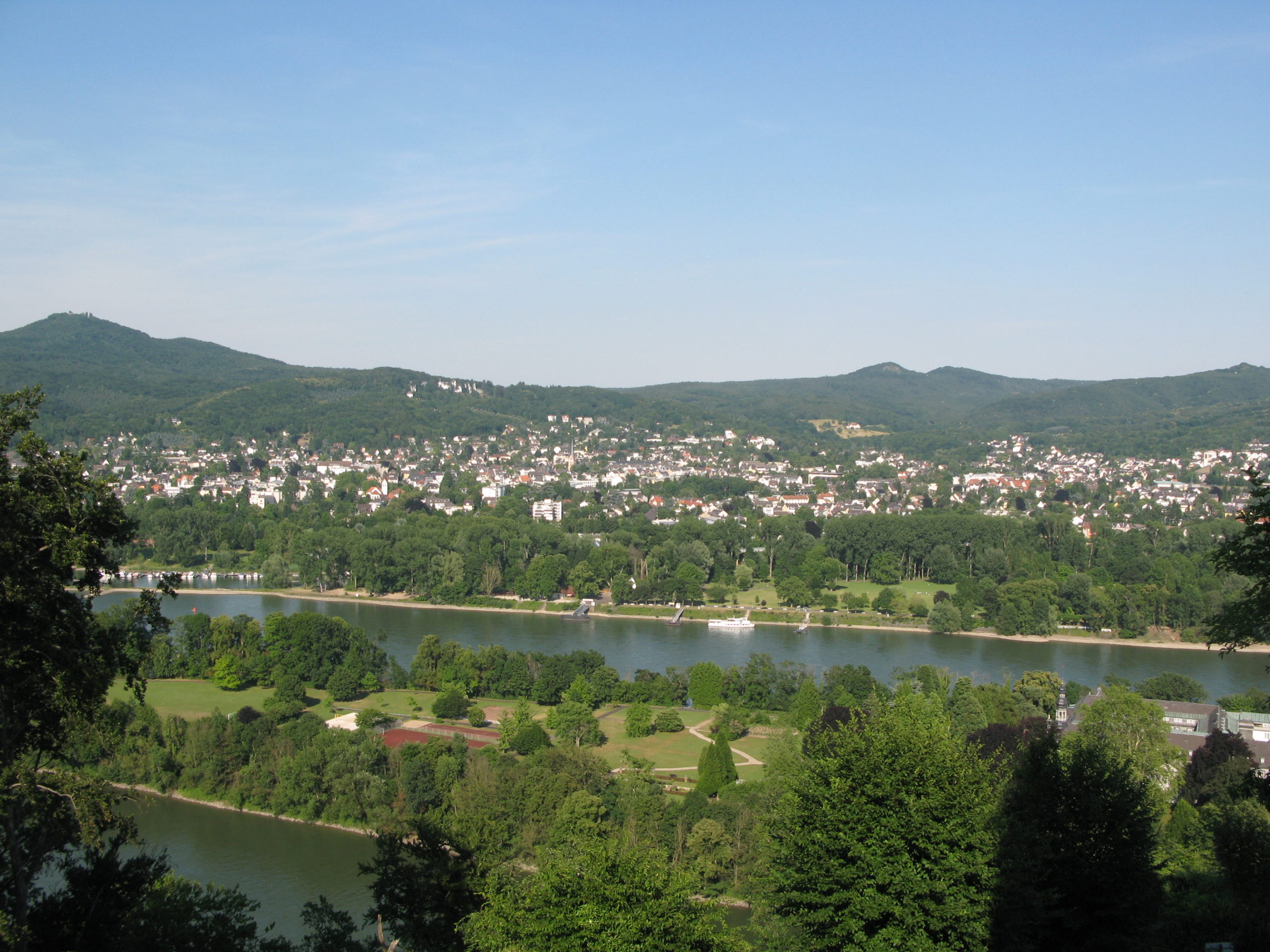
The Rolandsbogen has a long history. As early as the 19th century, it became a meeting place for students, poets and thinkers – a place where culture and nature merge. This special atmosphere formed the basis for our branding strategy:
We developed a brand identity that does not simply preserve the historical heritage, but retells it – as a link between the past and the present.
The result is a corporate identity that conveys a sense of character: authentic, minimalist, yet emotional. This is how tradition becomes a brand promise.
Corporate Design for catering
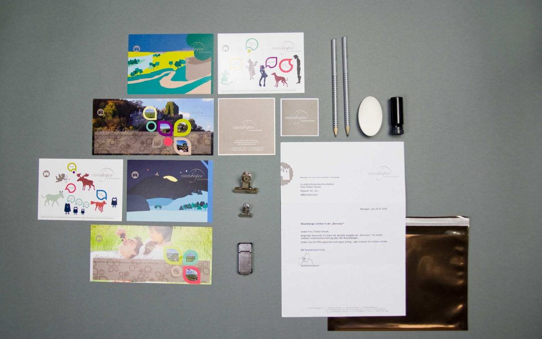
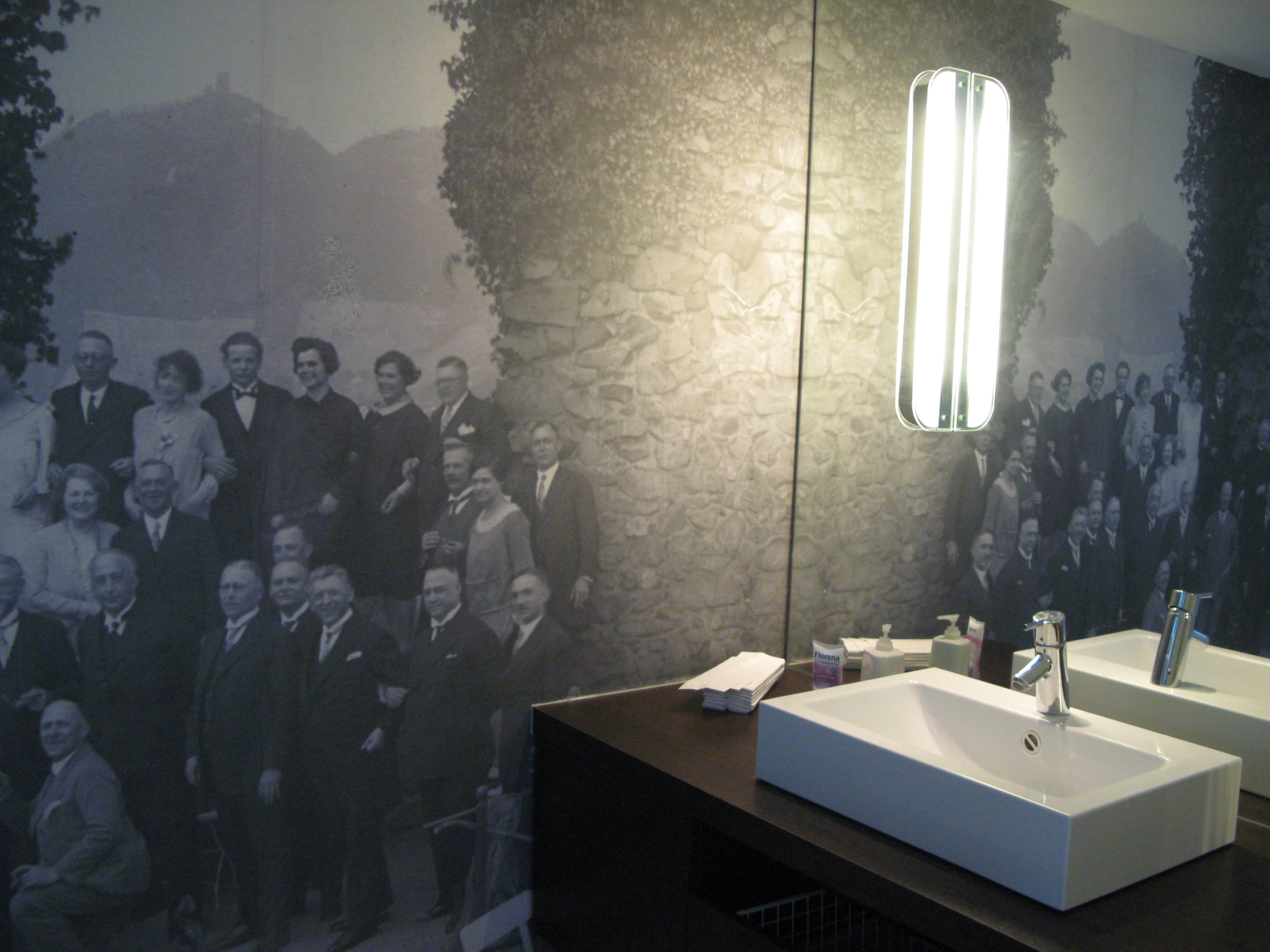
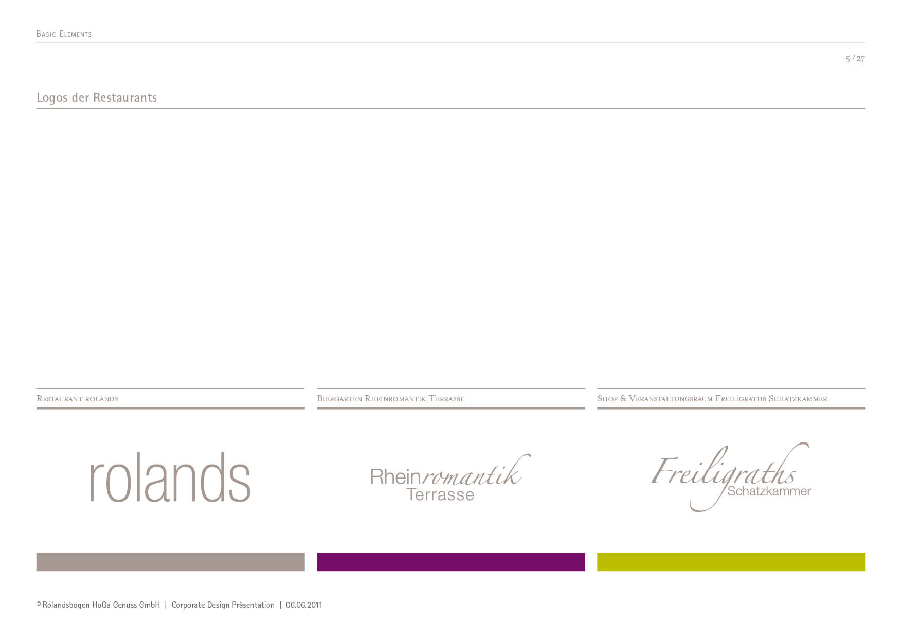
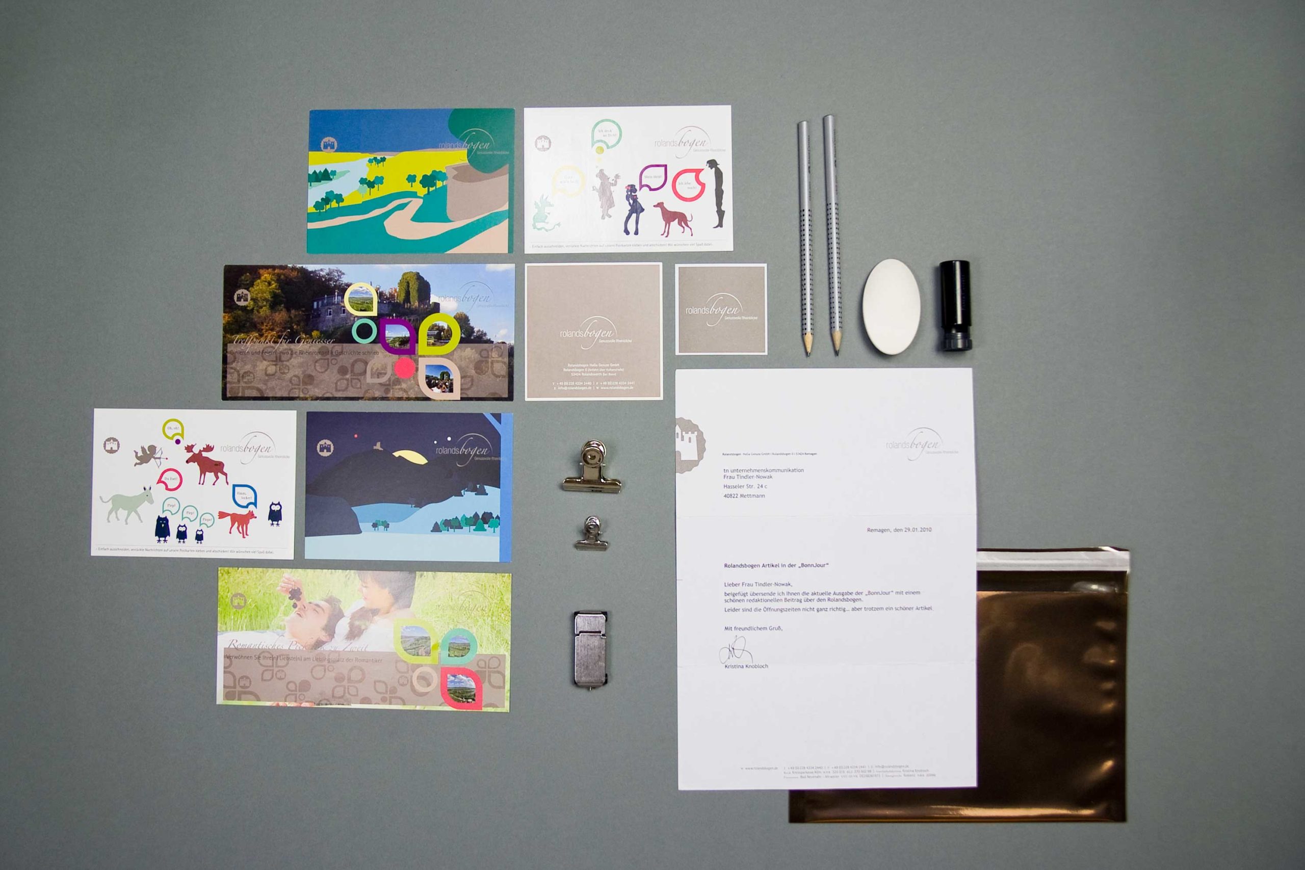
Unique, modern menus set the stage for all the delights to follow. Three restaurants, one experience: The Rolandsbogen brings together fine dining, regional cuisine and event catering under one roof. 2bu design developed a well-thought-out design system for this purpose, which fosters a sense of unity whilst simultaneously highlighting the individual character of each concept.
From the oversized A3 card with a haptically appealing envelope to the acrylic placemat and the wooden clipboard, everything was also stylishly finished with embossing or engraving. Important for every menu card: the card contents must be quick and inexpensive to replace.
Together, they form a consistent corporate design for the catering industry, which creates brand recognition and evokes emotions. At the same time, everything remains practical: content can be replaced quickly and cost-effectively without compromising the high-quality brand image.
Since 1929, the Rolandsbogen has stood for hospitality, quality and consistency. Over generations, it has grown into a brand that is now recognised far beyond Bonn.
2bu design translated this heritage into a contemporary rebranding that is compelling both visually and strategically:
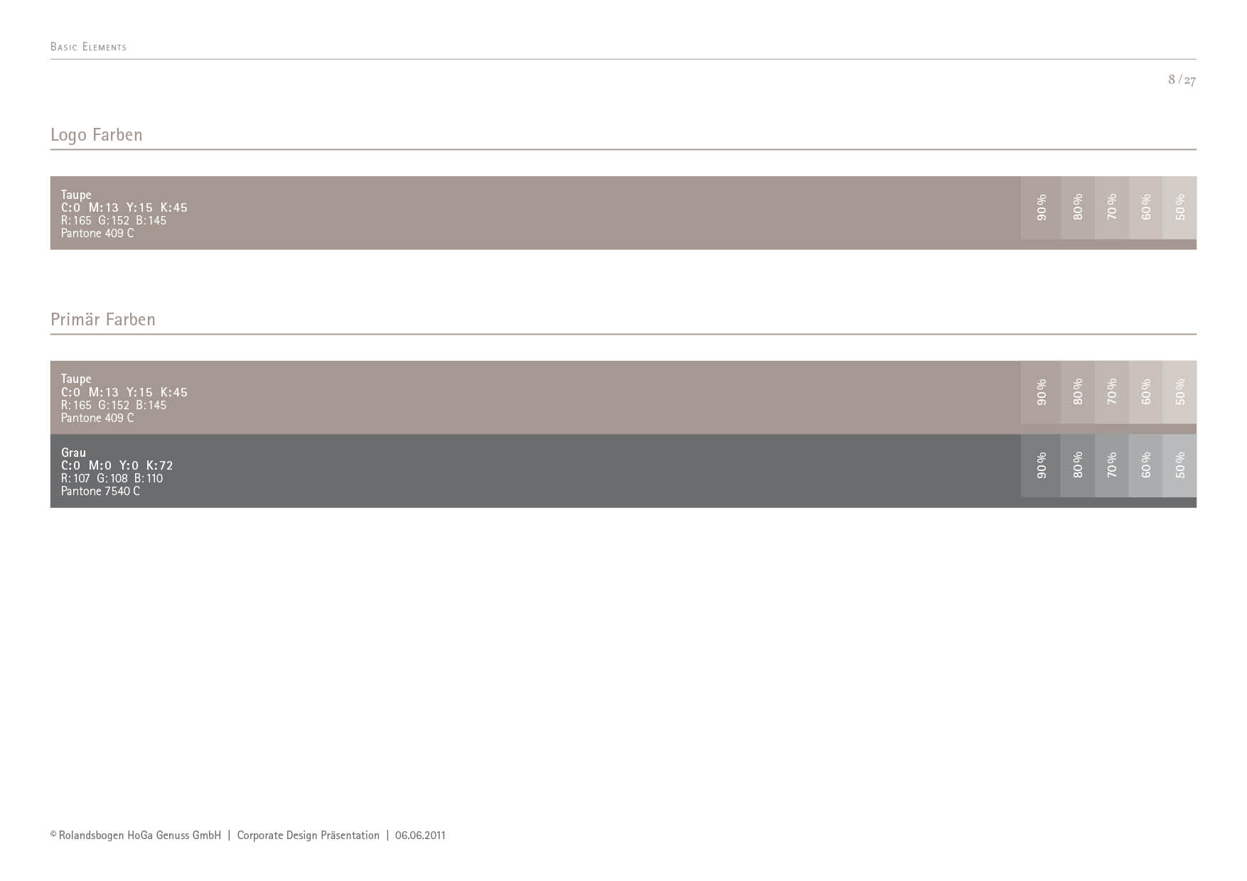
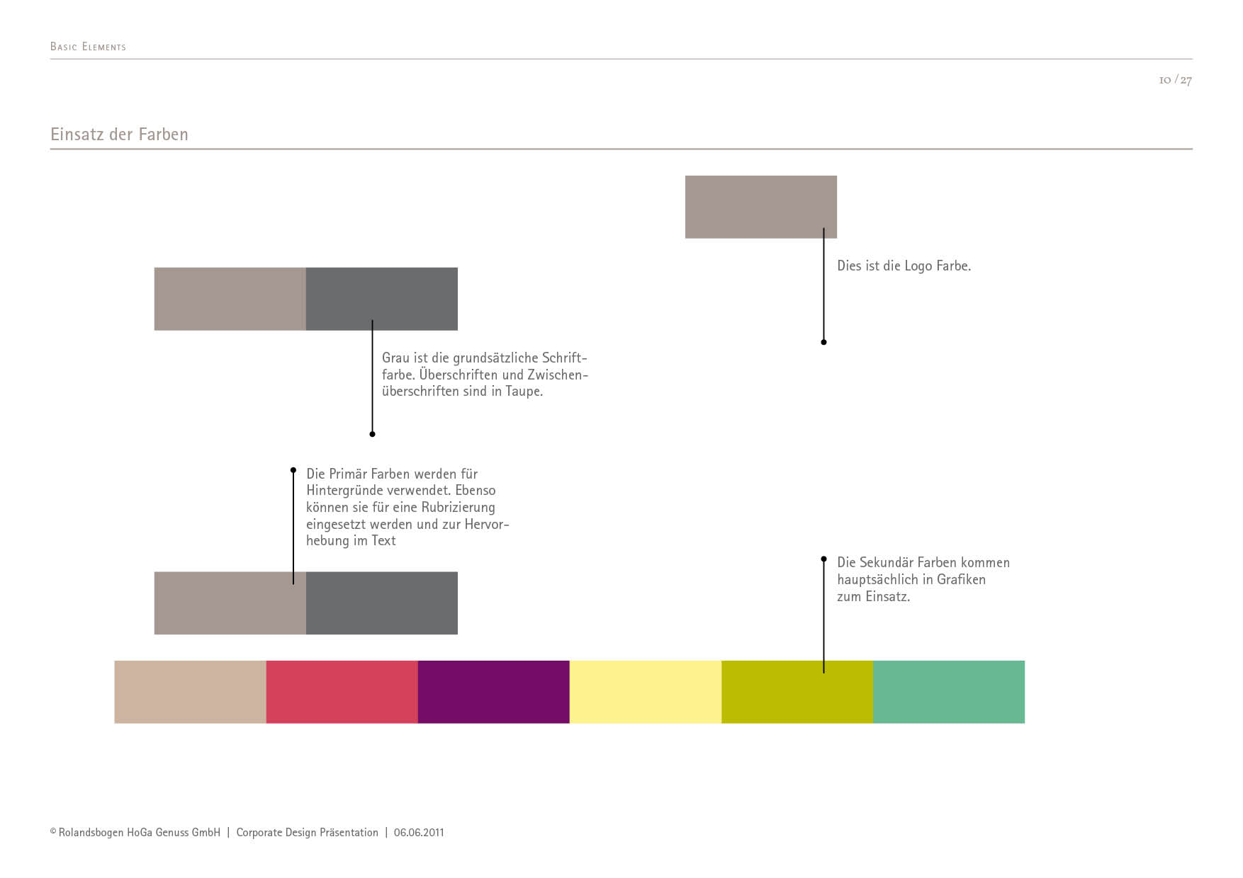
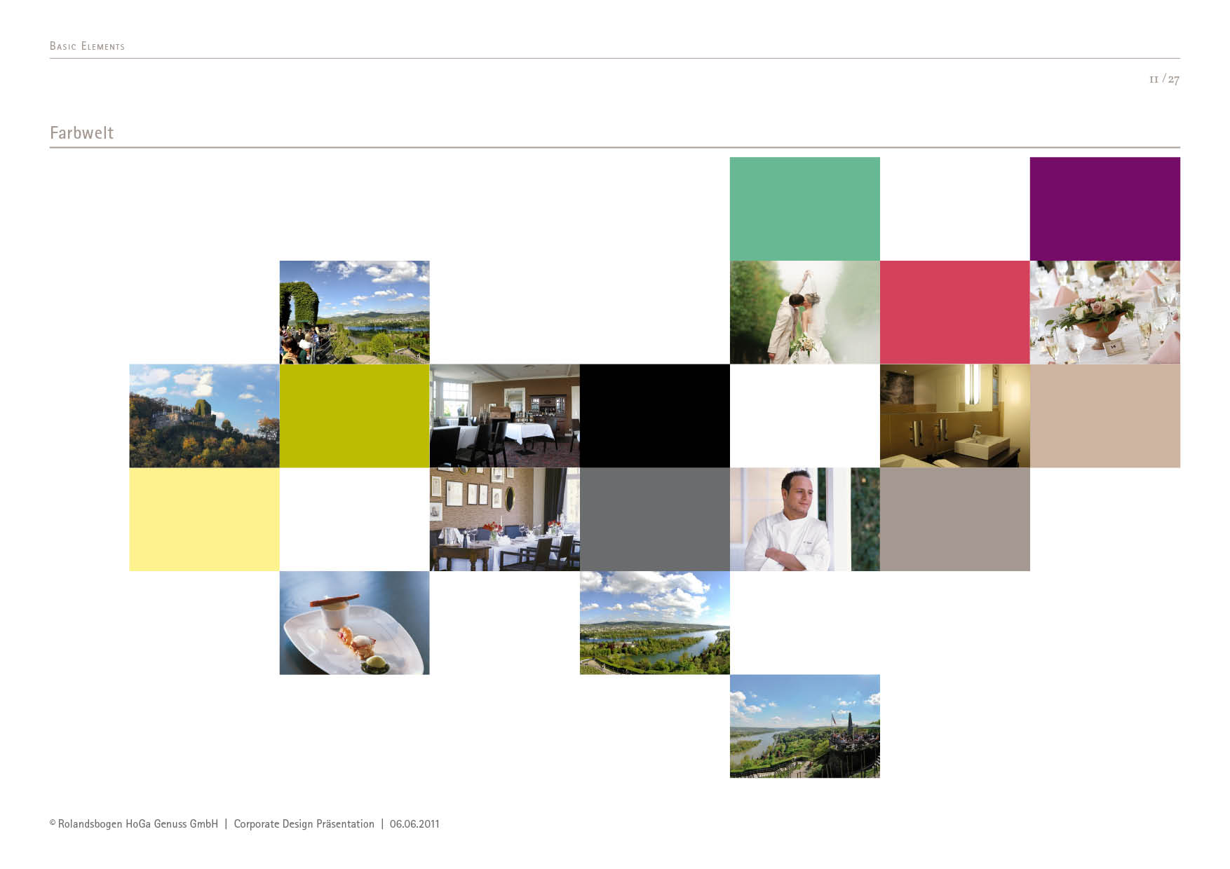
A clean logo, understated typography and a modern colour palette – the new visual identity combines historical depth with timeless elegance.
This makes the Rolandsbogen not just a destination for day trips, but a brand with character and recognition value.
Event branding with identity
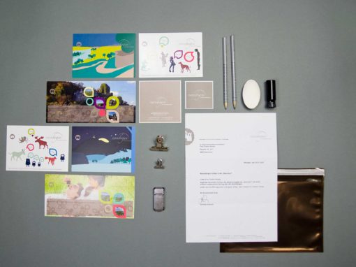
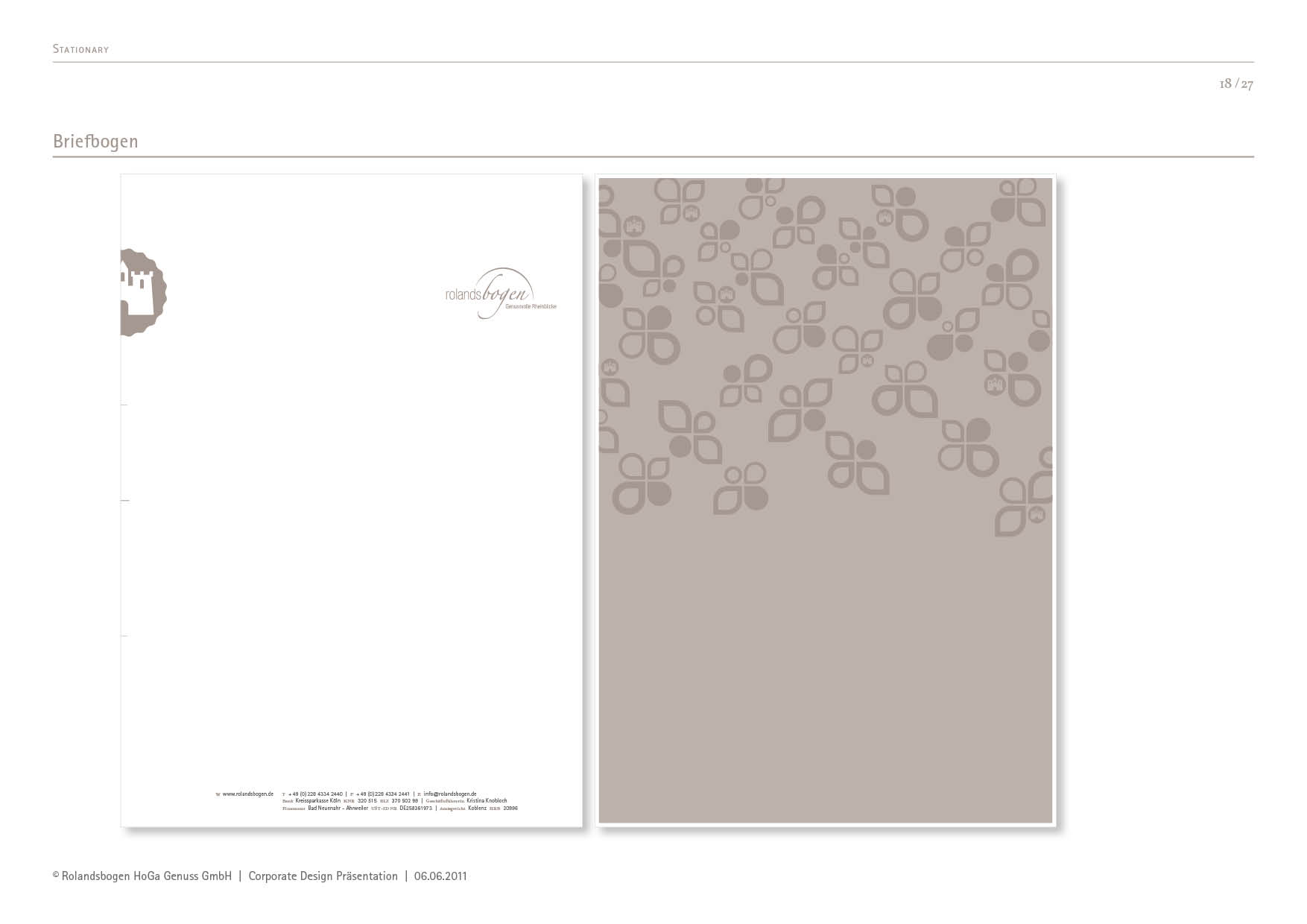
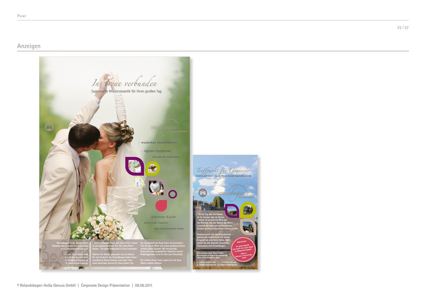
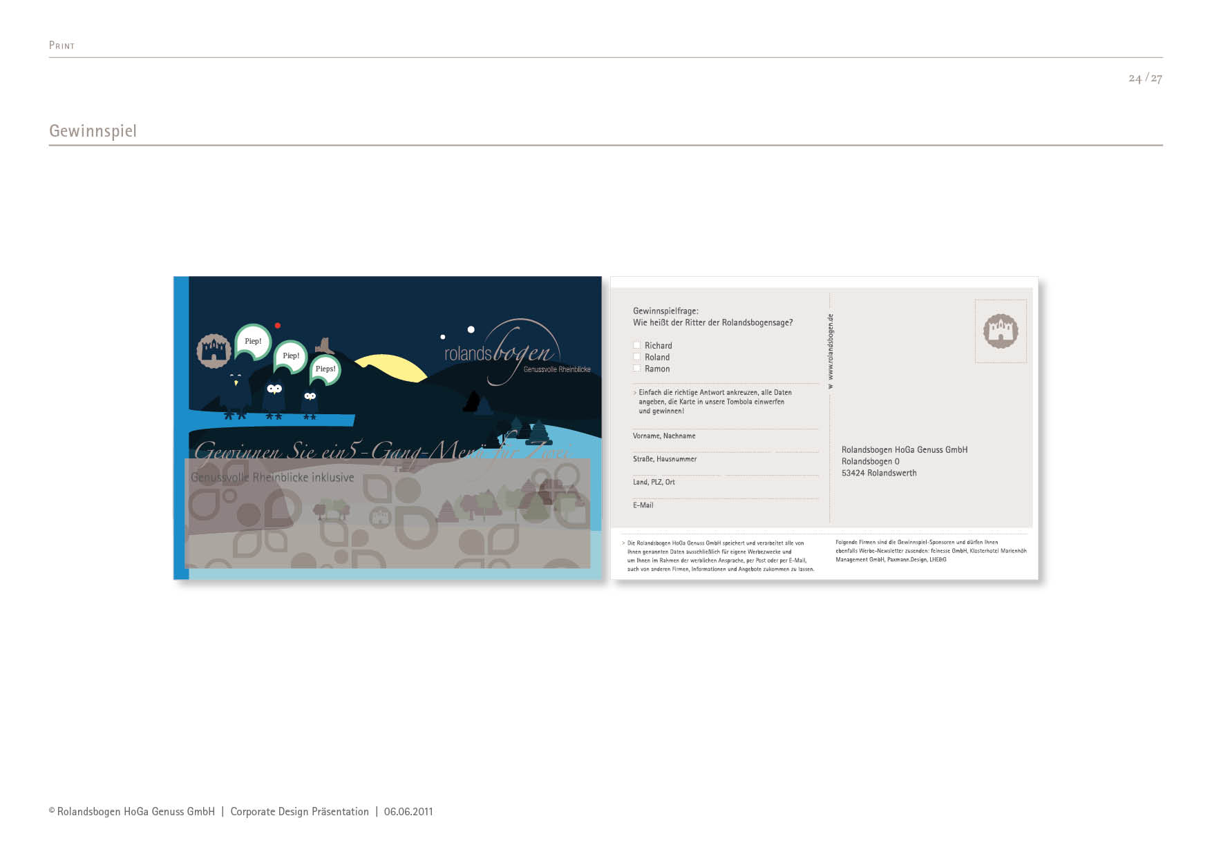
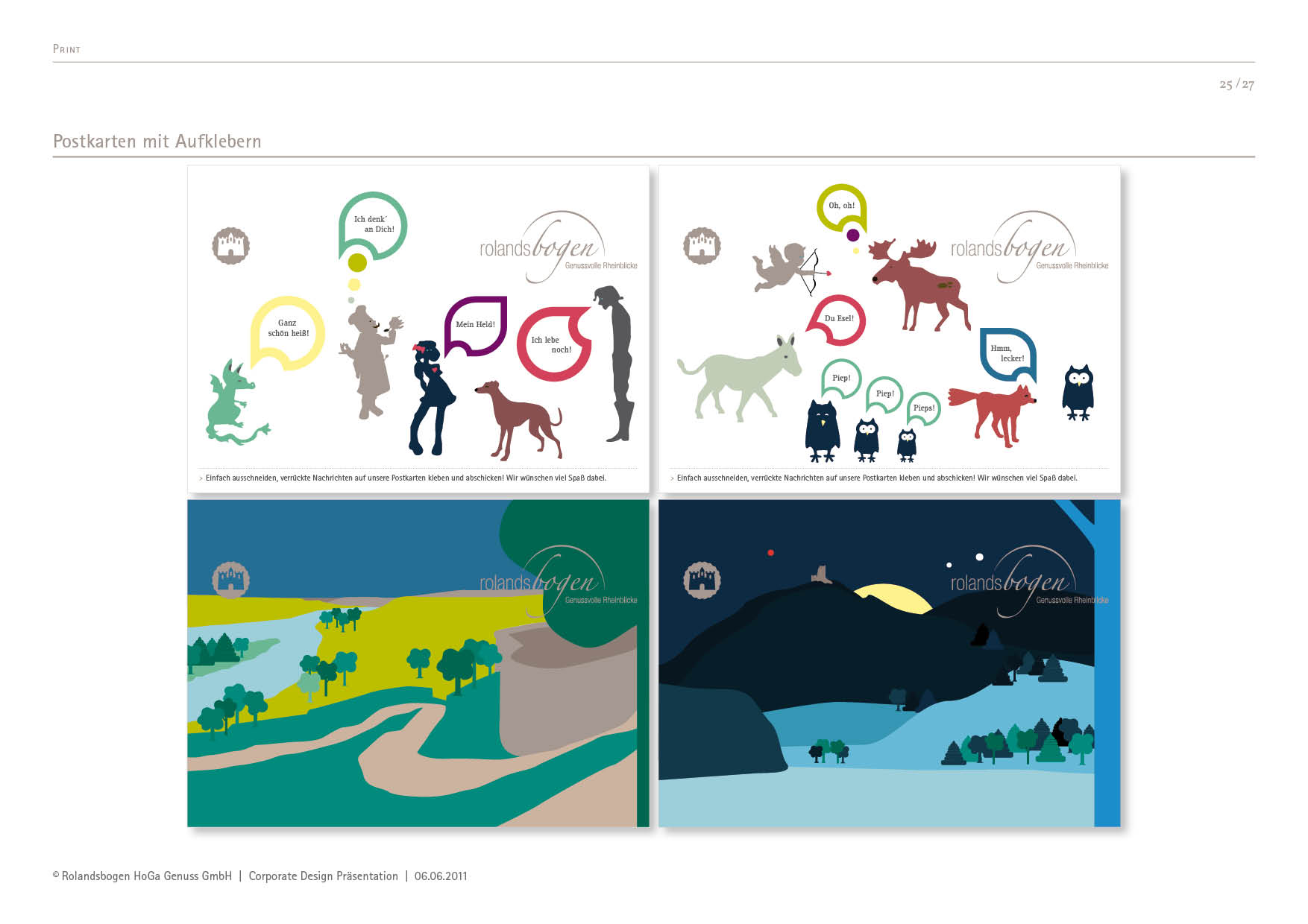
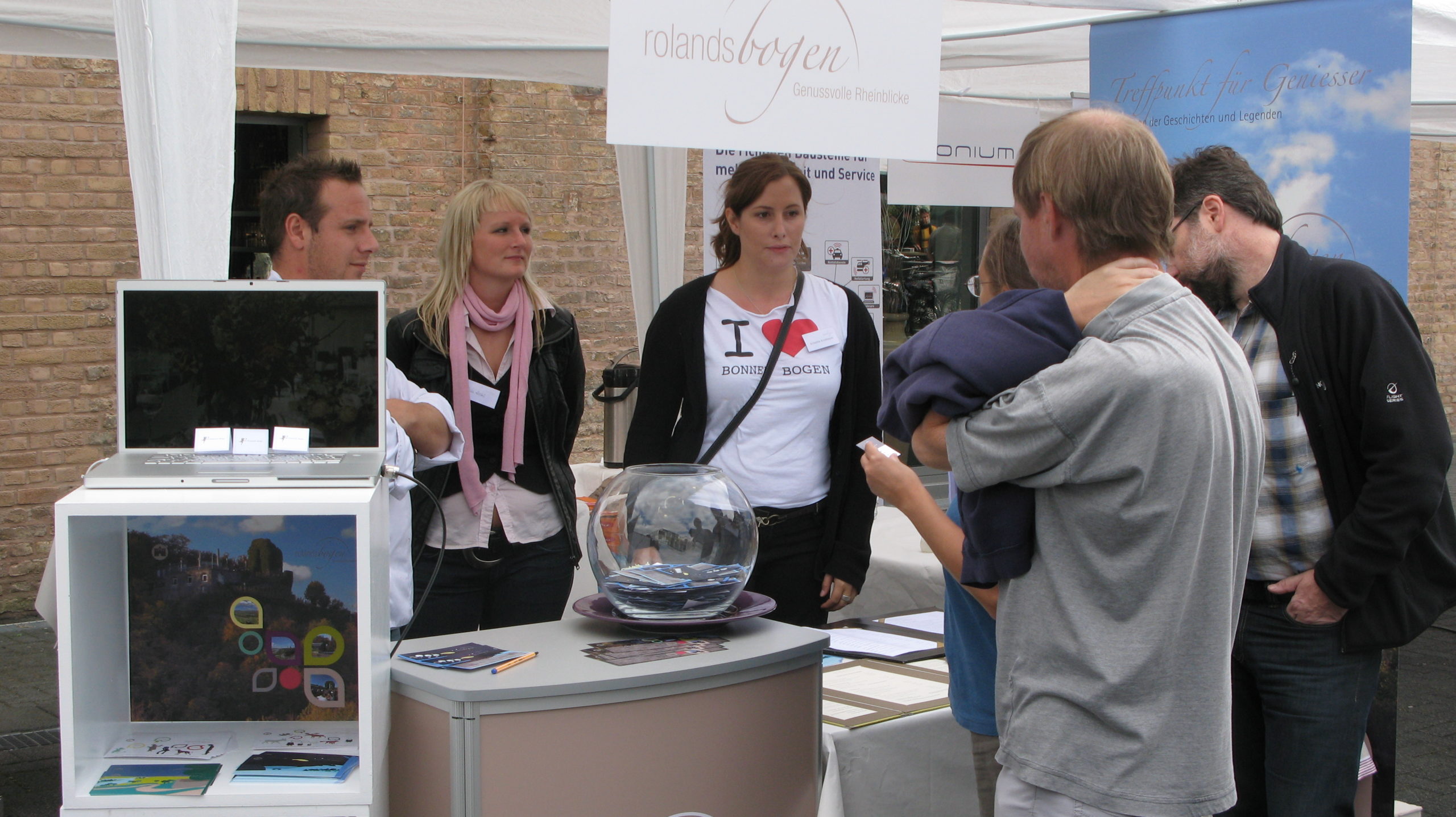
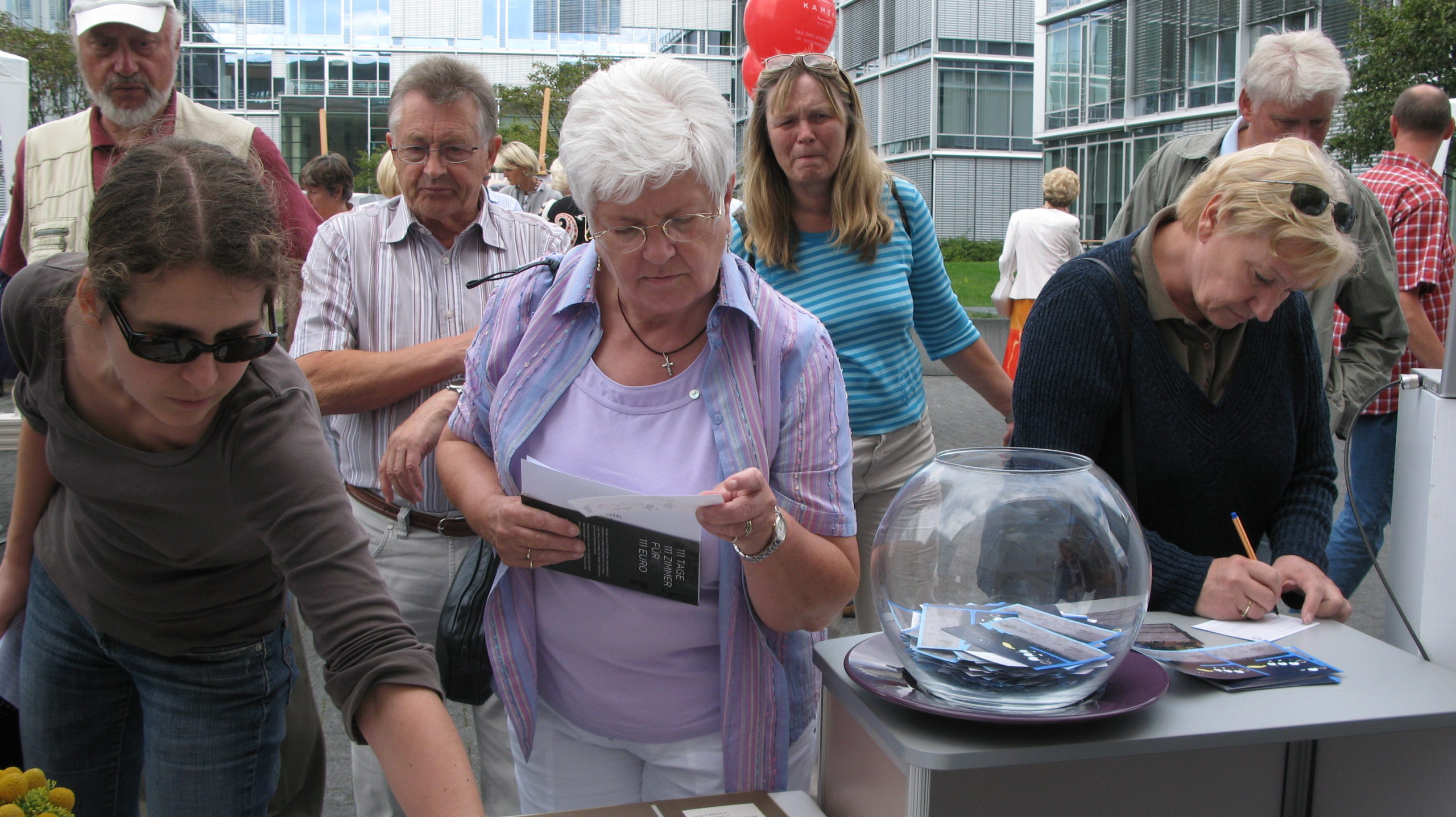
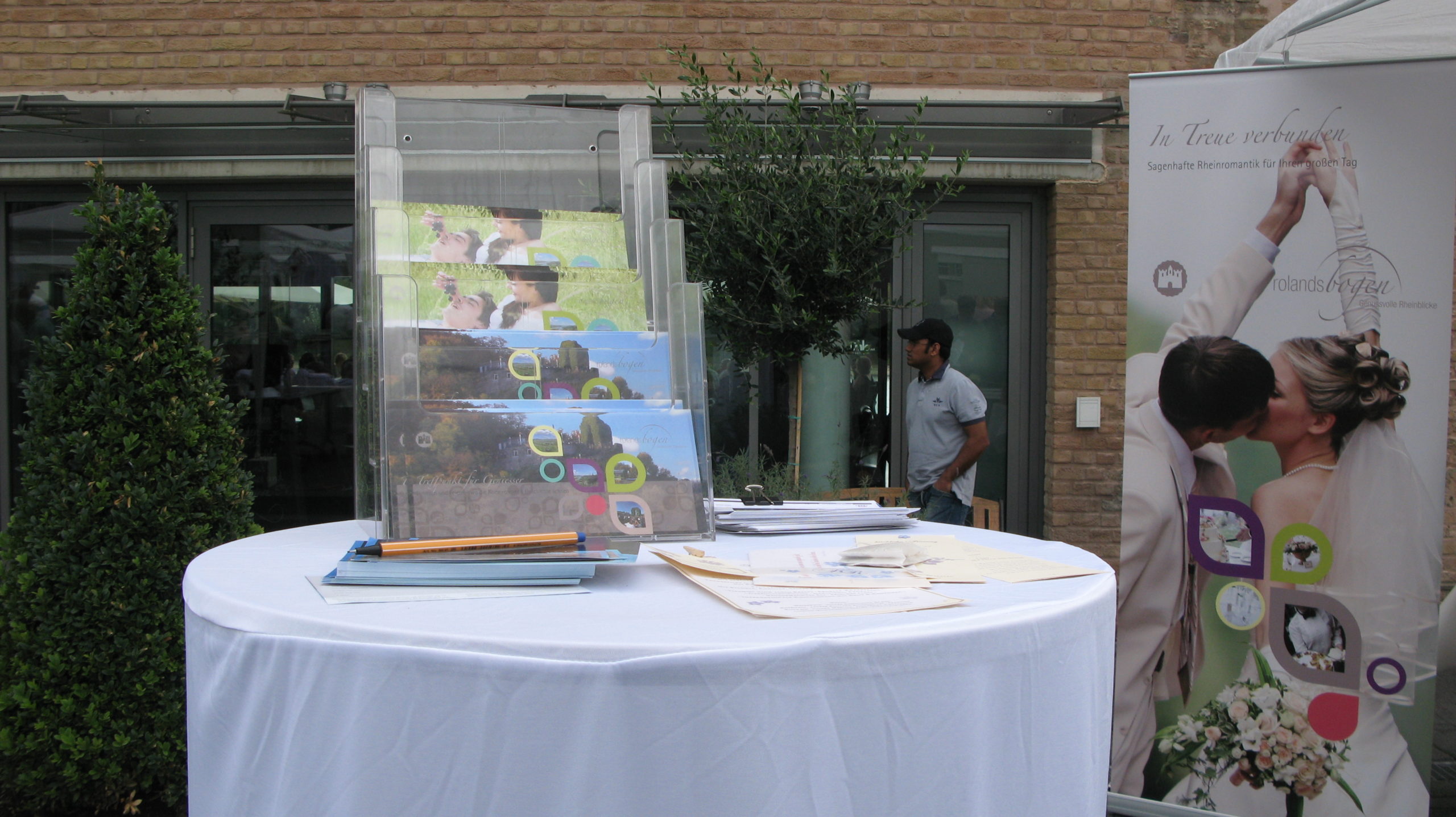
At the 2009 „Open Day“ at the Bonner Bogen, visitors were able to experience the new brand identity first-hand. 2bu design created the entire event branding – from the visual concept right through to the giveaways.
The concept focused on emotional brand communication: lovingly designed postcards depicting the legend of Roland’s Bow could be personalised and posted.
In this way, a local event gave rise to an authentic brand presentation that connects people – through history, design and emotion.
by Katrin Tindler-Kempen | 27 Oct 2021
Basics Typography, visual language, graphic elements Stationery Business cards, letterheads, stickers, envelopes, mailing envelopes Multimedia Web design, PowerPoint Communication Brochures, Christmas mailings
Documents optimised for efficient communication
At doctima, customer communication, service forms and interactive media take centre stage. The aim was to present complex documents in such a way that they are easily accessible, efficient to use and consistent with the brand.
In the brand strategy, language was defined as the brand’s core: only those who communicate clearly come across as credible. This principle was translated into visual terms – through clean lines, well-considered typography and a calm, uncluttered design.
Communication: Precise and legally compliant
Sectors such as banking, insurance and healthcare rely on precise and legally compliant communication. doctima specialises in this translation service, bridging the gap between technical language and everyday language.
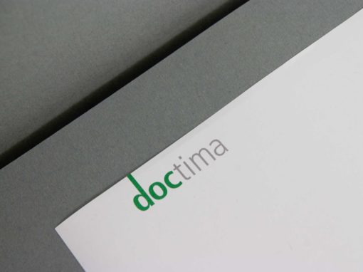
2bu design developed a corporate identity that brings this expertise to the fore: from the typeface and colour palette to the visual language. The result is a brand identity that not only conveys clarity but also visually embodies it.
The new website is the digital heart of the doctima brand – and the central hub where strategy, design and content come together. 2bu design developed the entire concept for the corporate website: information architecture, UX design, visual language, text principles and design guidelines. The aim was to position doctima online as a competent and accessible brand that demonstrates in practice what it promises – making complex topics simple.
The digital design follows a clear logic: visual calm, high readability and intuitive navigation. The modular structure allows content to be expanded flexibly without fragmenting the overall look and feel. This ensures that doctima remains consistent at every level – from the homepage through to blog posts and specialist articles.
The corporate website was designed to support the brand strategy: It creates visibility, reinforces the perception of doctima as an expert in language consultancy and conveys doctima’s values – precision, clarity and reliability – in every detail.
Give-away and Christmas greeting
Even small brand experiences count. As a Christmas giveaway, something special has been created: a stamp featuring a Christmas greeting. It can be used to stamp the matching modern postcards with their festive designs. Lovingly designed pictograms provide instructions on how to do this.
The whole thing is supplied in a beautiful box with a – ink pad and enclosed in a banderole with a Christmas pattern. Incidentally, this consists of the letters of the logo which, when turned correctly, form “snowflakes”.
These details show how brand identity through consistent design continues in every medium – from the document to the gift.
by Katrin Tindler-Kempen | 26 Oct 2021
Women's business directory
Basics Logos, typography, visual language, graphic elements Stationery Business cards, letterheads, stamp, envelope Multimedia Website Messaging Leaflet Guidelines CD manual
Visibility and networking for business women
The task was to create a B2B directory that businesswomen, female entrepreneurs and small businesses. The branding was intended to convey both professionalism and a sense of community. The aim was to develop a brand identity that conveyed expertise, trust and cohesion whilst simultaneously emphasising the business focus of the target audience.
The illustration style is correspondingly youthful and dynamic. The new corporate colour, orange, is used to add a fresh touch.
Modern design for professional B2B contacts
2bu design’s strategy focused on a corporate design that B2B professionalism with the energy and creativity of female entrepreneurs. The colour schemes, typography and visual language were deliberately chosen to convey trust, competence and cohesion.
In addition, graphic elements were developed to visualise cooperation and exchange. The central visual motif is derived directly from the figurative mark and represents a network.
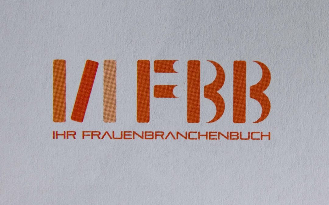
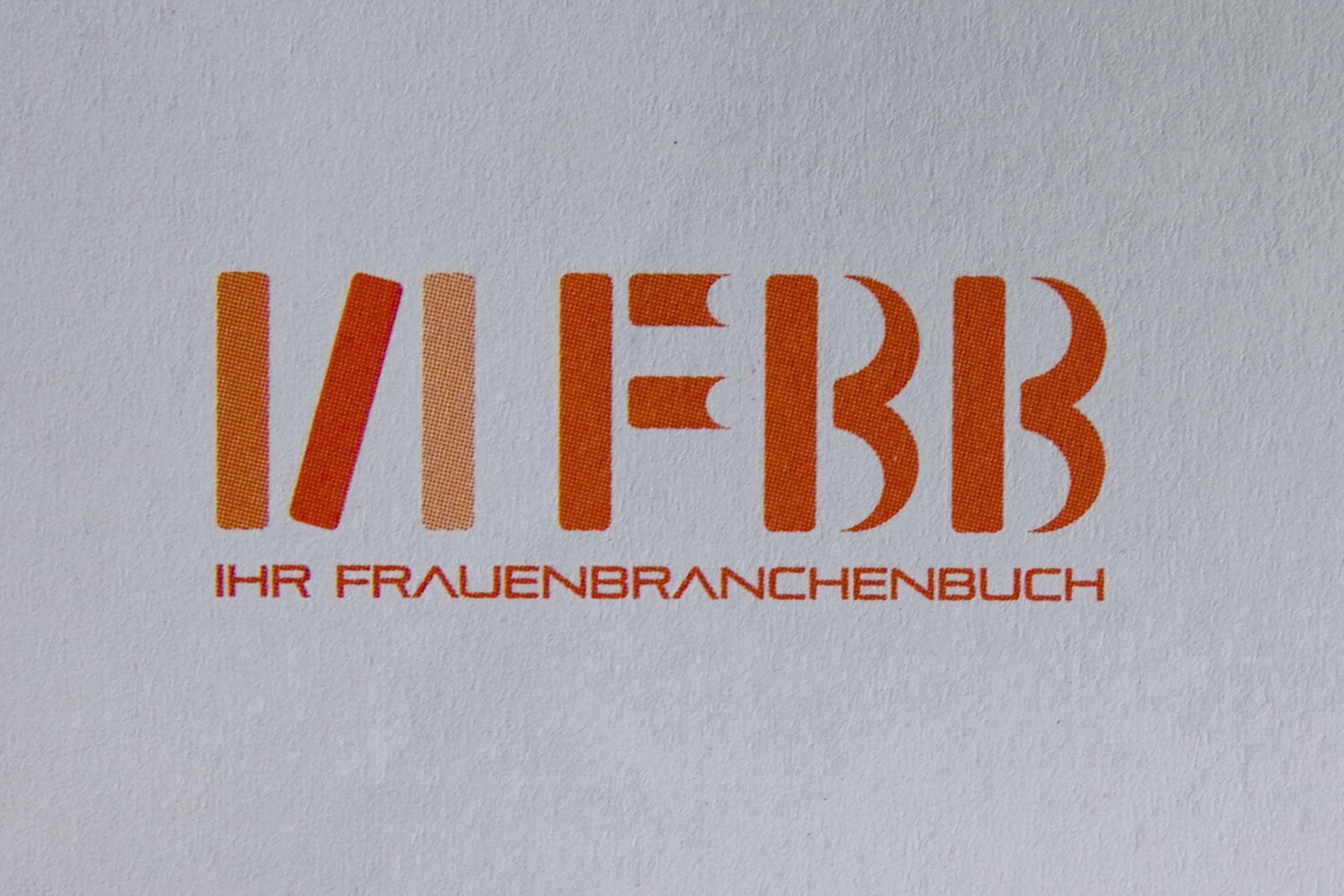
At second glance, you can see that the figurative mark FBB consists of books: one open, one upright and one lying flat. This creates a clear link between the modern online business directory and the original book format – a corporate design that combines tradition and innovation.
The business equipment: simple and high-quality
The new corporate design of the Women’s Business Directory is clear, bright, modern and inviting, whilst remaining professional enough to convey B2B contacts credibly. The stationery – from letterheads and business cards to envelopes – has been consistently adorned with graphic patterns derived from the FBB logo.
The pattern is subtly incorporated onto the reverse side of the letterheads and business cards, lending them a sense of quality as well as high brand recognition. Every colour and every graphic accent has been deliberately chosen to strengthen the brand identity and to professionalism of women in business networks.
Experience branding: Sealing for business women
To complement the envelopes, a stamp was developed which „seals“ the contents whilst conveying a sense of exclusivity. This creates a privileged community of FBB members.
The stamp is also used for bonus booklets, which are handed out at events and give participants the feeling of being part of a visible, high-quality B2B community. This small, thoughtful design solution not only conveys brand value, but also creates a tactile brand experience that lingers in the memory.
Making the community visible with testimonials
Storytelling is central to the brand impact of the Women’s Business Directory. Real businesswomen share their stories. Every testimonial is unique and reflects the diversity of FBB members – from female founders and freelancers to established businesswomen.
These stories are presented in graphic speech bubbles, which immediately establish a visual link to communication, exchange and networking. The testimonials generate attention (Attention), their quotes spark interest, whilst the overall picture of the collaborative platform creates the desire to become part of the community oneself. The managing director rounds off the storytelling by calling for action (Action) in her speech bubble: „Join us!“
This combination of high-quality design and authentic storytelling not only makes the FBB brand visible, but also tangible, conveys professionalism and, at the same time, strengthens the B2B positioning for businesswomen.
by Katrin Tindler-Kempen | 14 Oct 2021
Basics Logo, typography, graphic elements Messaging Magazine, invitation
Strategy: Making art visible
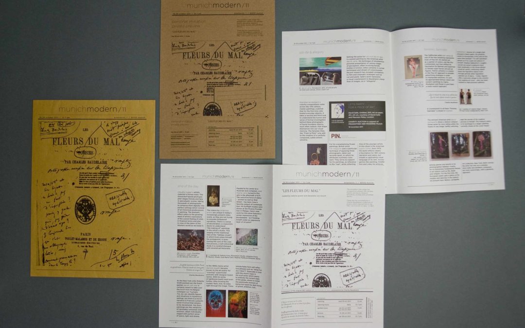
The brand strategy aims to communicate art in a way that brings it to life and anchor contemporary perspectives within a historical context. Each exhibition is organised around a theme that changes annually, serving as a common thread running through all media. This creates a coherent narrative that continues visually, linguistically and spatially.
The aim was to create a brand that appeals to artists, galleries and collectors alike – as a platform for exchange, promotion and international networking. munich modern thus positions itself as a cultural brand that is both aesthetically compelling and recognises in the public eye.
Contemporary art with a historical look
The visual concept combines contemporary design with classic typography – a deliberate bridge between tradition and the present. Clean lines, understated colours and generous white space give the works room to breathe and allow the art to speak for itself. At the same time, modern layout principles and digital adaptations ensure that the visual identity works across all channels – from posters and catalogues to the website and social media.
This creates a visually striking identity that conveys the spirit of the brand: modern, open, sophisticated – and always closely linked to the arts.
by Katrin Tindler-Kempen | 13 Oct 2021
Basics Logo, typography, visual language, graphic elements Stationery Business card Environment Interior design consultancy, wayfinding & signage Messaging Leaflets
Beauty business with an international clientele
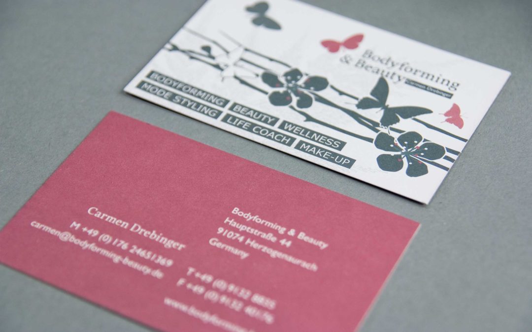
The brand strategy relied on English wording to appeal directly to an international clientele. The name Bodyforming & Beauty was supplemented with „by Carmen Drebinger“ to comply with legal requirements for small businesses whilst also emphasising the founder’s expertise.
The word and figurative mark featuring a butterfly symbolises lightness, transformation and elegance. Graphic elements run through all media, creating a visual identity that ensures the brand is experienced consistently and professionally – from business cards to leaflets.
Visual clarity for a strong brand presence
For flyers and business cards, we chose a consistent visual style that conveys professionalism and friendliness. Key visuals and a photo shoot featuring Carmen Drebinger herself bring the founder to the fore, giving the brand a personal, credible touch. The images are effective thanks to plenty of white space, approachable models and recognisability, which further strengthens the international positioning.
Orientation design made visible
The functional aspects of the design were also taken into account: A directions map on the leaflet, an A3 sign at the entrance and an A5 sign at the building entrance reduce navigation problems by 90 %. This makes appointments much more relaxed for customers and allows the brand is perceived as professional, whilst the corporate design simultaneously reinforces the aesthetic clarity and recognisability of the brand.
by Katrin Tindler-Kempen | 12 Oct 2021
Basics Logo, typography, visual language, graphic elements StationeryBusiness card Messaging Leaflet
Clear communication for experts
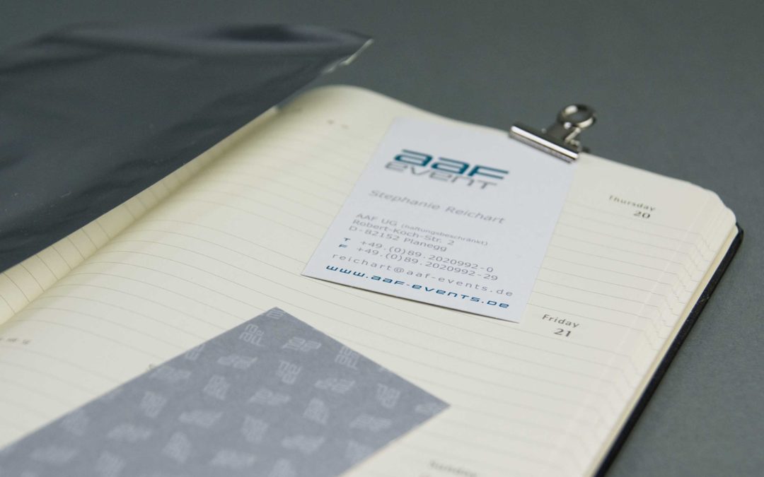
For offline communication, a multi-page leaflet was developed, which clearly stands out from traditional flyers. Compared to other marketing tools, leaflets offer low production costs and a tactile appeal that is particularly effective in the B2B sector. At the same time, care was taken to ensure clear structures and readability, so that all information on speakers, topics and the programme can be grasped quickly.
Increased recognition value through advertising constants
In order to achieve a high level of brand recognition, care is taken when designing a corporate identity and its elements to ensure that consistent design principles (branding constants) run throughout the entire corporate identity. The graphic concept incorporates a geometric pattern, derived from the new logo, which is used consistently across all media. The colours silver and blue were chosen to convey professionalism and competence.
The combination of modern design and structured presentation of information has resulted in targeted communication has been achieved, which both strengthens the brand identity and effectively appeals to the target audience.
by Katrin Tindler-Kempen | 10 Oct 2021
Basics Logo, typography, visual language, graphic elements Stationery Business cards, letterheads Messaging Leaflets
Music thrives on rhythm, excitement and emotion – and that is exactly what the new branding was designed to convey. The aim was to create a visual sound that reflects the personalities of the two DJs: relaxed, professional, with a touch of humour. The brand strategy focuses on recognisability through symbolism, clear typography and emotional imagery.
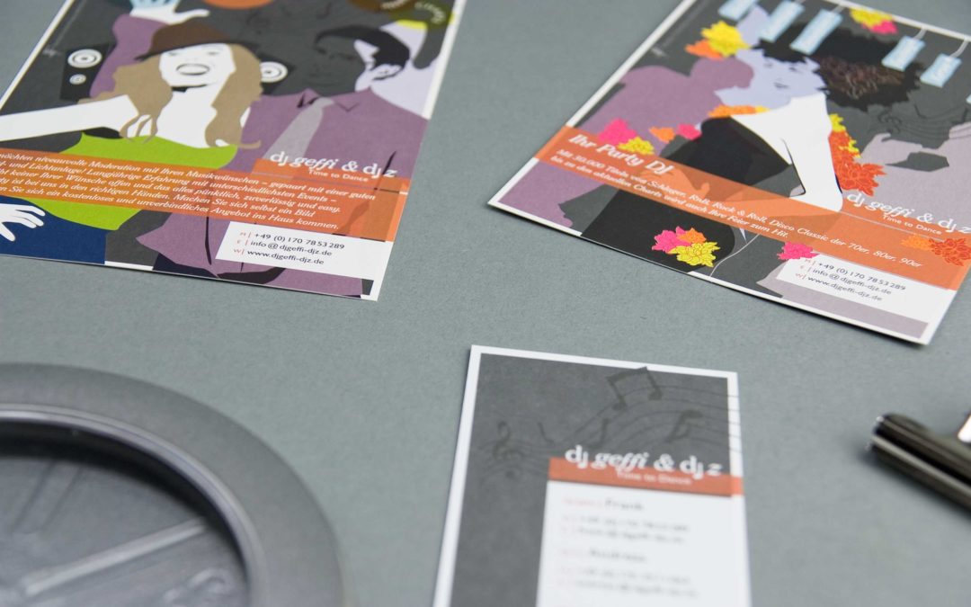
The new word and figurative mark is musical, modern and minimalist – just like the DJs themselves. The name DJ Geffi & Z provided the perfect template for a playful idea: a stave that runs through all media as a graphic element. This makes sound visible and gives the logo a sense of rhythm.
Corporate illustration: Good humour in time
For flyers and social media, we developed bespoke illustrations that appeal directly to young target audiences. The characters are likeable, active and on the move – they convey a sense of light-heartedness, fun and a party atmosphere. So it’s clear at first glance: This is all about music, emotion and energy.
The illustrations also incorporate informative keywords relating to music genres and events – a playful way of conveying content visually.





























 German
 English