Oatly: How humour and tone of voice became the strongest brand strategy

Oatly: How humour and tone of voice became the strongest brand strategy

Oatly is not oat milk. Oatly is a statement.

Oatly does not sell a product. Oatly sells an attitude.
And this is not marketing speak, but a strategic decision.

While many food brands rely on Health Claims, and soft-pedalled promises of sustainability, Oatly does something completely different:
The brand speaks. And in the way that brands actually should not speak.

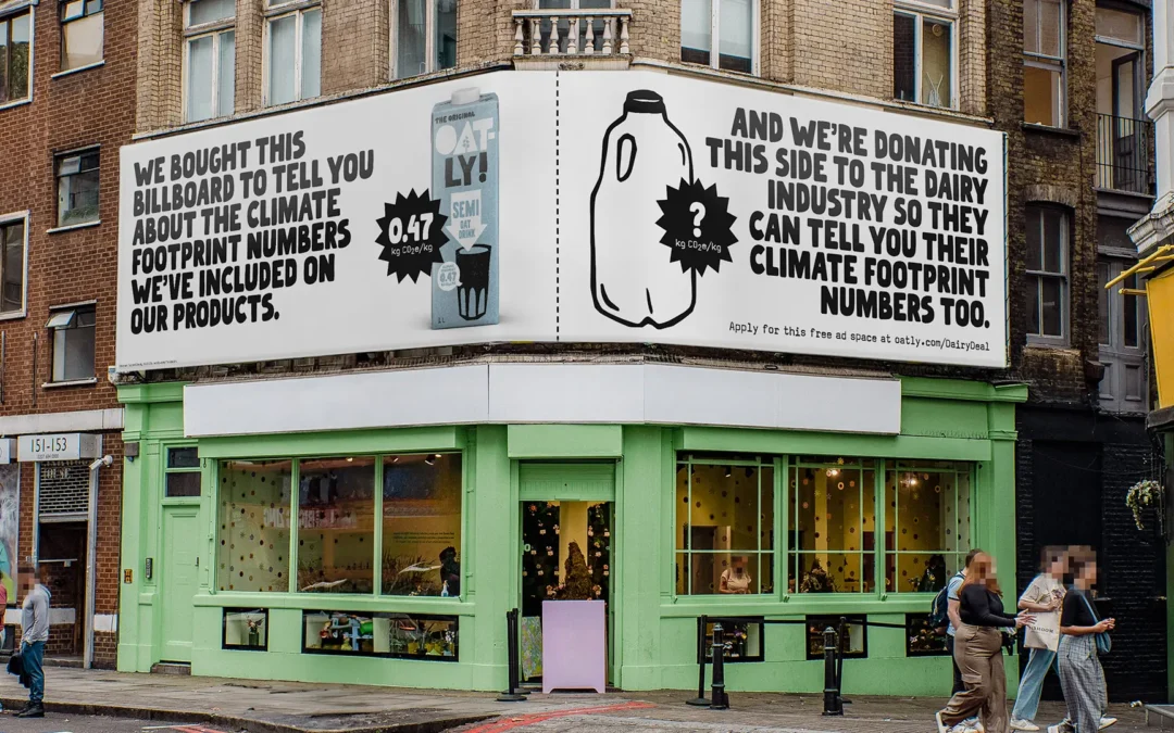
This is particularly evident in social media marketing. Here you can see how Brand Strategy becomes a living language. Humour is not a nice extra, but brand-defining element. Oatly uses language as a tool to reduce distance, generate attention and create cultural relevance.

Or to put it another way: Oatly doesn't want to please. Oatly wants to resonate.

Brand Strategy: The conscious decision in favour of the Challenger role

Every strong brand voice begins with a clear strategic stance. At Oatly, this is: We are the disruptive factor.

The brand strategy is based on a few basic assumptions that are implemented extremely consistently:

  • The market is full of interchangeable messages
  • People have had enough of slick brands
  • Sustainability needs honesty, not a glossy façade

Oatly deliberately positions itself as a Challenger Brand. That means:

  • Do not adapt, but question.
  • Not to explain, but to comment.
  • Don't try to convince, but allow discussion.

This strategy is directly reflected in social media marketing. Oatly does not communicate about the community, but with her. Comments are allowed to contradict. Campaigns can be offensive. Posts can be absurd.

The result: a brand with clear edge, which not everyone likes – but which remains relevant for precisely this reason.

Tone of Voice: Cheeky, self-deprecating, human – and maximally conscious

Oatly's Tone of Voice seems spontaneous. But it is not.
It is highly strategic.

The language follows clear principles:

  • Everyday language instead of marketing language
  • Irony instead of instruction
  • Personality instead of perfection

Oatly writes the way people think. Disorganised. Honest. Sometimes slightly annoyed. Sometimes overly reflective. Often with a humorous twist that breaks expectations.

Important: Humour is never just for entertainment. It is Signal transmitter.
He says: We don't take ourselves more seriously than the cause. 
And that is precisely what makes the brand credible.

In the social media context, this language ensures high Shareability, strong community loyalty and recognisability – even without a logo.

Humour as a brand tool – not as a gag

Many brands „do humour“. Oatly is humorous.
That is a big difference.

Humour at Oatly fulfils several functions at the same time:

  • It lowers the entry barrier to complex topics such as sustainability
  • It makes attitude accessible without appearing moralistic
  • It creates emotional closeness

The humour is often deliberately unwieldy. Texts are long. Statements seem almost too honest. Some messages read like internal thoughts made public by –.

That creates irritation.
And irritation generates attention.

Humour is therefore not an end in itself, but part of the communicative brand architecture. It helps to ensure that Oatly is not only seen, but also remembered.

Social media as an extension of the brand identity

Oatly does not use social media as a sales channel, but as a cultural platform.
Every post follows the same logic as packaging, OOH or website:

  • same language
  • same attitude
  • The same desire to break the rules

This also means:
No trending hashtags without meaning.
No copy-paste CTAs.
No empty sustainability claims.

Instead, content is created that feels like commentary on the zeitgeist. Social media becomes a stage for brand personality – not a discount wall.

This is a key realisation for sustainable brands:
Consistency beats volume.
And attitude beats reach.

„Your brand is what people say about you when you're not in the room.“

Jeff Bezos | US-American entrepreneur and investor

Oatly ensures this in a very targeted way, what – is said through language, tone of voice and the courage to be uncomfortable.

Why Oatly is a blueprint for value-orientated brands

Oatly impressively demonstrates that good social media marketing is not about tools, but about Decisions exists. Decisions in favour of attitude. For language. For personality.

The brand proves it:
Humour can be deep.
Sustainability can be loud.
Branding can be uncomfortable.

There is a clear lesson here for sustainable, animal-friendly and value-orientated companies:
A strong Brand Strategy needs an equally strong Tone of Voice. And this may sound – no, – should sound different from everything else in the feed.

You don't want an interchangeable brand voice, but a language with attitude?

With 2bu design we develop Brand strategy, branding and tone of voice not from trends, but from depth. We work with the Archetypes according to C. G. Jung and translate them into contemporary brand attitudes – as with Oatly, where the Challenger from the mixture of Rebel and hero is created.

Let's find out together how your brand can speak.

Pilar Font – Art deco typography for strong brand identities

Pilar Font – Art deco typography for strong brand identities

Art deco, but contemporary please

Art deco is one of those things. It's easy to slip into gold frames, Gatsby kitsch and overambitious nostalgia. Pilardoes it differently. The scripture takes the Formal rigour and geometry of European Art Deco, but leaves out everything superfluous.

Pilar was originally created in 2012 for the headlines of the magazine Bol'shoy Gorod (Big City). No coincidence. Editorial environments are mercilessly honest. Either a typeface carries – content or it fails. Pilar has passed and has been further developed.

The result is a geometric grotesque, that appears stable, but not rigid. Clearly constructed, but not cold. Ideal for brands that Attitude, intellect and aesthetics want to connect. Especially in the Branding, in Editorial Designs or on Websites, that want to say more than „we're here too“.

This is exciting for sustainable and value-orientated brands. Pilar doesn't shout. It stands. And that is often the louder statement.

Four stylistic movements – one system, many voices

Now it's getting typographically nerdy. And that's a good thing.

Pilar has four stylistic movements, each with its own alphanumeric glyphs. This means that each letter exists in several variants. These are not gimmicks, but real design options.

The four sets are called:

  • Regularly open

  • Wide closed

  • Narrow

  • Game

The highlight: you can vary within a word or sentence without breaking the visual system. Headlines become dynamic. Logos look customised. Campaigns remain consistent, but not monotonous.

Especially in the Brand design this is worth its weight in gold. A font that adapts without losing its identity saves time, discussions – and ultimately resources. Sustainability sometimes simply starts with good decisions.

For us as a branding agency, this means fewer compromises between aesthetics and function. More room for manoeuvre for real concepts.

Who is behind it?

Behind Pilar stands CSTM Fonts, founded in 2014 by Ilya Ruderman and Yury Ostromentsky. Both do not come from the „we also make fonts“ corner, but from a deep typographic practice.

Both have participated in the Moscow State University of Print studied graphic design. Ilya Ruderman later completed the renowned Master Type & Media at the Royal Academy of Art in The Hague. He has been a tutor, art director and type designer for international foundries and has worked on Neutraface, Graphic and Lava collaborated.

Yury Ostromentsky was for a long time Art Director of BigCity Magazine. Pilar is based on his personal typeface, which was used there. So: real application, real requirements, real feedback.

Her work has received several awards, including Granshan, Modern Cyrillic and the European Design Award. In short: this is not a trend font. This is substance.

Why we love Pilar

Because Pilar shows attitude, without being loud.
Because they Complex brand appearances instead of dominating them.
And because it proves that good typography doesn't need to be explained – it simply works.

For Sustainable, ethical and vegan businesses Pilar is particularly exciting. She comes across as reflective, mature and clear. No gimmickry. No eco-clichés. But design with ambition.

Exactly our thing.

Want to know if Pilar fits your brand?

Or are you looking for a font that Brand strategy, your Corporate Design and your Communication really wears?

Then let's talk about it. We don't think of typography in isolation, but as part of a meaningful overall system. For brands with attitude. And backbone.

Forager Font - Expressive display font for bold branding with attitude

Forager Font - Expressive display font for bold branding with attitude

Forager: When typography starts to breathe

Forager is one of those typefaces where you immediately realise that nobody wanted to design „just another sans serif“.
This was about attitude. About rhythm. About visual friction.

The font unites three very different worlds:

  • the psychedelic opulence of the 70s,

  • the organic lines of Art Nouveau,

  • and the Reduction of modern grotesque fonts (sans serif fonts without small closing strokes).

That sounds like chaos. But it's not.
Forager balances these influences with surprising precision.

Overlapping as a design principle

The centrepiece of Forager is its Overlap. Letters share space, intersect, interlock. Normally a nightmare for legibility. Not here.

The trick lies in the design:
curved verticals meet Flat horizontal lines. This creates a rounded, slightly angular design language that makes overlapping clearly recognisable. The eye can separate the letters even though they are touching. Typographically clever. Almost cheeky.

The font family includes Five line widths, each in:

  • overlapping variants for maximum effect

  • and closely running versions for more controlled layouts

This makes Forager amazingly versatile – from bold branding and editorial headlines to experimental social media visuals.

Who is behind it?

Forager was designed by Jacob Cummings, published via Overlap Type – is still a young, but all the more exciting typo label under the direction of Kel Troughton.

Overlap Type started in 2023 with a radical rule: Only fonts with overlapping letterforms.

What began as a self-imposed restriction quickly became a creative playing field. Today, Overlap Type goes beyond pure overlap, but remains true to its mission: question conventional rules in font design.

And that's exactly what you can feel in Forager.
This writing does not aim to please. It wants to work.

Why we love Forager

Forager is the perfect fit for brands that don't want to be slick. For sustainable businesses, cultural projects, vegan labels or magazines with high standards.

She says:
We think differently.
We dare to do something.
And we mean it.

Typografie ist Kommunikation. Forager spricht laut – aber nicht beliebig.

Additional licence options –, for example for apps or enterprise use –, can be found on www.overlaptype.com.

Du willst wissen, ob Forager zu deiner Marke passt?

Or are you looking for a font that Brand strategy, your Corporate Design and your Communication really wears?

Then let's talk about it. We don't think of typography in isolation, but as part of a meaningful overall system. For brands with attitude. And backbone.

Benton Modern - classic serif font for editorial design with attitude

Benton Modern - classic serif font for editorial design with attitude

A newspaper and that's exactly why it's so good

Benton Modern was not designed to shine on Dribbble. It was built to be read. Day by day. Column by column.

Font Bureau originally developed Benton Modern as a text font for the Boston Globe and the Detroit Free Press. Newspapers are mercilessly honest when it comes to typography. If a font doesn't work, you notice it immediately. Poor reading flow? Annoying shapes? Fatigue after a few paragraphs? Not a chance.

The design basis is formed by Century Expanded, designed around 1900 by Morris Fuller Benton for ATF. A typeface from a time when typography was still a real craft. Proportions with meaning. Serifs with function. A calm grey tone that carries content instead of drowning it out.

Benton Modern is a very respectful new edition of this idea. Historical at its core, technically realised in a contemporary way. It appears stable, clear and surprisingly modern – precisely because it is not orientated towards short-lived trends.

For Editorial Design, Magazines, Blogs or extensive text sections, this is a gift. And also in the Brandingit plays to its strengths: It conveys credibility, seriousness and depth. Characteristics that sustainable and ethical brands urgently need.

Quiet details instead of loud effects

What makes Benton Modern special happens quietly. The font doesn't want to stand out. It wants to work.

The Italics based on Century Schoolbook. Many people know it from school books. That's exactly why she feels so familiar. She comes across as human, approachable and honest. No academic arrogance. No typographical posturing.

The family is completed by Display cuts, designed by Dyana Weissman and Richard Lipton. They bring a little more presence into play, but remain true to the basic approach. Ideal for headlines, quotes or editorial lead-ins. Clear. Calm. Confident.

This restraint is a particular advantage for brands that want to communicate consciously. Benton Modern does not come between the sender and the message. It lets the content take effect.

In practice, this means: fewer typographical corrections, less visual readjustment, more focus on the essentials. Sustainable in the best sense of the word.

Who is behind it?

The display sections of Benton Modern were created by Dyana Weissman and Richard Lipton developed. Both stand for functional, precise type design with attitude.

Today the font is used by Monotype Studio is in charge. An international team with over 50 employees that supports brands worldwide in developing an independent visual voice. Since 2025 Fontworks Inc. to Monotype –, a merger that shows how strategically relevant typography has become.

Why we love Benton Modern

We love Benton Modern because it takes content seriously. Because it is not loud. And because it creates trust.

For value-orientated branding, Editorial Design and well thought out Brand communication it is an excellent choice. It suits companies that think long-term. For brands that don't need to shout. And for everyone who knows that good typography is often at its best when you hardly notice it.

Additional licence options –, for example for apps or enterprise use –, can be found on www.monotype.com/de.

You want to know if Benton Modern fits your brand?

Or are you looking for a font that Brand strategy, your Corporate Design and your Communication really wears?

Then let's talk about it. We don't think of typography in isolation, but as part of a meaningful overall system. For brands with attitude. And backbone.

Which file formats does my branding need?

Which file formats does my branding need?

Why there is not just one correct file

Your logo may be the same everywhere – but the file requirements are not. After all, a social media post needs different specifications than a T-shirt print or a business card.

Important to understand:

  • Not every file format is suitable for everything

  • Colour modes such as RGB and CMYK determine whether your design looks good on screen or in print

  • The Resolution (dpi) decides whether the whole thing is pixelated or crisp and sharp

It sounds like nerdy stuff, but it's the be-all and end-all for a consistent – look and saves you nerves when working with print shops, service providers or online shops.

File formats: Which for what – an overview

In design, we basically distinguish between two file formats: Raster graphics, which consist of individual pixels, and Vector graphics, which can be scaled without loss.

Raster formats – for photos & web graphics

These formats consist of Pixels and are Not infinitely scalable:

  • JPG / JPEG

    • Most common format for photos

    • Compressed, therefore smaller file size

    • No transparency possible

    • Good for: Web, social media, newsletter

  • PNG

    • Supports transparency (e.g. for logos without background)

    • Compressed without loss

    • Larger than JPG

    • Good for: Websites, presentations, small printed matter

  • TIFF

    • High-quality image format without loss of quality

    • Very large file size

    • Good for: professional printing, archiving

Vector formats – for logos, icons & printing

These formats consist of mathematical forms and are Scalable as required – without any loss of quality:

  • SVG

    • Ideal for web and responsive designs

    • Small file size, but not printable everywhere

    • Good for: Websites, online icons, illustrations

  • EPS

    • Classic vector format for printing

    • Often required by printers

    • Good for: Posters, banners, advertising material

  • PDF

    • Universal format for print data

    • Can contain both raster and vector data

    • Good for: Print approvals, proofs, flyers, brochures

Tip from us: Always ask your agency to a selection formats. So you are equipped for all applications – from the website to the exhibition stand.

Colour mode: RGB vs. CMYK – Screen or print?

Colours are not the same as colours – at least not digitally. The question is: Does the colour light up (RGB) or is it printed (CMYK)?

RGB – for digital applications

  • Stands for Red, green, blue

  • Colour mode for Monitors, smartphones, websites

  • Bright, powerful, lively

  • Colour space is larger, but not printable

CMYK – for printing

  • Stands for Cyan, magenta, yellow, key (black)

  • Colour mode for Print products of all kinds

  • Colours often appear duller than on the screen

  • Important for: Business cards, posters, brochures, packaging

Important: RGB data looks great on the screen, but can be disappointing in print. Therefore, all print data must always be in CMYK converted – are ideally already before the design process, to avoid unpleasant surprises.

Resolution: What does dpi actually mean?

dpi = dots per inch –, i.e. how many pixels are displayed per inch. The higher the number, the sharper will be the result. But: Not everything needs 300 dpi.

The most important dpi values at a glance:

  • 72 dpi

    • For: Web, screen, social media

    • Completely sufficient for digital display

    • Fast loading, small file size

  • 150 dpi

    • For: simple office printouts, presentations

  • 300 dpi

    • For: professional printing

    • Business cards, flyers, brochures, packaging

  • 600+ dpi

    • For: very fine prints, e.g. art prints or labels

Fun Fact: An image with 72 dpi looks good on the screen, but pixelated and blurred in print. Conversely, a 300 dpi image is oversized for the web and results in long loading times.

What does this mean for sustainable companies?

Sustainability doesn't end with eco-paper – but starts with the paper itself. Clear communication of your brand. If you:

  • uses the right formats for each channel,

  • colour profiles consistently and

  • work with a smart resolution,

...you not only avoid mistakes, but also unnecessary reprints, Returns or hours of queries with the print shop. This saves Resources, nerves and COâ‚‚.

It's all a question of form(at)s

Whether website, business card or gift box – the file must match the application. And that is precisely why it is so important to know the differences between JPG, PNG, EPS & Co. RGB vs. CMYK? dpi? Sounds technical, but it's essential for working professionally, efficiently and sustainably.

Do you want a corporate design that not only looks good, but is also practical?

We can help you with:

  • Business & product photography, which works – digital and printed

  • Colour selection for your brand, that also look great in print

  • Logos, that convince in every format

Professional, sustainable & with attention to detail. Design that remains – and works.

Images for websites - between aesthetics and loading time

Images for websites - between aesthetics and loading time

The file format – jpeg, png or gif

For convincing web performance, it is crucial to keep image data as slim as possible without losing impact. If you ignore this, you risk high bounce rates and wasting valuable SEO potential. But don't worry: with a few targeted measures, loading times can be minimised – without sacrificing good design.

Images are far more than just visual decoration. They contribute to branding, control emotions – and are (correctly integrated) real conversion boosters. This makes it all the more important to understand which image formats are suitable for what and which technical settings make sense.

The most common image formats on the web

  • JPEGIdeal for photos, good ratio between quality and file size.

  • PNGSupports transparency, better for graphics with few colours.

  • GIFOld, but still relevant for animations (e.g. in newsletters).

JPEG (Joint Photographic Experts Group) is probably the best-known image format on the web – and for good reason: it offers high compression combined with high image quality. Colours are displayed realistically and even with a reduced file size, the image usually remains clear and rich in detail. This is why JPEG perfect for photos and images with many colour gradients.

PNG (Portable Network Graphics) also compresses effectively, but in a different way: It reduces the number of colours used, which shrinks the file size. The more compression, the smaller the colour spectrum. The big advantage: unlike JPEG, PNG can be Display transparencies – is ideal for logos or icons that need to blend seamlessly into a background. This is why PNG is particularly popular for Graphics with few colours and transparent backgrounds.

GIF (Graphics Interchange Format) is no longer technically up to date, but is still used for simple purposes. It can also display transparency, but is limited to only 256 colours limited to –, which can look unnatural in photos. The big plus point: GIFs can be be animated. That is why they are still popular for small animations, e.g. in newsletters, chats or as reaction graphics.

Resolution, image size & compression – what really counts?

The distinction between file format, image size and file size is essential for web optimisation. While the Format describes the type of file (JPEG, PNG etc.), the Image size Information about the number of pixels (e.g. 1920x1080 px) –, i.e. how large the image is displayed on the screen. The File size on the other hand, shows how much storage space an image actually needs.

Many images that come directly from a camera are oversized. This may look stylish, but is of little technical benefit. For most websites, a maximum width of 1920 px is completely sufficient. Anyone with a higher resolution risks slow loading times – a real problem, especially on mobile devices.

Important: Images should never be uploaded large and then scaled in the CMS. This not only has a negative effect on the display, but also unnecessarily inflates the amount of data. It is better to crop the images beforehand and optimise them specifically for the web – so that the quality remains good and the loading time short.

Best practices for image sizes

  • Images for fullscreen header: max. 1920 x 1280 px

  • Thumbnails: 300 x 300 px

  • Blog pictures: 1200 x 800 px

  • Always: same aspect ratio (e.g. 3:2 or 4:3)

Compression – Preserve quality, save weight

The aim is to achieve a smart compromise between file size and image quality. The more compressed an image is, the faster the page loads – but also the higher the risk of loss of quality. Especially with small images, too much compression can quickly lead to blurring.

With tools like Photoshop, Squoosh or TinyJPG the image quality can be reduced in a targeted manner without it being immediately visible. In Photoshop, this works very simply via „Export for Web“. Here you can set the quality (e.g. to 60 %), select the format and define the final image size.

Important: Anyone scaling images should ensure that the Maintain aspect ratio – otherwise it will quickly become distorted. Also: Consistency is key! If you're constantly jumping between formats and aspect ratios, you'll quickly look unprofessional.

Tools & tips for compression

  • PhotoshopExport „Save for web“

  • TinyJPG / TinyPNGfurther compression without visible loss of quality

  • Image ratio: best to keep 3:2 or 16:9

  • Beware of scaling in the CMS – better adapt beforehand!

File names & Alt texts – The SEO boost

Search engines cannot (yet) see what is on images. They rely on meta information – especially on the File names and the so-called Alt attribute. If you work cleverly here, you not only improve your ranking, but also make your website more accessible.

The rules for SEO-compliant file names are simple, but are often ignored: no spaces, no umlauts, no special characters. Instead: short, clear terms with hyphens that precisely describe the image content. The alt attribute should also be filled sensibly – not only for SEO reasons, but also for users with screen readers.

So „IMG_4589.jpg“ becomes „vegan-brunch-düsseldorf.jpg“. Sounds completely different, doesn't it?

SEO tips for image data

  • File namesmall, with hyphens, without umlauts/special characters

  • Alt tagshort, descriptive texts („Breakfast plate with avocado“)

  • Avoidcryptic camera designations or empty alt fields

  • Also think about accessibility – Pictures are more than decoration

Good images, short loading times – no contradiction

If you want to be visually convincing, you don't necessarily have to put up with huge amounts of data. With the right combination of image format, resolution, compression and SEO, images can unfold their full charm – without Google or the user bouncing off. Stay flexible, keep your content technically clean and make your web presence as light as it is convincing.

Du bist unsicher und möchtest eine professionelle Website?

Dann ist 2bu design an deiner Seite.

Egal ob Bildoptimierung, Divi-Websites, WooCommerce, Corporate Design oder Social Media – wir helfen Marken, ihre Botschaft klar und stark zu transportieren.

Branding or marketing – what matters

Branding or marketing – what matters

Why this is not an „either-or“ situation

Do you want to make a difference with your business? Touch people instead of just promoting them? Then you need a clear attitude and equally clear communication. This is the difference between Branding and Marketing. While one is your inner voice, the other is the megaphone. Branding is the „why“ behind everything, marketing is the „how“. Sounds simple, but is often watered down in practice. Especially for small, committed companies that want (and should) do everything at once. Time for clarity!

What is branding?

Branding is not your logo. Not your colour palette. Neither is your name –, at least not only. Branding is your entire Brand presence, based on your identity, your values and your attitude. It is what remains when everything else changes. It gives your business direction, backbone and resonance. It is the reason why people trust you or not.

Typical pain points in brand development:

  • „I don't know what makes me unique.“

  • „I don't want to exclude anyone, but I don't want to appear arbitrary either.“

  • „How do I bring my personality into my business?“

  • „I don't have time to deal with brand strategy.“

What you can actually do:

  • Clearly define your values and vision – in writing.

  • Develop a Brand Manual with tonality, imagery and attitude.

  • Ask your environment: How do others see you – and does that fit in with your idea?

  • Get support: Branding is a process, not a one-man job.

  • Think long-term: A strong brand is not a whim, but a promise.

What is marketing?

If branding is your core, marketing is your outward movement. Marketing encompasses all measures that make your brand visible and build relationships with your target groups. Whether SEO, social media, newsletters or adverts – you communicate what you are. Important: Marketing only works sustainably if it is based on clear branding. Otherwise it will seem arbitrary. Or worse: like greenwashing in a pretty design coat.

Typical pain points in everyday marketing:

  • „I don't know which channel is the right one.“

  • „My content seems arbitrary, even though my business is unique.“

  • „I get lost in the tools overload.“

  • „I feel like I'm chasing trends.“

What you can actually do:

  • Develop a content strategy that corresponds to your values.

  • Use tools (e.g. SEO, social media, email marketing) in a targeted manner instead of inflationary.

  • Plan regular rear-view mirror times: What works? What doesn't?

  • Avoid hectic marketing: authenticity beats volume.

  • Make your offer measurable – but only where it makes sense.

Branding vs. marketing – Similarities & differences

Branding is strategic, emotional, long-term – Marketing is tactical, operational, situational. You can't „just do branding quickly“, but you can do marketing. Branding is the basis for trust, marketing is the channel for reach. Without branding, you lack direction. Without marketing, nobody will find you.

Branding is:

  • Your positioning & attitude

  • your brand identity & tonality

  • your visual appearance

  • Your promise to customers

Marketing is:

  • Your content strategy

  • your SEO measures

  • Your advertising & social media presence

  • your sales promotion & communication

And together they are:

  • the basis for sustainable corporate success

  • the interplay of authenticity and visibility

  • Your path from desire to effect

Measurability: Marketing loves numbers – Branding loves impact

A common misconception: „If I can't measure it, it's useless.“ Marketing can often be summarised in KPIs: Clicks, leads, conversion rates. Branding, on the other hand, unfolds its power more subtly. You can't show brand love in Google Analytics, but you can tell when it's missing.

What you can measure (marketing):

  • Mail open rates

  • Reach in social media

  • Sales figures & lead quality

What you can feel (branding):

  • Customer satisfaction & loyalty

  • Recognition value of your brand

  • Emotional connection of your community to you

And yes: Branding is also becoming increasingly important through things like reviews, recommendations and brand studies. tangible and evaluable.


Branding is your why – Marketing is your how

If you run a business that goes to market with awareness, attitude and a genuine appetite for change, you need both: a strong branding and suitable marketing. One without the other is like an organic apple without flavour or a megaphone without content. 2bu design helps you at precisely this interface: We think strategically, design honestly and communicate humanely so that your business is effective without being blatant.


Do you want to strengthen your brand from the inside out? Or finally fill your marketing with meaning? Then let's talk.