by Katrin Tindler-Kempen | 27 Oct 2021
Basics Typography, visual language, graphic elements StationaryBusiness card, letterhead, sticker, envelope, mailing folder Multi Media Webdesign, Powerpoint Communication Brochures, X-Mas mailing
Documents optimised for efficient communication
At doctima you will find Customer communication, Service forms and interactive media took centre stage. The aim was to prepare complex documents in such a way that they are accessible to all target groups. Easily accessible, efficient to use and brand coherent are.
In the Brand strategy language was defined as the core of the brand: Only those who communicate clearly are credible. This principle was translated visually by – through clear lines, well thought-out typography and a calm, uncluttered design.
Communication: Precise and legally compliant
Sectors such as banking, insurance and health insurance live from Precise and legally compliant communication. doctima stands for this translation service between technical language and everyday life.
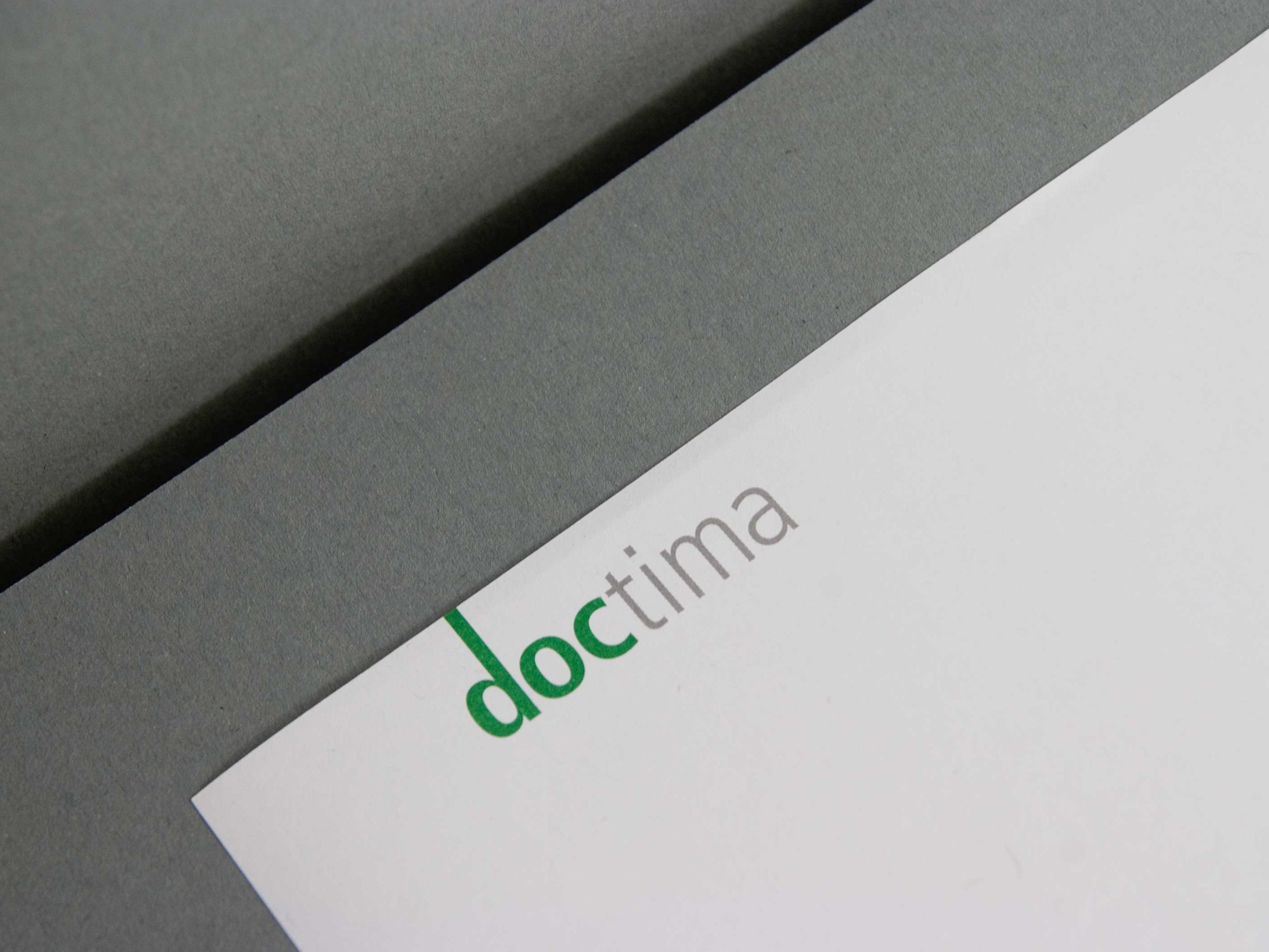
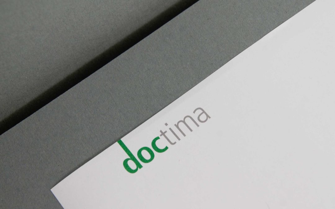
2bu design developed a Corporate Design, that makes this expertise visible: from the font and colour definitions to the imagery. The result is a brand identity that not only conveys comprehensibility, but Visibly designed.
The new website is the digital centrepiece of the doctima – brand and the central place where Strategy, design and content flow together. 2bu design developed the entire concept of the Corporate WebsiteInformation architecture, UX design, visual language, text principles and design guidelines. The aim was to develop doctima online as Competent and accessible brand which itself proves what it promises – to make complex topics simple.
The digital design follows a clear logic: Visual calmness, high readability and intuitive navigation. The modular structure makes it possible to flexibly expand content without fragmenting the appearance. This means that doctima remains consistent at all levels – from the homepage to blog posts and specialist articles.
The Corporate Website was designed to work strategically for the brand: it creates visibility, strengthens the perception of the company as an expert in language consulting and conveys the doctima values – precision, clarity and reliability – in every detail.
Give-away and Christmas greeting
Even small Brand experiences count. As Give Away Something extraordinary is being created for Christmas: a stamp with a Christmas greeting. The accompanying modern postcards with a Christmas print can be printed with it. Lovingly created pictograms provide the instructions.
The whole thing is supplied in a beautiful box with a – ink pad and enclosed in a banderole with a Christmas pattern. Incidentally, this consists of the letters of the logo which, when turned correctly, form “snowflakes”.
These details show how Brand identity through consistent design continues in every medium – from the document to the gift.
by Katrin Tindler-Kempen | 26 Oct 2021
Women's business directory
Basics Logos, typography, visual language, graphic elements Stationary Business card, letterhead, stamp, envelope MultimediaWebsite Messaging Folding flyer GuidelinesCD manual
Visibility and networking for business women
The task consisted of creating a B2B directory to create the Business women, Founders and small companies networked with each other. The branding should be both Professionalism and a sense of communityconvey. The aim was to Brand identity to develop the Expertise, Trust and Cohesion and at the same time the Business orientation of the target group is emphasised.
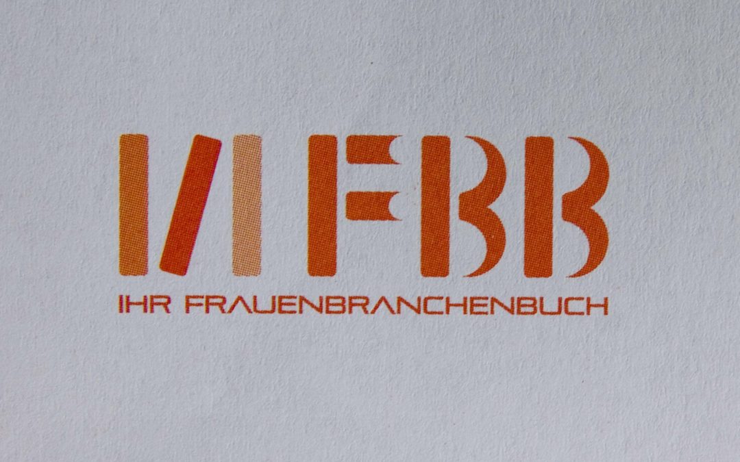
The Illustration style is correspondingly young and dynamic. The new corporate colour orange is used as a fresh accent.
Modern design for professional B2B contacts
The strategy of 2bu design focussed on a Corporate Design, that B2B professionalism with the energy and creativity of female entrepreneurs. Colour schemes, typography and imagery were deliberately chosen to communicate trust, competence and cohesion.
In addition Graphic elements developed to promote co-operation and exchange visualise. The central visual patterns is derived directly from the figurative mark and represents a network.
At second glance, you realise that the Figurative mark FBB consists of books: an open book, a standing book and a lying book. This creates a clear link from the modern online business directory to the original book format – Corporate design that combines tradition and innovation connects.
The business equipment: simple and high-quality
The new Corporate Design of the Women's Business Directory is Clear, bright, modern and inviting, professional enough to B2B contacts credibly. The Office equipment – from letterheads to business cards and envelopes – has been consistently developed with graphic patterns which are derived from the figurative mark FBB.
The pattern is used subtly on the back of the letterheads and business cards and creates a high value and a high recognition value. Every colour, every graphic accent was deliberately chosen in order to Strengthen brand identity and the Professionalism of women in business networks visible.
Experience branding: Sealing for business women
To match the envelopes, a Stamp developed that „seals“ content and at the same time creates a feeling of Exclusivity mediated. This creates a privileged community of the FBB members.
The stamp is also used for Bonus booklet distributed at events and give participants the feeling that they are part of a visible, high-quality B2B community to be. This small, loving design solution not only conveys brand value, but also creates a Haptic brand experience, that will be remembered.
Making the community visible with testimonials
The Storytelling is central to the brand impact of the Frauenbranchenbuch. Real business women tell their stories. Every testimonial is individual and reflects the diversity of FBB members – from female founders and freelancers to established female entrepreneurs.
These stories are told in graphic speech bubbles that immediately establish a visual connection to communication, exchange and networking. The testimonials create Attention (Attention), their quotes awaken Interest, and the overall picture of the collaborative platform creates the Desire, to become part of the community themselves. The managing director rounds off the storytelling by saying in her speech bubble calls to action (Action)„Join!“
This combination of high-quality design and authentic storytelling makes the FBB brand not only visible, but also tangible, conveys professionalism and at the same time strengthens the B2B positioning for business women.