

Creativity meets sustainability - our insights
Behind every brand is a vision - and with a clear branding strategy, it becomes visible. In our blog, we share valuable insights into sustainable design, authentic marketing and well thought-out brand communication. Our goal: to combine creativity with sustainability and create brand identities that are not only visually convincing.
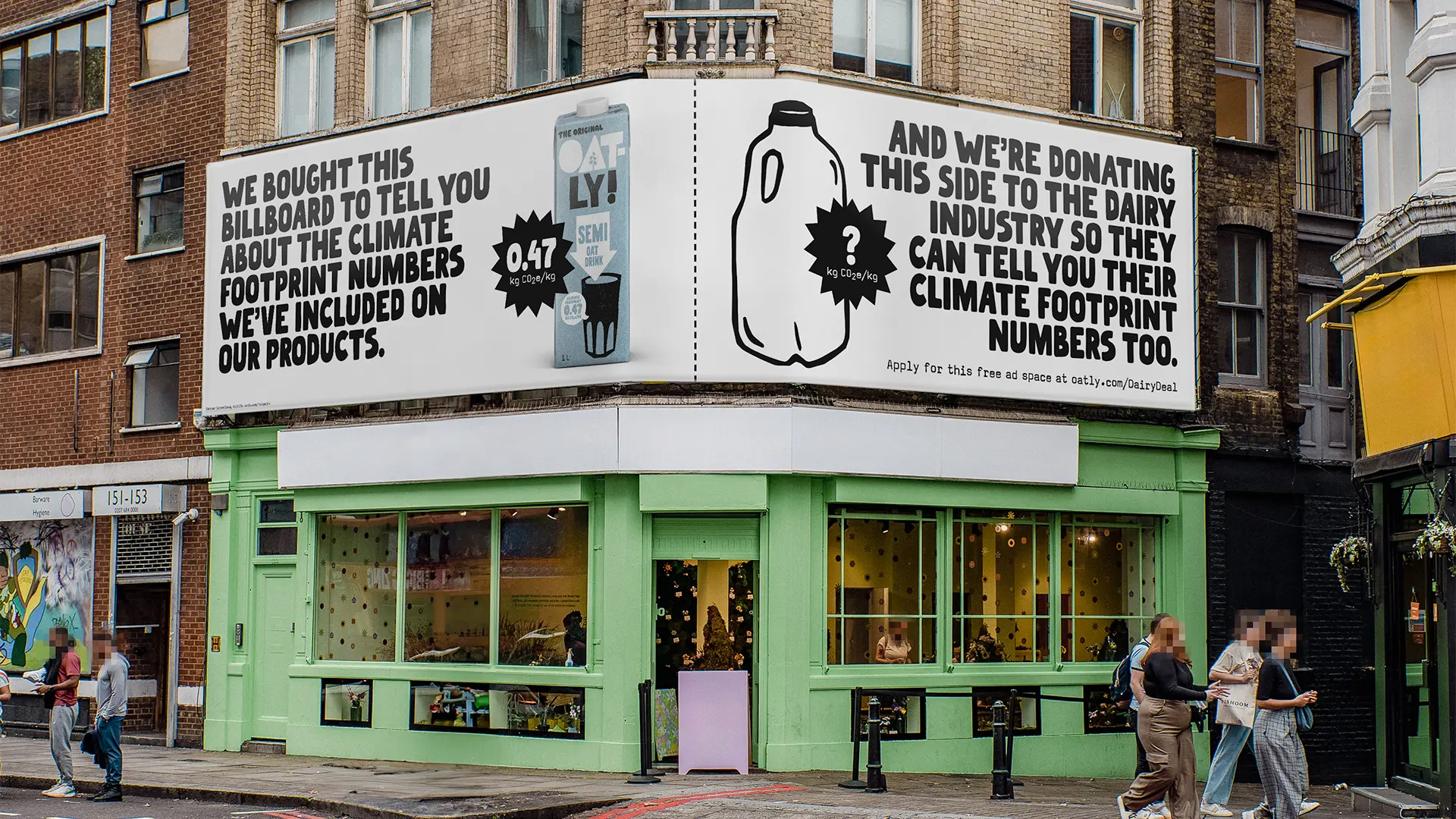
Oatly: How humour and tone of voice became the strongest brand strategy
Pilar Font – Art deco typography for strong brand identities
Forager Font - Expressive display font for bold branding with attitude
Call-to-actions in social media - how sustainable brands get people to take action

Understanding website hosting: Which solution suits you and your budget
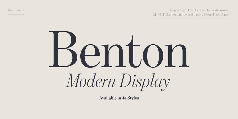
Benton Modern - classic serif font for editorial design with attitude
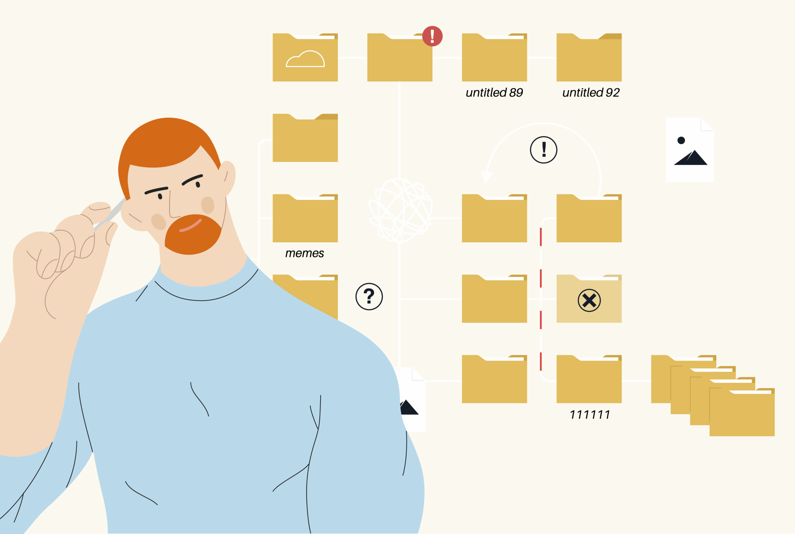
Which file formats does my branding need?

The 5 phases of the customer lifecycle - explained for sustainable companies

Images for websites - between aesthetics and loading time