by Katrin Tindler | 29 Oct 2021
Campaigns Adverts, posters
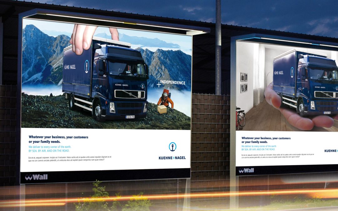
"In good hands" – Trust as a brand experience
The strategic idea of 2bu design: All transport routes – land, air and sea – are visually connected with each other. Instead of showing anonymous logistics processes, people take centre stage. The customer becomes part of the story.
This creates a emotional branding, that combines technical expertise with proximity and reliability – values that go beyond pure price and performance in international B2B business. The campaign gets to the heart of the brand: „Your goods in good hands“ – is a message that combines safety, efficiency and personal responsibility.
Precision meets personality
The campaign concept translates the strategic idea into a Expressive imagery. With a A winkThe images show surprising everyday scenes in which Kuehne + Nagel is closer to its customers than ever before. The visual language combines Precision, clarity and sympathetic staging – makes logistics an emotional experience.
The design works with reduced typography, bold colours and strong contrasts, that support the global brand image while remaining regionally customisable. Whether print, online or trade fair communication – creates the campaign a consistent brand experience, which is both Internationally convincing as well as locally.
by Katrin Tindler | 28 Oct 2021
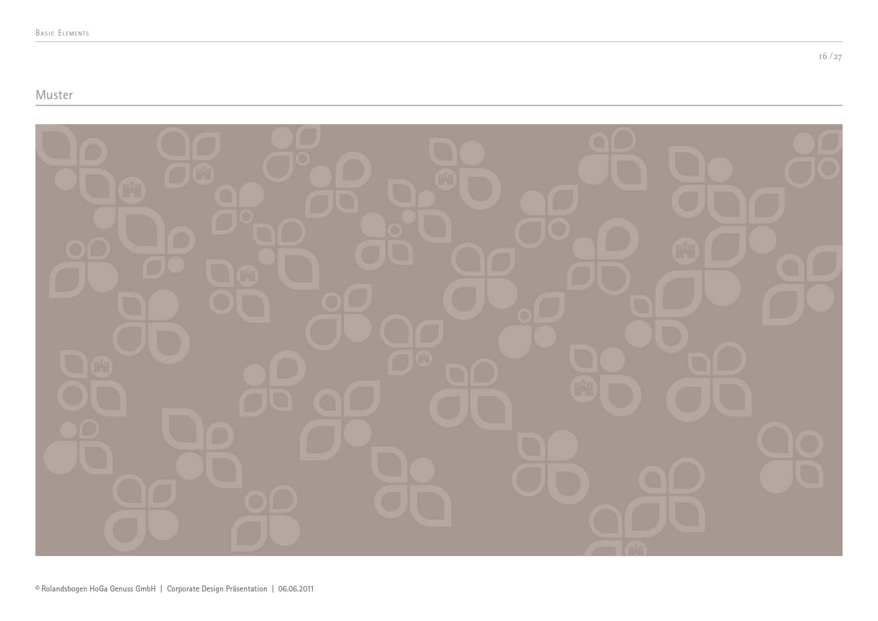
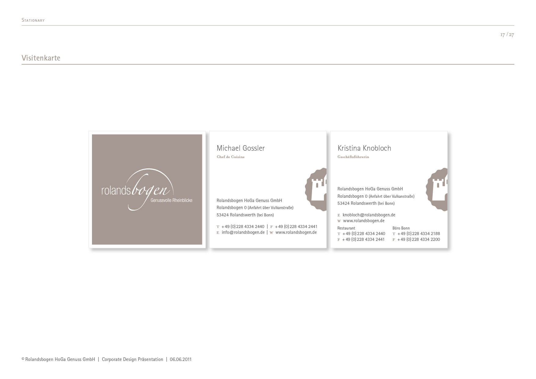
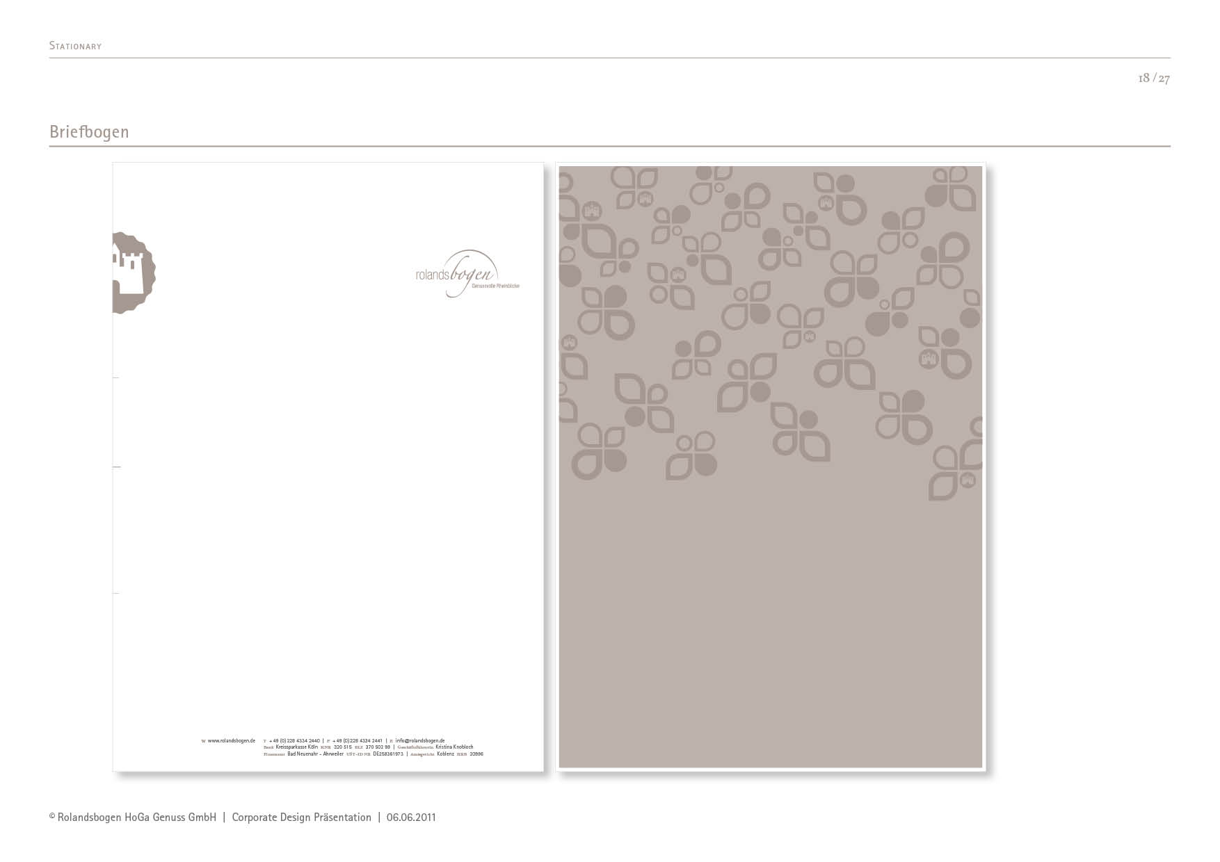
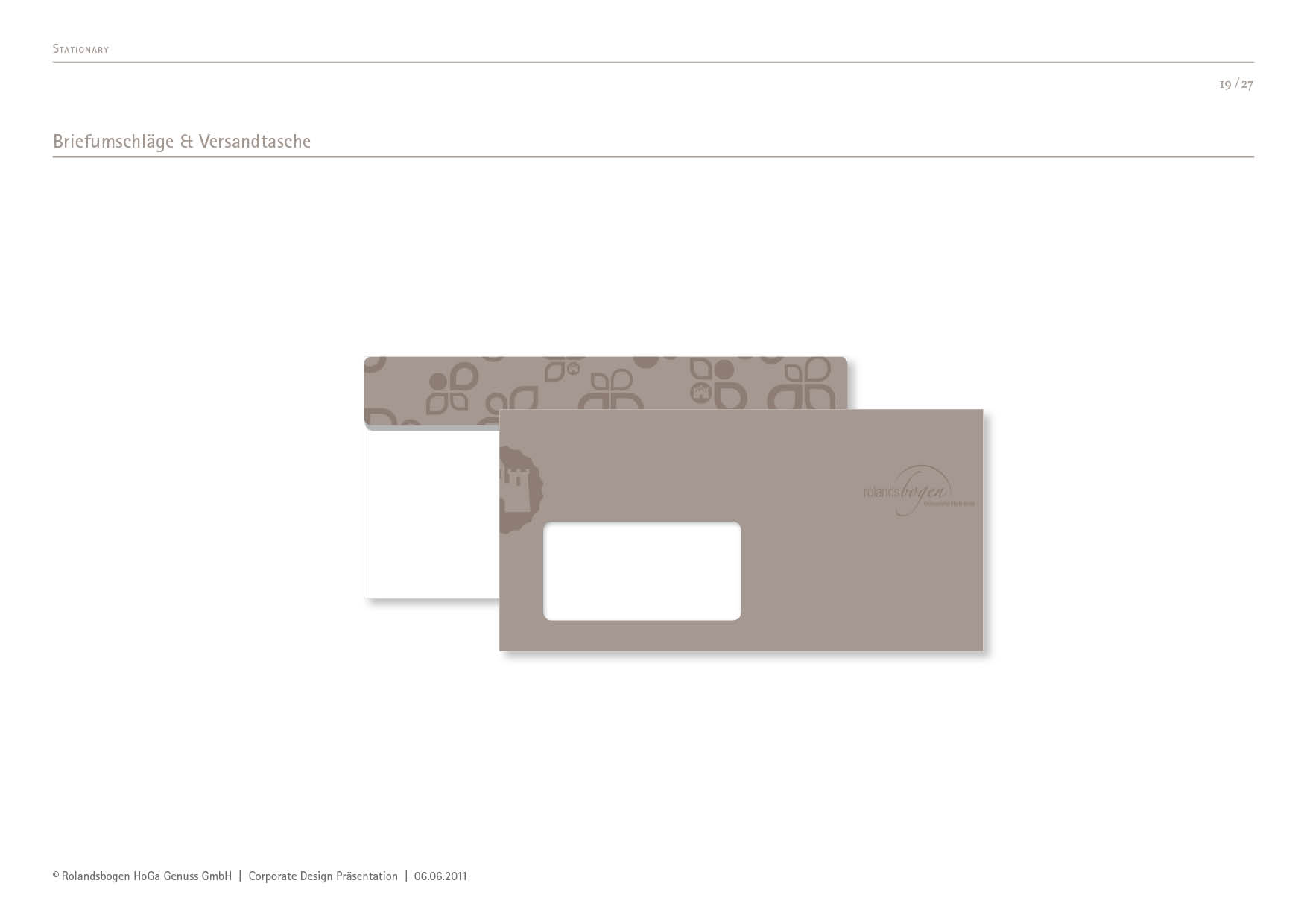
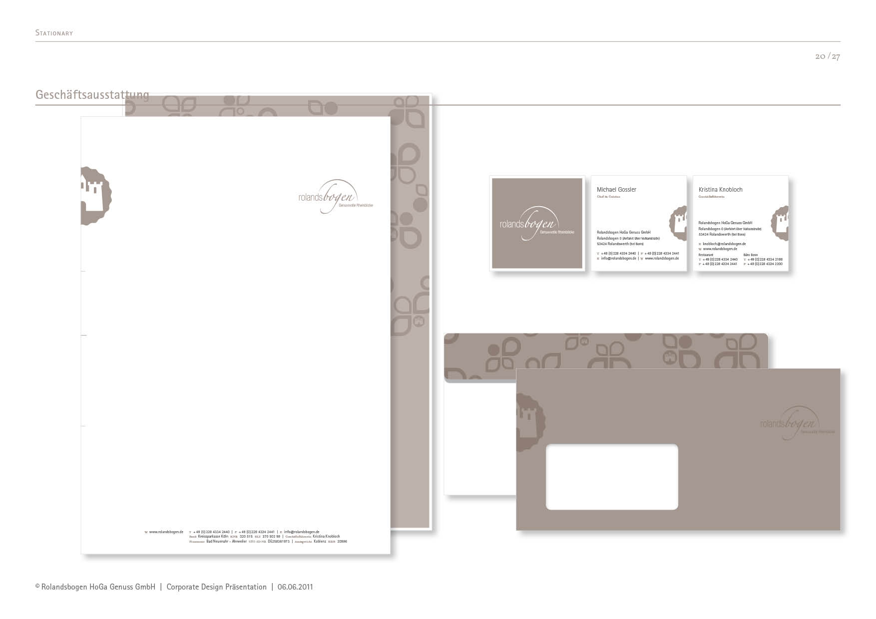
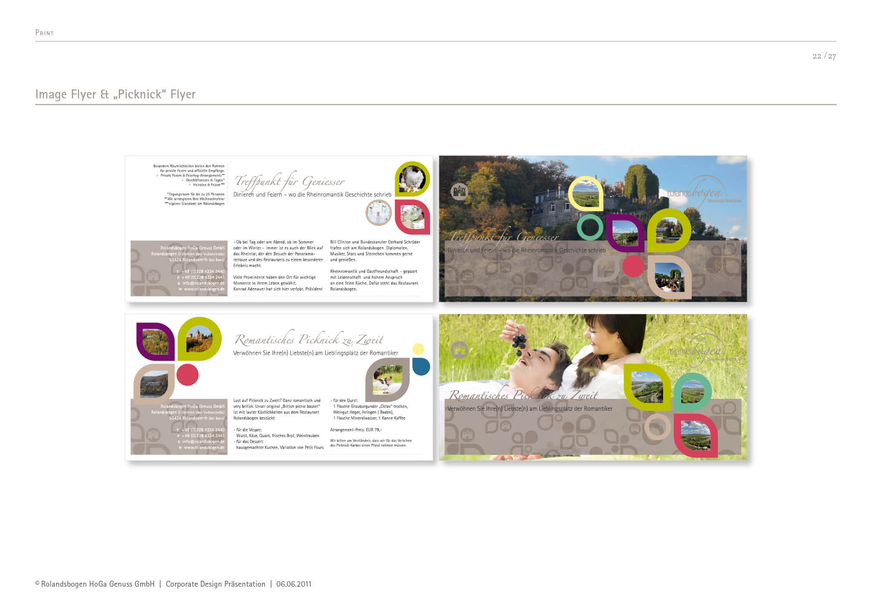
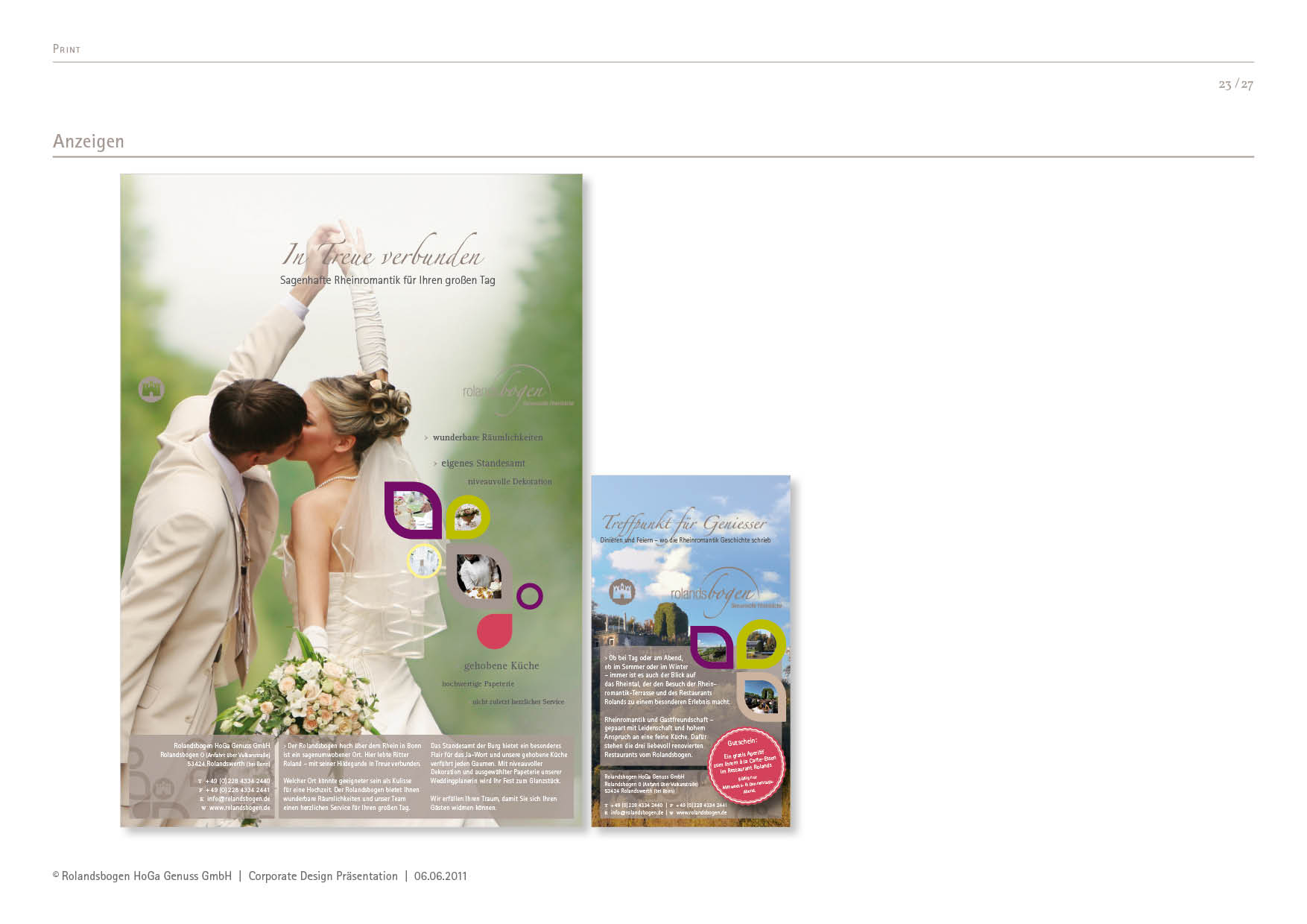
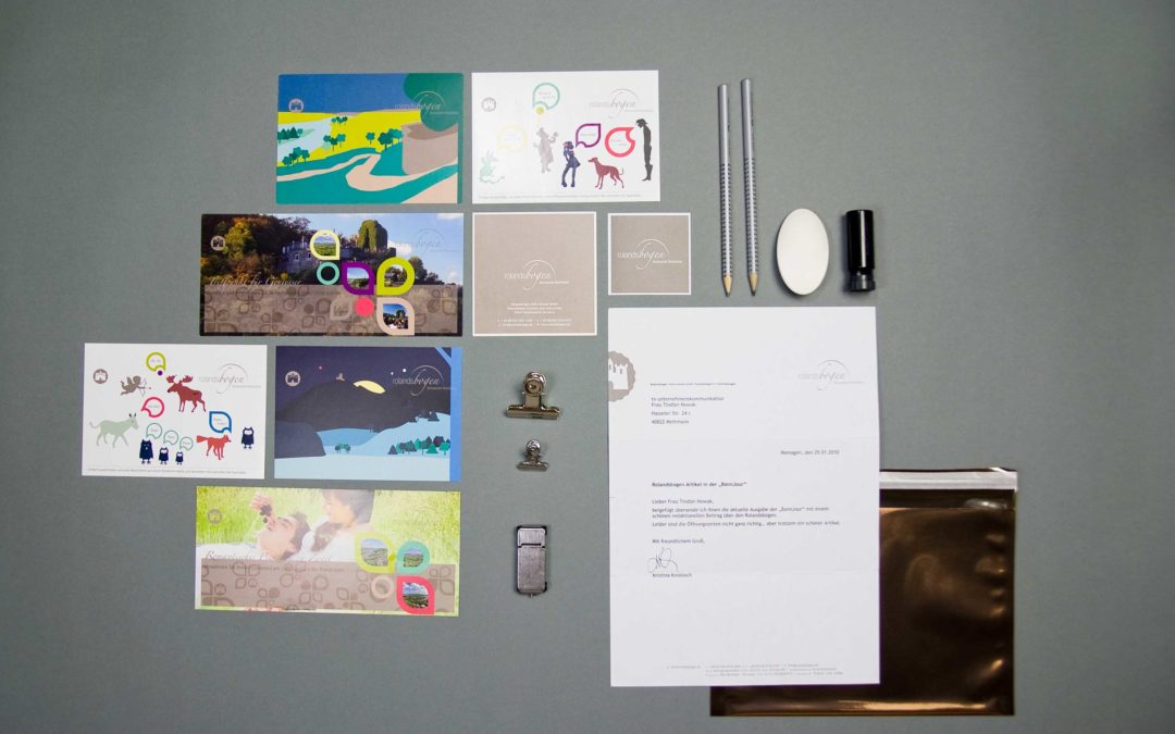
Basics Logos, typography, visual language, graphic elements Stationary Business card, letterhead, stamp, envelope, waiter's pad, directions sketch Enviroment Interior design advice Product Wine label, mulled wine glass, food & drink menu for the Roland's, the Rhine Romantic Terrace and Freiligrath's treasure trove Campaigns Adverts, posters, roll-ups Messaging Brochure, stamp booklet Events Performance at the “I love Bonner Bogen” festival Guidelines CD manual
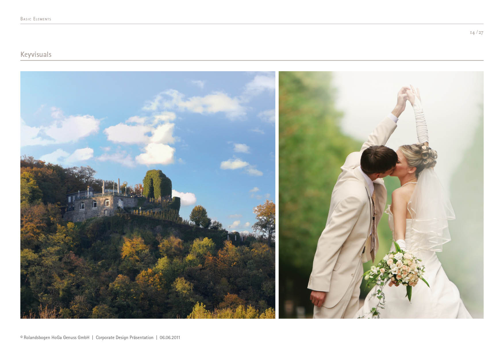
Brand strategy with vision
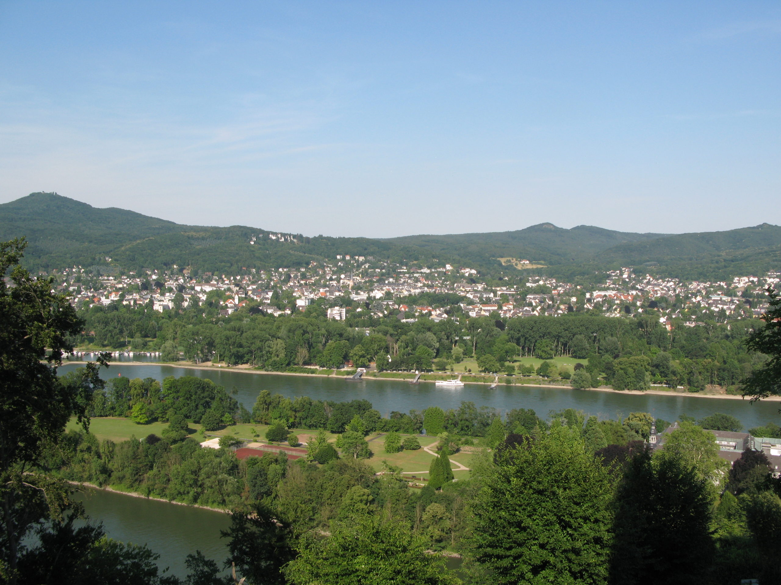
The Rolandsbogen looks back on a long history. As early as the 19th century, it became a meeting place for students, poets and thinkers - a place where culture and nature merge. This special atmosphere was the basis for our Branding strategy:
We developed a Brand identity, which does not conserve the historical heritage, but retold - as a link between past and present.
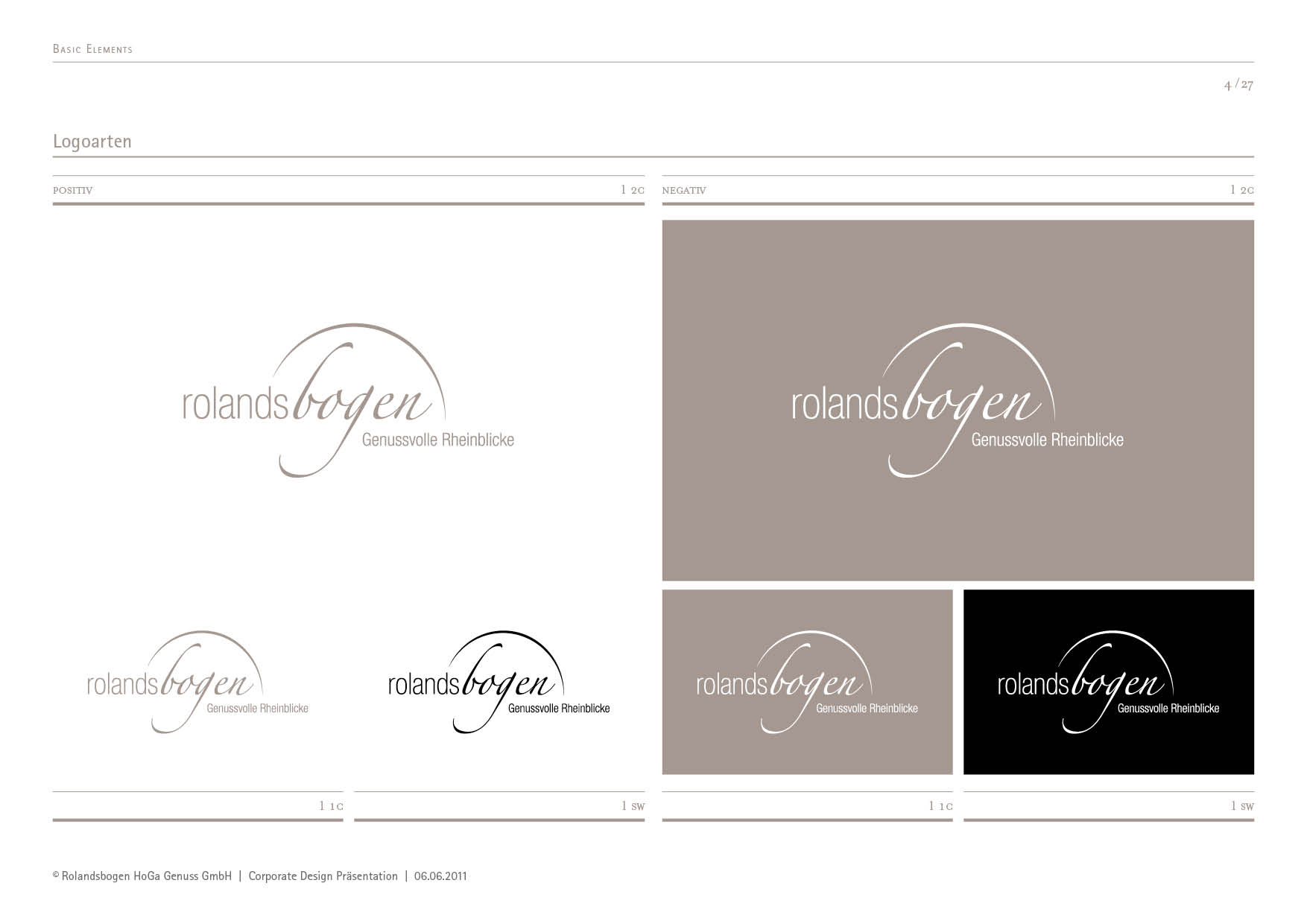
The result is a Corporate Design, that shows attitude: authentic, reduced and yet emotional. This is how tradition a brand promise.
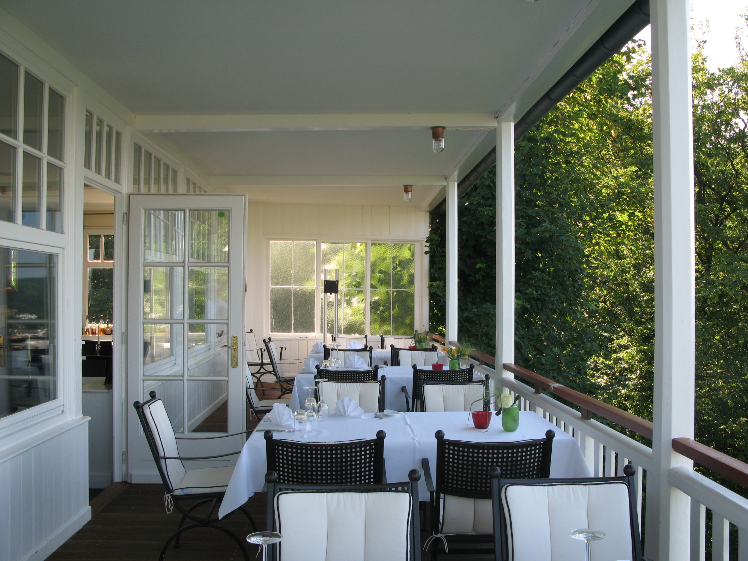
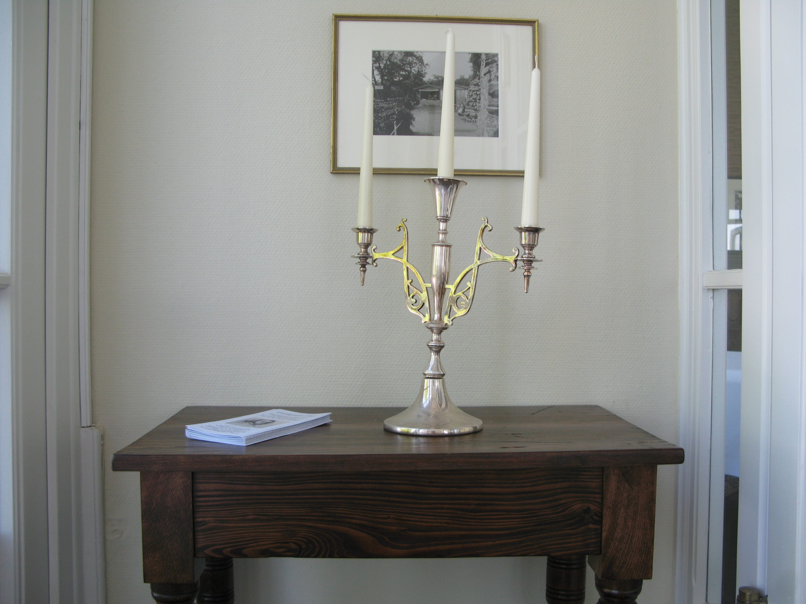
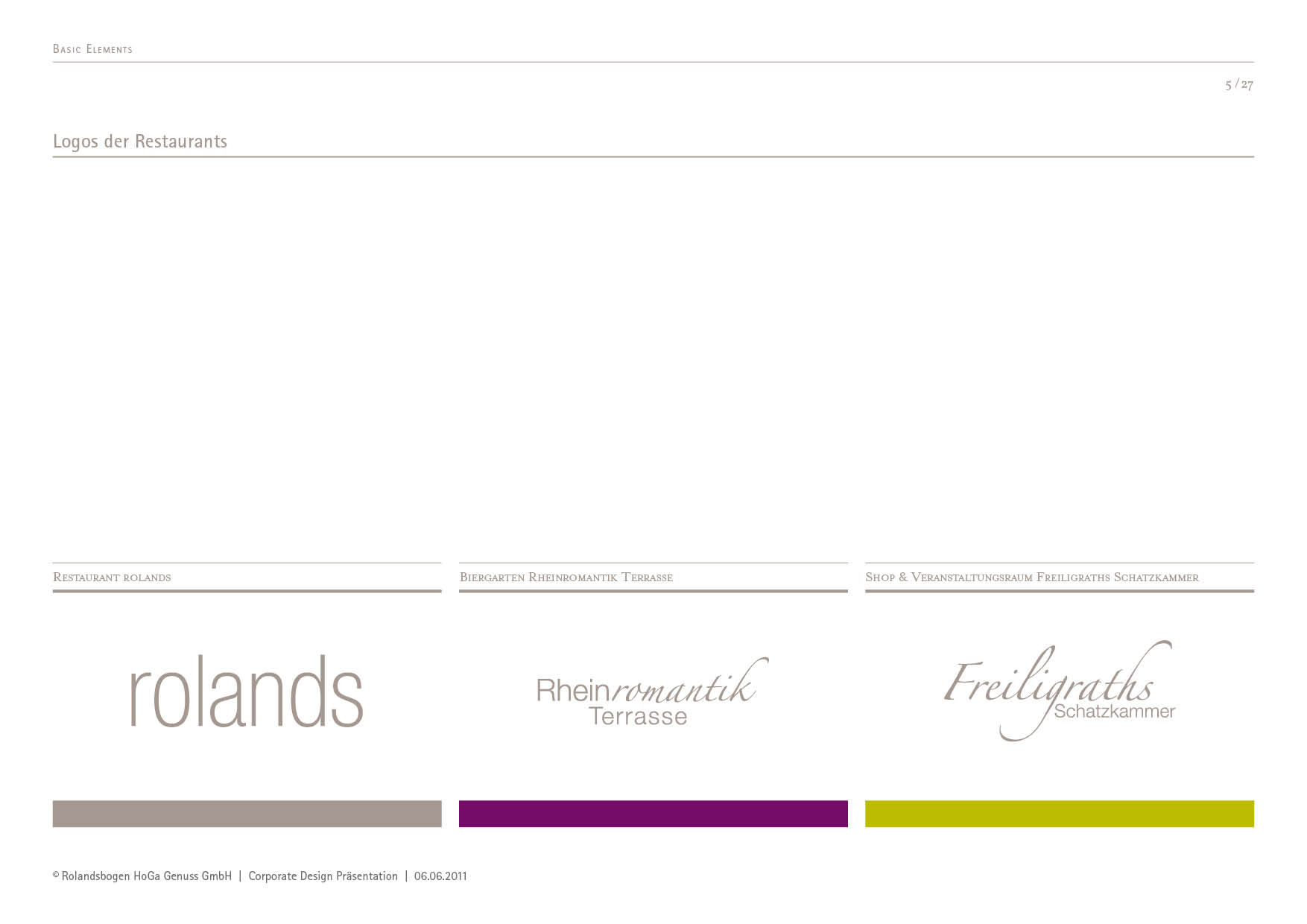
Corporate design for catering
Customised modern menus become an auspicious introduction to all the delights that follow. Three restaurants, one experience: the Rolandsbogen unites Fine Dining, regional cuisine and Event catering under one roof. 2bu design developed a well thought-out Design system, that creates solidarity and at the same time visualises the personality of each concept.
From the oversized A3 card with a haptically appealing envelope to the acrylic placemat and the wooden clipboard, everything was also stylishly finished with embossing or engraving. Important for every menu card: the card contents must be quick and inexpensive to replace.
Together they form a consistent Corporate design for the catering industry, that creates recognition and arouses emotions. At the same time, everything remains practical: content can be Replace quickly and cost-effectively, without jeopardising the high-quality brand image.
Since 1929, the Rolandsbogen has stood for hospitality, quality and consistency. Over generations, it has grown into a brand that is now recognised far beyond Bonn.
2bu design translated this heritage into a Contemporary rebranding, that convinces both visually and strategically:
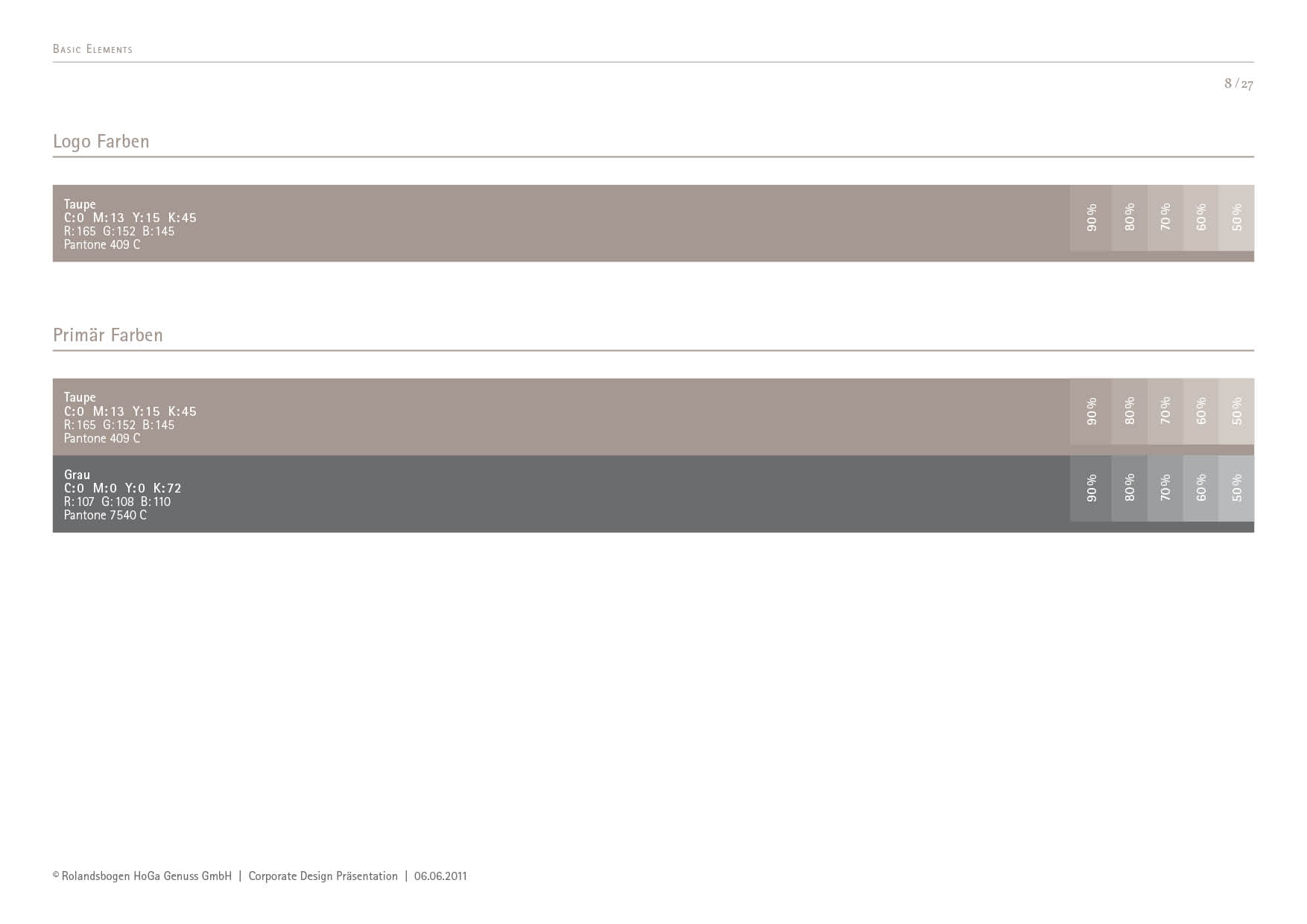
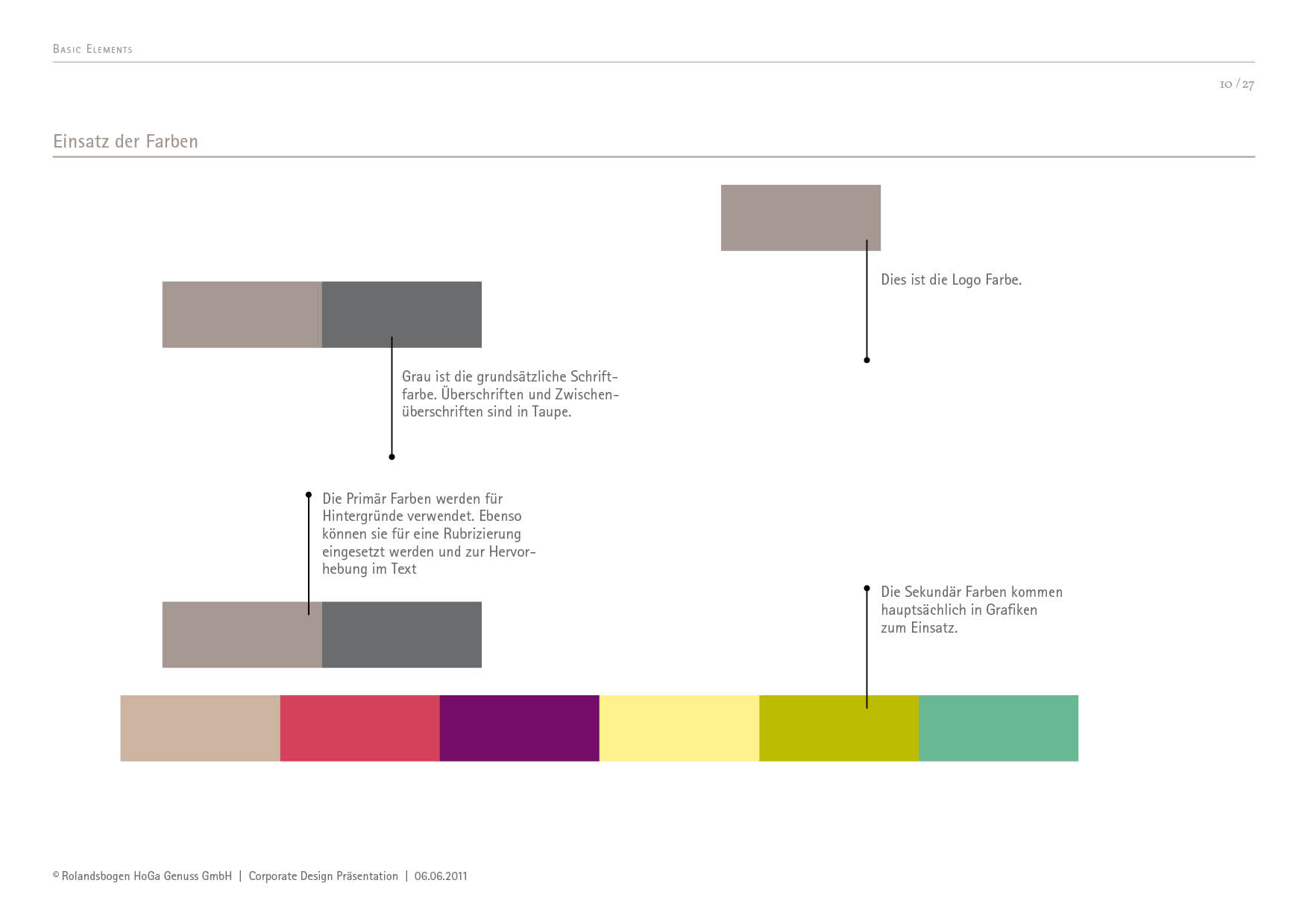
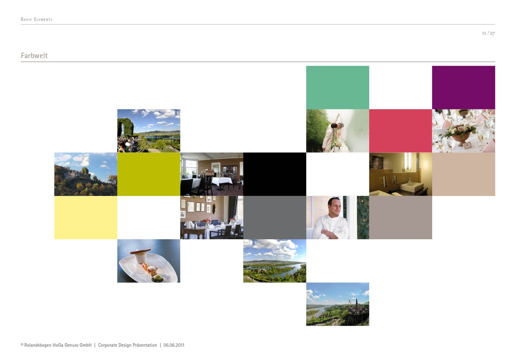
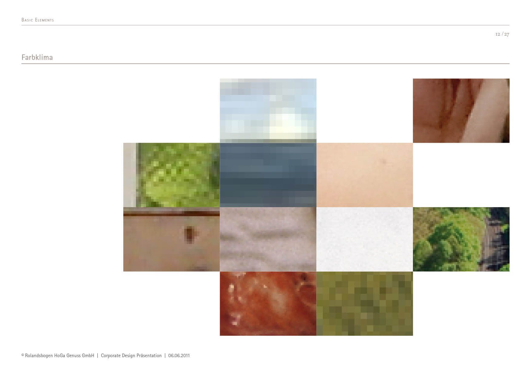
Clear logo, calm typography, modern colour scheme - the new corporate design combines Historical depth with timeless elegance.
This makes the Rolandsbogen not just an excursion destination, but a Brand with attitude and recognition value.
Event branding with identity
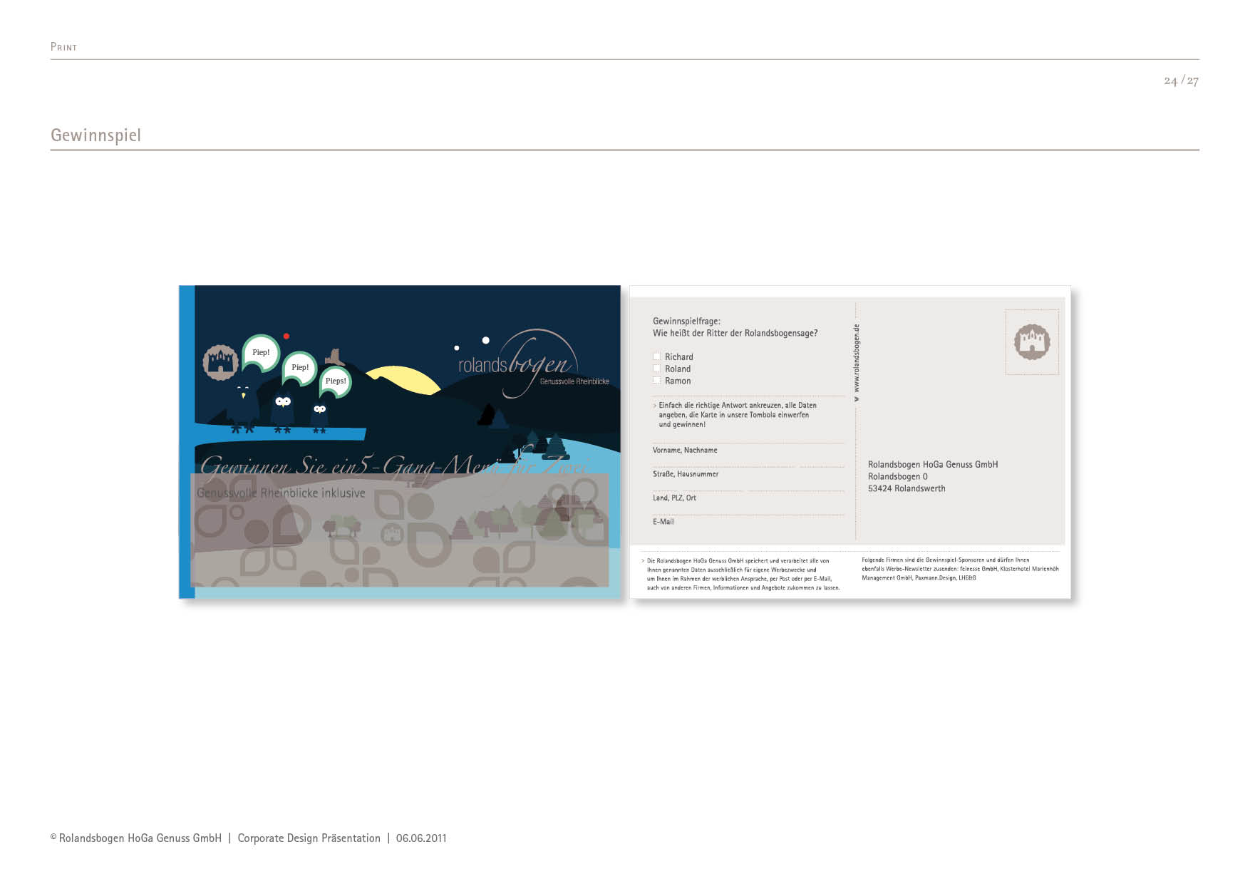
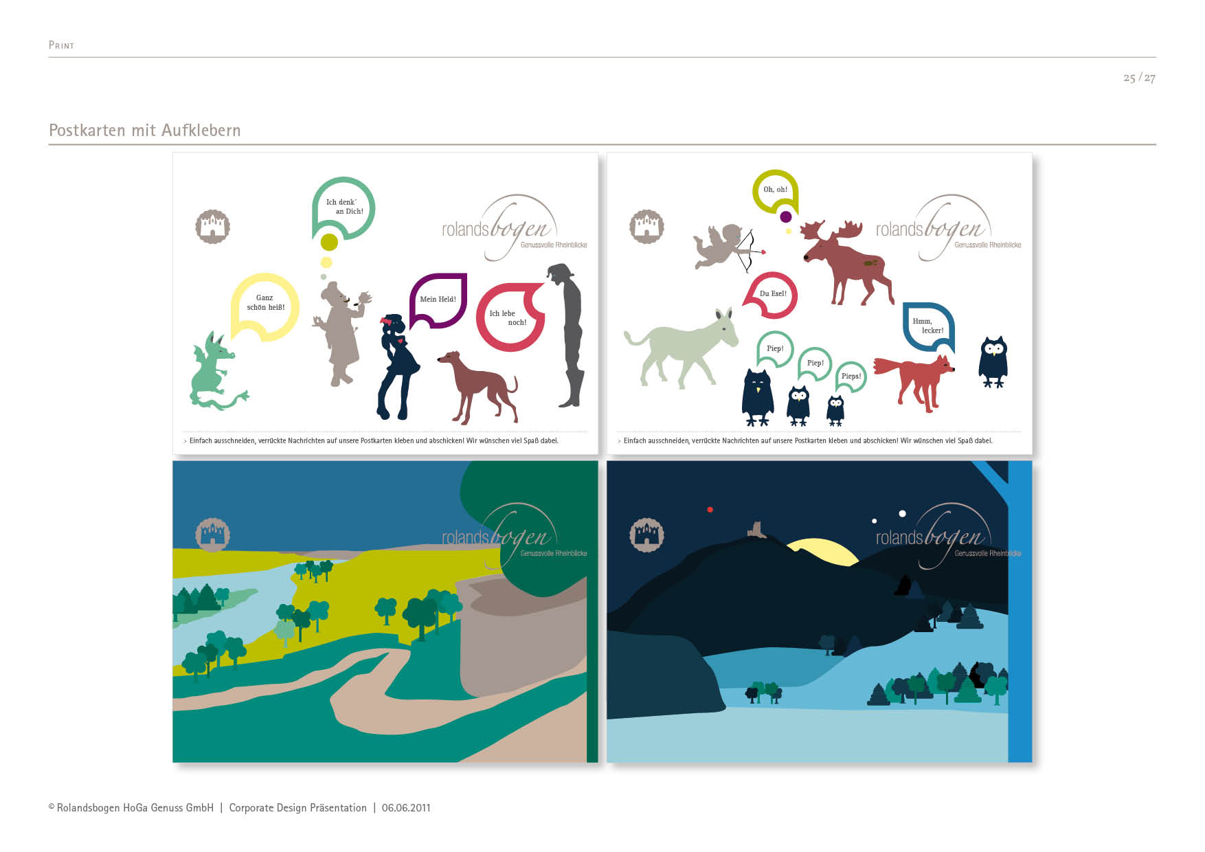
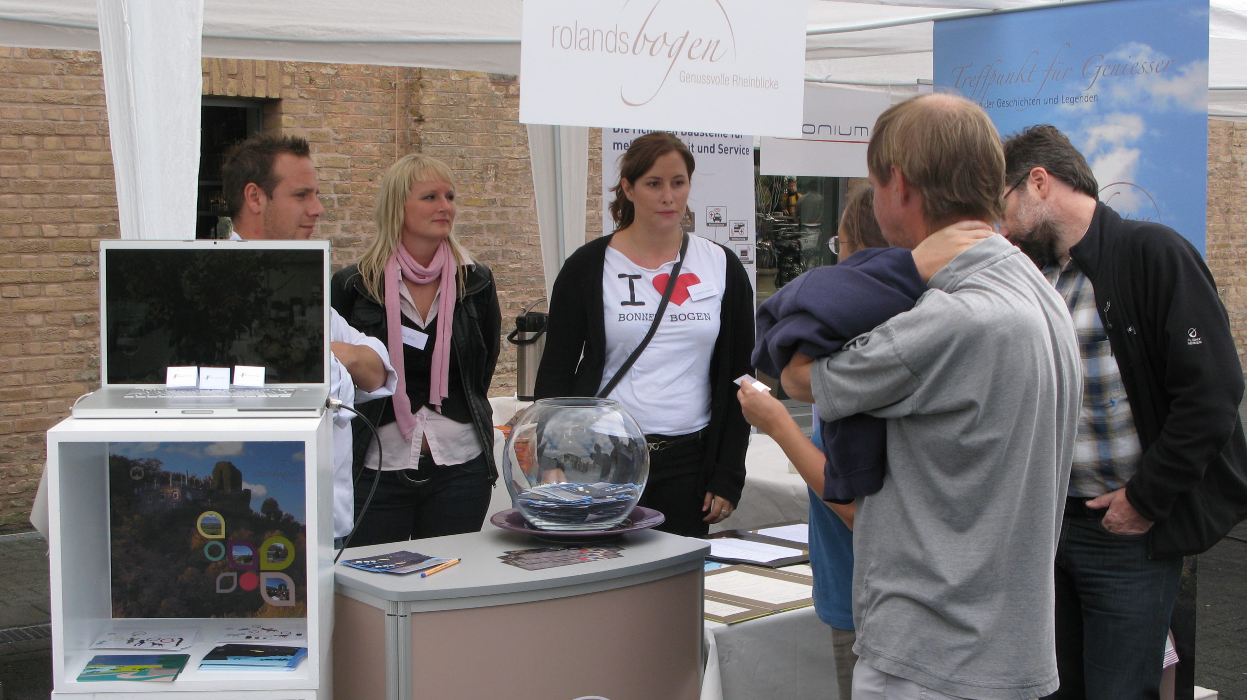
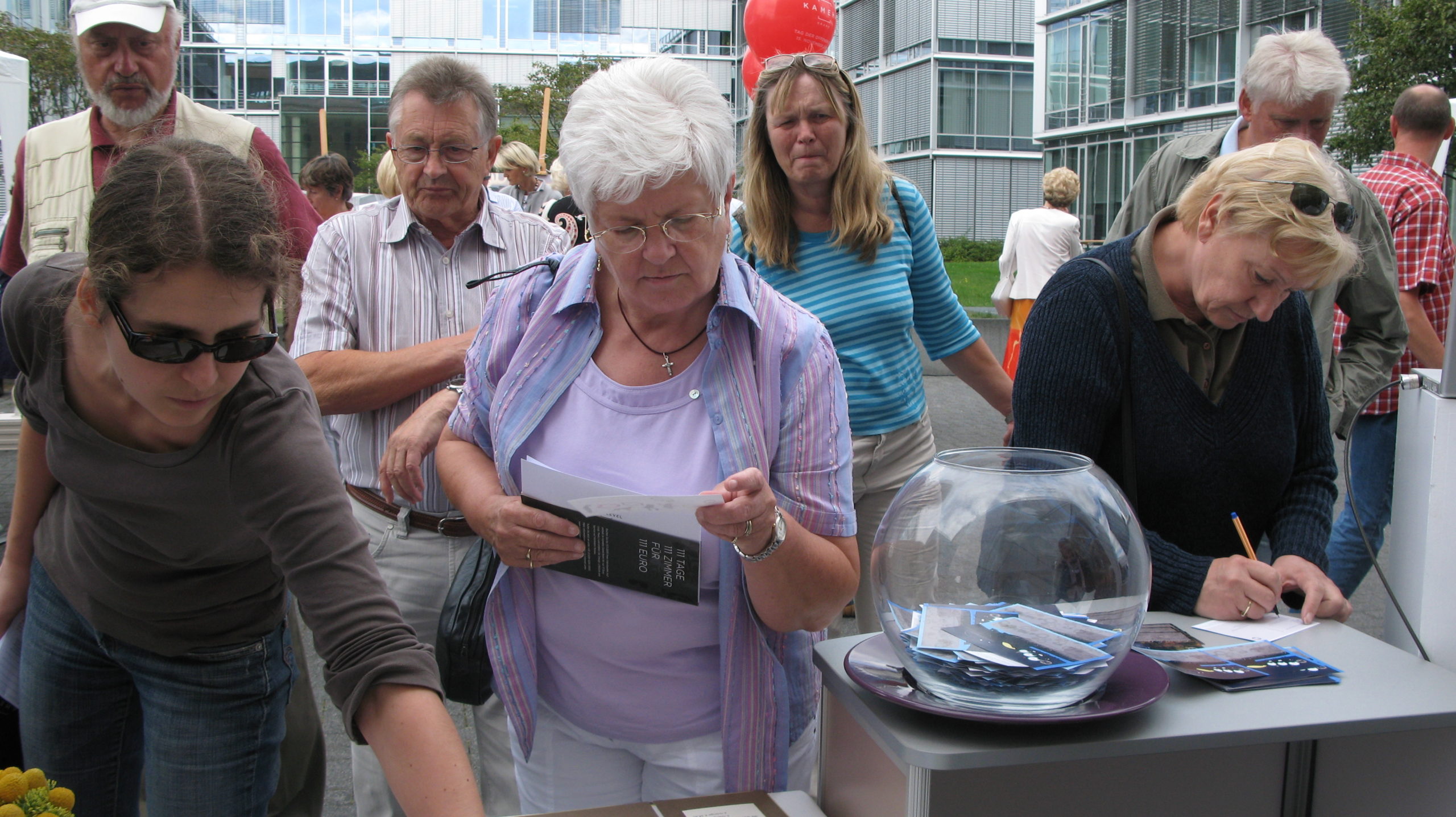
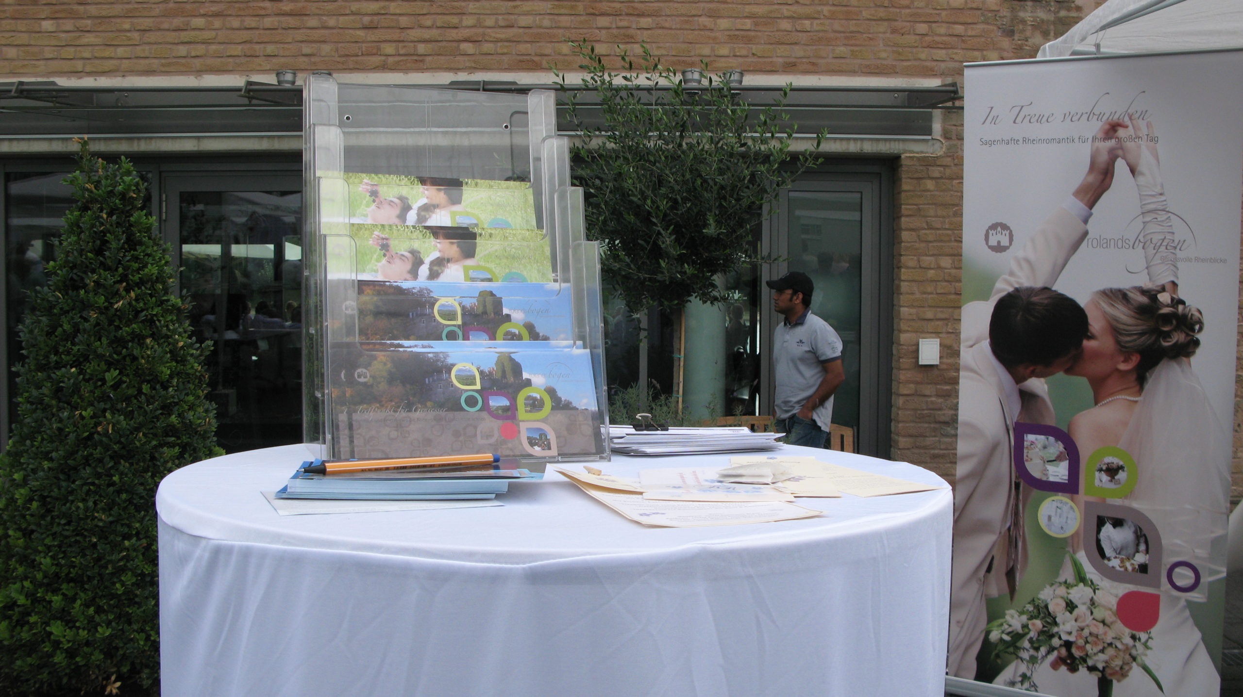
The new brand identity was brought to life at the „Open Day“ at Bonner Bogen in 2009. 2bu design created the entire Event branding - from the visual guiding idea to the Give-aways.
The concept was based on Emotional brand communication: lovingly designed postcards about the legend of the Roland Arch could be individually labelled and sent.
This is how a local event became a Authentic brand staging, that connects people - with history, design and emotion.
by Katrin Tindler | 27 Oct 2021
Basics Typography, visual language, graphic elements StationaryBusiness card, letterhead, sticker, envelope, mailing folder Multi Media Webdesign, Powerpoint Communication Brochures, X-Mas mailing
Documents optimised for efficient communication
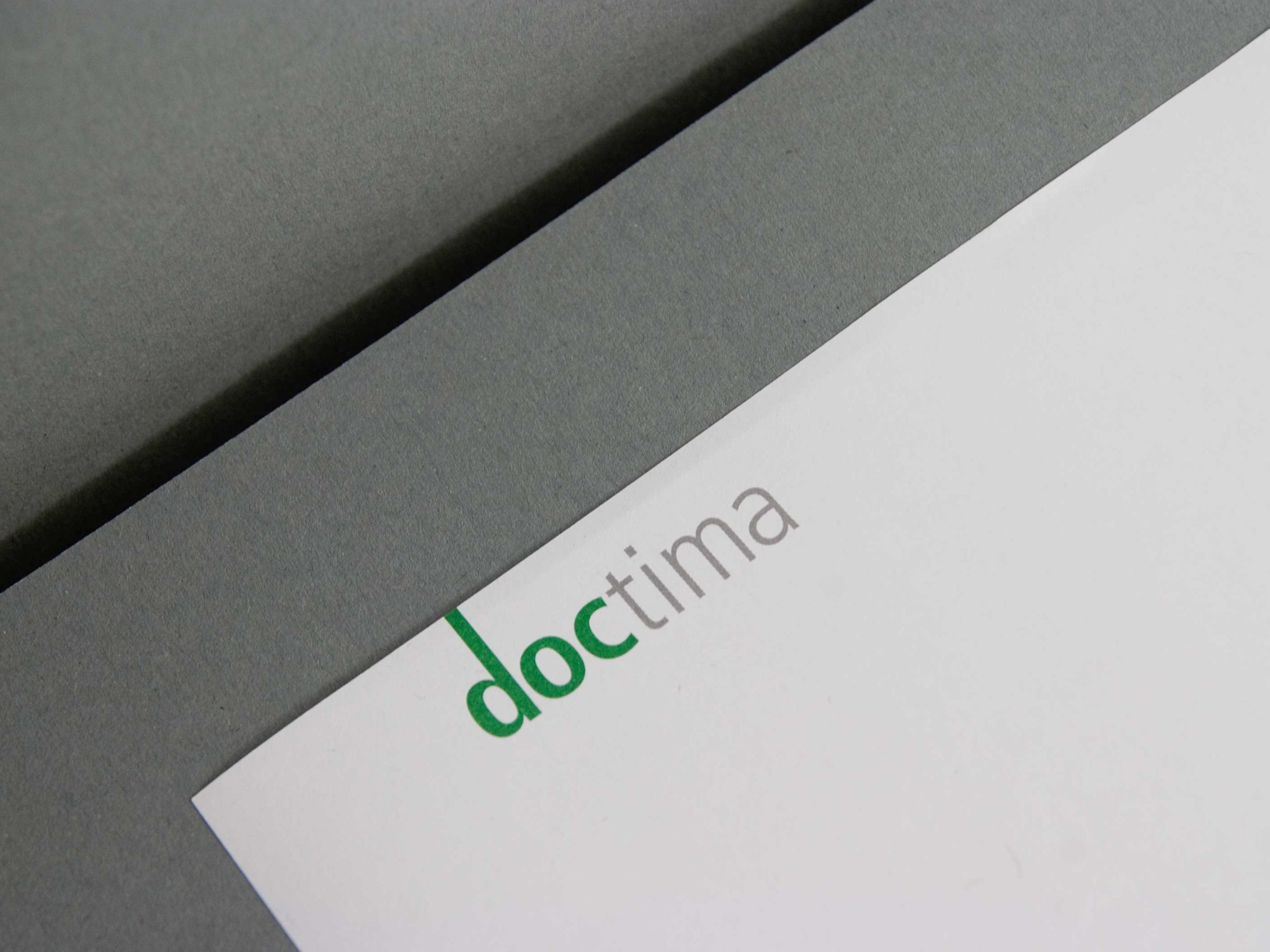
At doctima you will find Customer communication, Service forms and interactive media took centre stage. The aim was to prepare complex documents in such a way that they are accessible to all target groups. Easily accessible, efficient to use and brand coherent are.
In the Brand strategy language was defined as the core of the brand: Only those who communicate clearly are credible. This principle was translated visually by – through clear lines, well thought-out typography and a calm, uncluttered design.
Communication: Precise and legally compliant
Sectors such as banking, insurance and health insurance live from Precise and legally compliant communication. doctima stands for this translation service between technical language and everyday life.
2bu design developed a Corporate Design, that makes this expertise visible: from the font and colour definitions to the imagery. The result is a brand identity that not only conveys comprehensibility, but Visibly designed.
The new website is the digital centrepiece of the doctima – brand and the central place where Strategy, design and content flow together. 2bu design developed the entire concept of the Corporate WebsiteInformation architecture, UX design, visual language, text principles and design guidelines. The aim was to develop doctima online as Competent and accessible brand which itself proves what it promises – to make complex topics simple.
The digital design follows a clear logic: Visual calmness, high readability and intuitive navigation. The modular structure makes it possible to flexibly expand content without fragmenting the appearance. This means that doctima remains consistent at all levels – from the homepage to blog posts and specialist articles.
The Corporate Website was designed to work strategically for the brand: it creates visibility, strengthens the perception of the company as an expert in language consulting and conveys the doctima values – precision, clarity and reliability – in every detail.
Give-away and Christmas greeting
Even small Brand experiences count. As Give Away Something extraordinary is being created for Christmas: a stamp with a Christmas greeting. The accompanying modern postcards with a Christmas print can be printed with it. Lovingly created pictograms provide the instructions.
The whole thing is supplied in a beautiful box with a – ink pad and enclosed in a banderole with a Christmas pattern. Incidentally, this consists of the letters of the logo which, when turned correctly, form “snowflakes”.
These details show how Brand identity through consistent design continues in every medium – from the document to the gift.