Customer
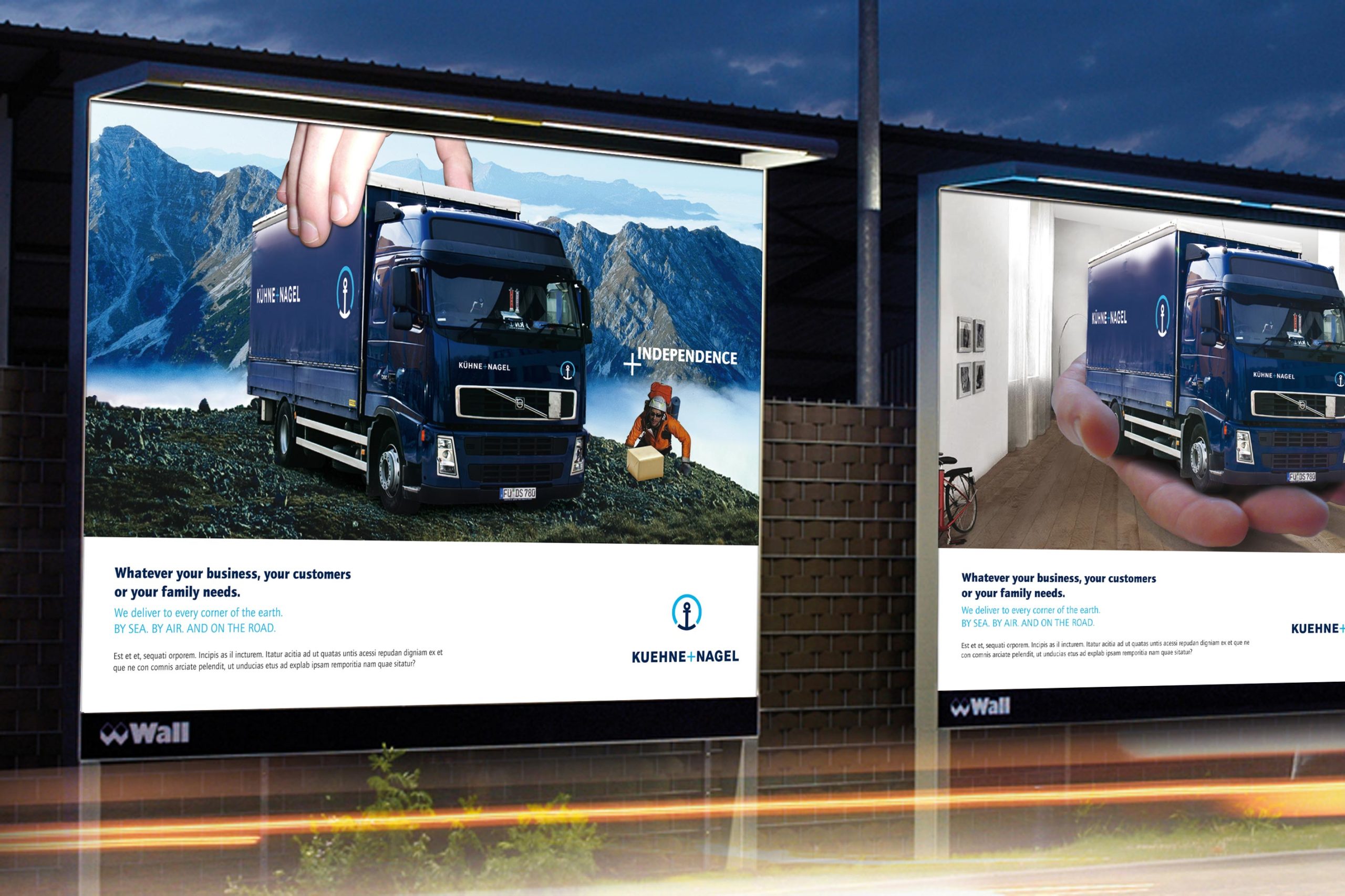
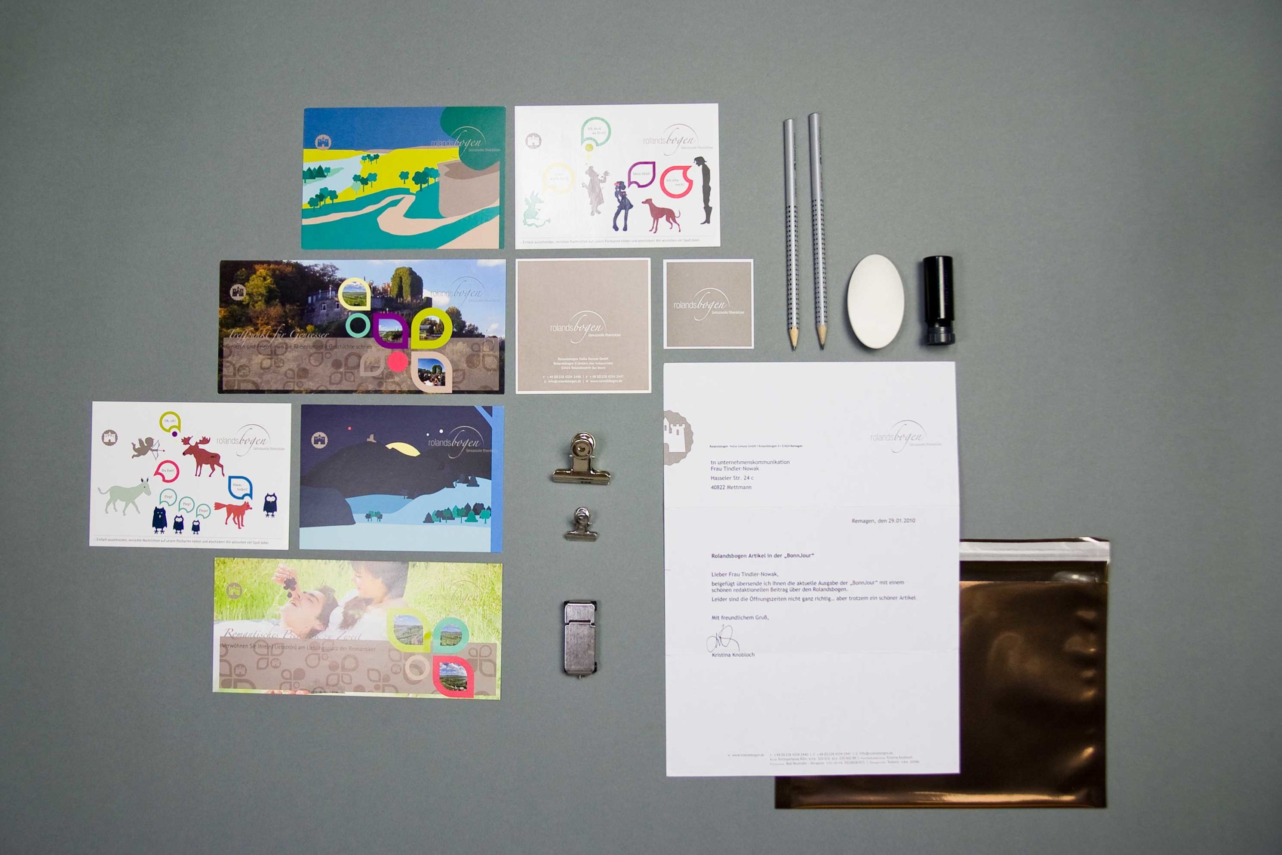
Roland Arch
Services
Basics Typography, visual language, graphic elements StationaryBusiness card, letterhead, sticker, envelope, mailing folder Multi Media Webdesign, Powerpoint Communication Brochures, X-Mas mailing
doctima - Clear design for comprehensible communication
doctima supports companies and institutions in communicating complex content clearly and comprehensibly. As a brand with a focus on business linguistics, doctima attaches particular importance to language strategy, text optimisation and a consistent corporate design that transforms information into impact. 2bu design developed the – branding with a clear structure, visual calm and precise language. The result is a brand identity that creates trust and makes comprehensibility a brand.
Documents optimised for efficient communication
At doctima you will find Customer communication, Service forms and interactive media took centre stage. The aim was to prepare complex documents in such a way that they are accessible to all target groups. Easily accessible, efficient to use and brand coherent are.
In the Brand strategy language was defined as the core of the brand: Only those who communicate clearly are credible. This principle was translated visually by – through clear lines, well thought-out typography and a calm, uncluttered design.
Communication: Precise and legally compliant
Sectors such as banking, insurance and health insurance live from Precise and legally compliant communication. doctima stands for this translation service between technical language and everyday life.
2bu design developed a Corporate Design, that makes this expertise visible: from the font and colour definitions to the imagery. The result is a brand identity that not only conveys comprehensibility, but Visibly designed.
The corporate website
The new website is the digital centrepiece of the doctima – brand and the central place where Strategy, design and content flow together. 2bu design developed the entire concept of the Corporate WebsiteInformation architecture, UX design, visual language, text principles and design guidelines. The aim was to develop doctima online as Competent and accessible brand which itself proves what it promises – to make complex topics simple.
The digital design follows a clear logic: Visual calmness, high readability and intuitive navigation. The modular structure makes it possible to flexibly expand content without fragmenting the appearance. This means that doctima remains consistent at all levels – from the homepage to blog posts and specialist articles.
The Corporate Website was designed to work strategically for the brand: it creates visibility, strengthens the perception of the company as an expert in language consulting and conveys the doctima values – precision, clarity and reliability – in every detail.

Give-away and Christmas greeting
Even small Brand experiences count. As Give Away Something extraordinary is being created for Christmas: a stamp with a Christmas greeting. The accompanying modern postcards with a Christmas print can be printed with it. Lovingly created pictograms provide the instructions.
The whole thing is supplied in a beautiful box with a – ink pad and enclosed in a banderole with a Christmas pattern. Incidentally, this consists of the letters of the logo which, when turned correctly, form “snowflakes”.
These details show how Brand identity through consistent design continues in every medium – from the document to the gift.