
BRAND GUIDELINES
Basic Modules
Colours
Colours convey brand values, but they also organise content and guide the user. A good colour scheme distinguishes between primary colours (brand colours), secondary colours (complementary accents) and colours used for interactions and confirmations, such as for buttons, error messages or success messages. Consistent use ensures clarity in user guidance and a strong visual identity.
Primary Colours
The deliberate interplay of the primary colours creates a distinctive colour scheme that clearly defines our visual communication. Depending on the combination, they establish a clear association with the brand at the colour level alone. In conjunction with other design elements, they play a decisive role in shaping the characteristic look and feel of our brand identity.

Avocado Skin (main colour)
#00313c
Dark backgrounds, background post slider, top menu
Lemon Sobet (Highlight)
#c1fb69
Headings, hover buttons, hover icons, hover/active navigation, breadcrumb, links
Pumpkin Spice (Call to Action)
#fa6e43
Call to action, button, icons, shopping basket and search icons, crossed-out price, filter criteria, H4
Sage Butte (troublemaker)
#92aca0
Promotional items, special offers
Pink Grapefruit (accent)
#ffb3ab
another accent
Cashew Cream (light background)
#f6f0d8
Light-coloured backgrounds
Black Sesame (Lyrics)
#212322
Body text
Icing Sugar
#ffffff
Page background
Secondary Colours
The secondary colours are used specifically in the design of infographics, diagrams and illustrations. In other areas of brand communication, their use is deliberately avoided.
Accent
#000000
Body text
Light-coloured background
#f7f3ec
Light-coloured backgrounds
Black
#000000
Body text
White
#ffffff
Page background
Interaction & Validation Colours
Colours used for interactions such as hover, click or focus, as well as for validation states (e.g. success, error, warning), help users to navigate and provide feedback. They ensure intuitive operation and improve accessibility. Your application follows set rules to ensure consistency and recognisability in the digital space.
Success
#000000
Warning
#f7f3ec
Error
#d64228
Note
#ffffff
Lines
#e6e6e6
Fields
#f8f8f8
rgba(210,218,228,0.38)
Background (Hero et al.)
Colour code: #eef1f5
- without -
Menu: Background (overall)
- without -
Menu text, level 1 background
#5f6264
Menu text, level 1 selected
#ffffff
Second-level menu background
- Divi Standard -
Menu text, level 2 background
- without -
Menu text – Level 2 selected
- without -
Menu: Jewellery item (complete)
#5f6264
Menu text, level 1 :hover
- without -
Menu text, level 1 selected, background
#5f6264
Level 2 menu: Separator/Line colour
- Divi Standard -
Menu text, level 2 :hover
- without -
Menu text, 2nd level selected, background
#5f6264
Menu text, level 1
- without -
Menu text, level 1: :hover background
#5f6264
Hamburger
#5f6264
Second-level menu text
- Divi Standard -
Second-level menu text :hover background
#5f6264
Navigation menu, Product price
Typography
The main typeface forms the typographical backbone of the – brand identity; it ensures consistency, legibility and recognisability across all media. It is complemented by an accent typeface, which is used specifically for particular content, such as quotations. The font hierarchy organises content in a clear and visually intuitive way: it distinguishes between headings, body text, subheadings, etc. – and guides users intuitively through the content.
Text
4Topline H4 – Roboto Condensed Demi Bold 13 px/2 em 1.2 px
Headline H1 – Roboto Condensed Medium
63 px/1.0 em
Headline H2 – Roboto Condensed Medium
39 px/1.4 em
Headline H3 – Roboto Condensed Medium
24 px/1.4 em
Cross-heading H5 – Roboto Condensed Bold
16 px / 1.6 em
Caption H6 – Roboto Condensed Regular 14 px/2 em
Copy – Roboto Condensed Regular 16 px/1.8 em Lorem ipsum dolor sit amet, consectetuer adipiscing elit. Aenean commodo ligula eget dolor Hyperlink. Even if the mountains were to give birth, with the aid of their companions, their ancestral spirits and the great gods, a ridiculous mouse would be born. Donec quam felis, ultricies nec, pellentesque eu, pretium quis, sem. Nulla consequat massa quis enim. Donec pede justo, fringilla vel, aliquet nec, vulputate eget, arcu. In enim justo, rhoncus ut, imperdiet a, venenatis vitae, justo. Nullam dictum felis eu pede mollis pretium.
Quote – Georgia 24 px/1.4 em Lorem ipsum dolor sit amet, consetetur sadipscing elitr, sed diam nonumy eirmod tempor invidunt ut labore et dolore magna aliquyam erat, sed diam voluptua. At vero eos et accusam et justo duo dolores et ea rebum. Stet clita kasd gubergren, no sea takimata sanctus est Lorem ipsum dolor sit amet.
Call to Action
Your title
Lorem ipsum dolor sit amet, consetetur sadipscing elitr, sed diam nonumy eirmod tempor invidunt ut labore et dolore magna aliquyam erat, sed diam voluptua. At vero eos et accusam et justo duo dolores et ea rebum. Stet clita kasd gubergren, no sea takimata sanctus est Lorem ipsum dolor sit amet.
Blurb/Information text

Title
Lorem ipsum dolor sit amet, consectetuer adipiscing elit. Aenean commodo ligula eget dolor. Aenean massa.
Even if the mountains were to give birth, with the aid of their companions, their ancestral spirits and the great gods, a ridiculous mouse would be born. Donec quam felis, ultricies nec, pellentesque eu, pretium quis, sem. Nulla consequat massa quis enim. Donec.
Title
Lorem ipsum dolor sit amet, consectetuer adipiscing elit. Aenean commodo ligula eget dolor. Aenean massa.
Even if the mountains were to give birth, with the aid of their companions, their ancestral spirits and the great gods, a ridiculous mouse would be born. Donec quam felis, ultricies nec, pellentesque eu, pretium quis, sem. Nulla consequat massa quis enim. Donec.
Title
Lorem ipsum dolor sit amet, consectetuer adipiscing elit. Aenean commodo ligula eget dolor. Aenean massa.
Even if the mountains were to give birth, with the aid of their companions, their ancestral spirits and the great gods, a ridiculous mouse would be born. Donec quam felis, ultricies nec, pellentesque eu, pretium quis, sem. Nulla consequat massa quis enim. Donec.
Imagery
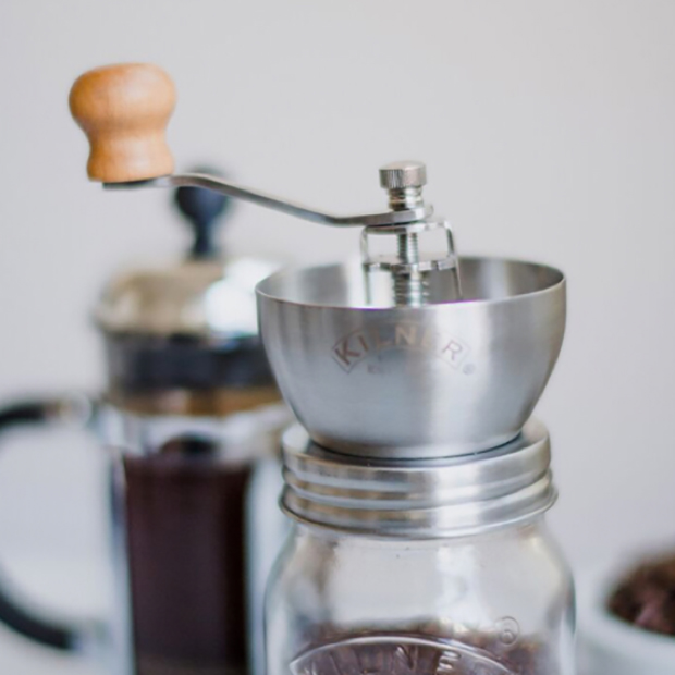
Images, product photos, illustrations and videos are used strategically to enhance content visually. In image galleries or video sliders, they serve to evoke an emotional response and convey information. Product photographs, for example, can be visually emphasised through the use of shadows. General images, on the other hand, remain shadowless but can be accentuated by decorative elements such as frames – a principle that also applies to illustrations.
Image
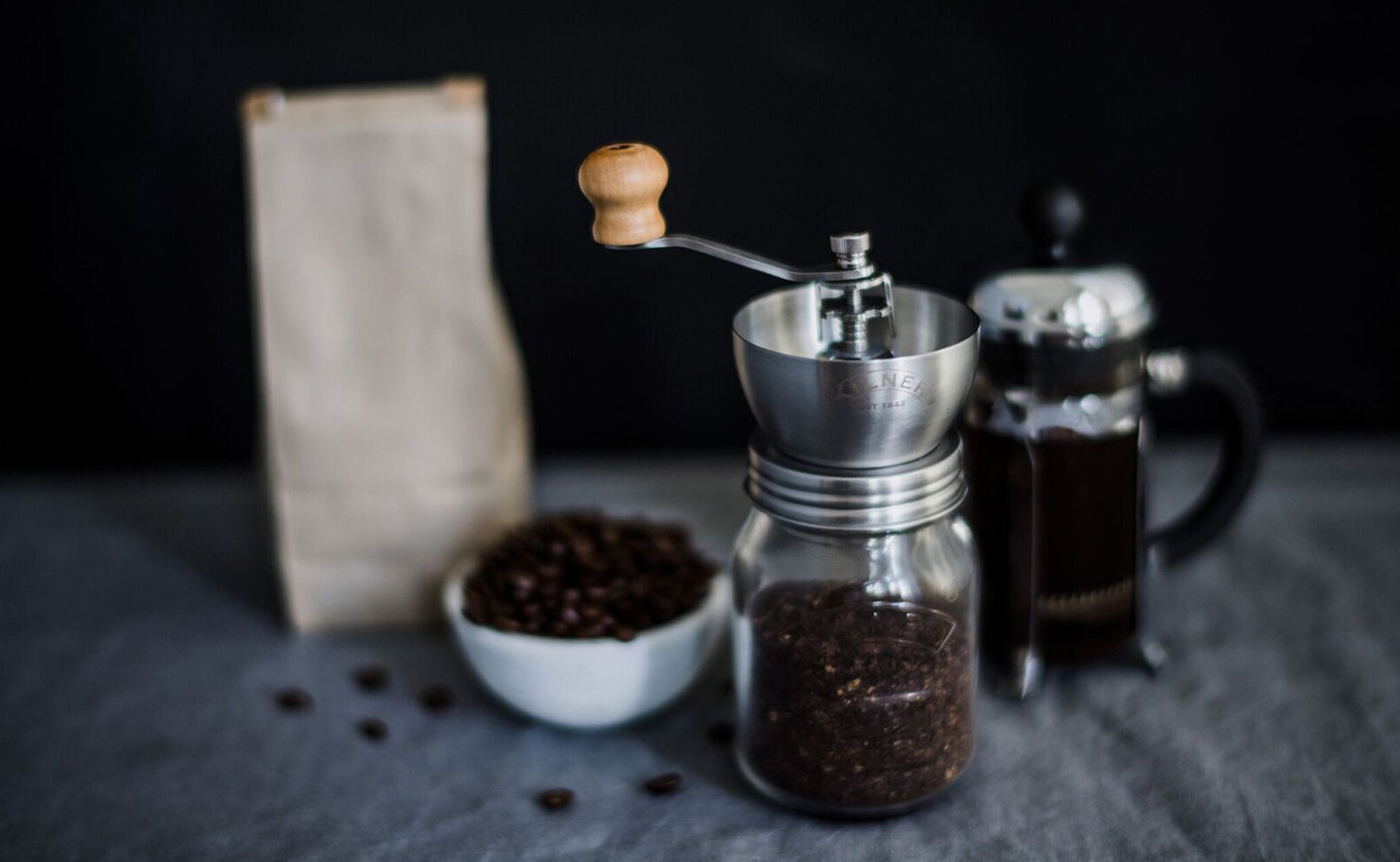
Product
Illustration

Gallery Slider

Gallery Grid
gallery-coffee-image-5
gallery-coffee-image-1
gallery-coffee-image-2-1
coffee-image-9
Video Slider
Video
Icons & Pictograms
Icons aid navigation, simplify use and provide clear guidance – for example, in menus or on social media. Pictograms convey information in a concise way and make content easier to grasp. A consistent style enhances recognition and reinforces the brand’s impact.
Icon
Line Icon
Social media
Pictogram


Buttons & Links
Primary buttons represent key actions, whilst secondary buttons represent supporting actions. Their colour scheme follows a clear hierarchy and ensures clarity and consistency within the interface. Simple Text links (reference links) blend into the body text but are still clearly recognisable. Navigation links that are not designed as buttons use colour, position and typography to be perceived as clickable elements, without taking on the visual prominence of a button.
Primary Button
Secondary Button
Link (navigation)
Link (Reference)
Lorem ipsum dolor sit amet, consetetur sadipscing elitr, sed diam nonumy eirmod tempor invidunt ut labore et dolore magna aliquyam erat, sed diam voluptua. At vero eos et Hyperlink And just two pains and that matter. Stet clita kasd gubergren, no sea takimata sanctus est Lorem ipsum dolor sit amet.
Accordions/Toggles/Tabs
Tabs organise content into clear sections, ideal when users need to switch between topics quickly. Toggles are simple switches that allow individual pieces of information to be shown or hidden as required. Accordions group together several expandable sections, perfect for long lists or FAQs. In short: tabs help with parallel content, whilst toggles and accordions create space and clarity when dealing with lots of details.
Tabs/Tabs
Your content goes here. Edit or remove this text inline or in the module Content settings. You can also style every aspect of this content in the module Design settings and even apply custom CSS to this text in the module Advanced settings.
Your content goes here. Edit or remove this text inline or in the module Content settings. You can also style every aspect of this content in the module Design settings and even apply custom CSS to this text in the module Advanced settings.
Accordion
Your title
Your content goes here. Edit or remove this text inline or in the module Content settings. You can also style every aspect of this content in the module Design settings and even apply custom CSS to this text in the module Advanced settings.
Your title
Your content goes here. Edit or remove this text inline or in the module Content settings. You can also style every aspect of this content in the module Design settings and even apply custom CSS to this text in the module Advanced settings.
Toggle switch
Your title
Your content goes here. Edit or remove this text inline or in the module Content settings. You can also style every aspect of this content in the module Design settings and even apply custom CSS to this text in the module Advanced settings.
Forms
Forms are the direct link to the user for collecting data or triggering actions. A clear, intuitive design ensures high conversion rates and prevents users from abandoning the process. The search function is also a form – the more precise and clearly structured it is, the better the user experience. It is important that forms and search functions are designed consistently and uniformly to avoid confusion and improve usability.
Search
Contact
Email opt-in/Email opt-in
Comments
Diagrams & Tables
Charts visualise figures and trends at a glance and make complex information easy to grasp. They are particularly well suited to clearly illustrating comparisons or trends. Tables organise data in a clear and detailed manner, making them ideal for precise information that users wish to search through or compare in a targeted manner. Both elements should be designed in a clear and consistent manner to ensure readability and user-friendliness.
Pricing Tables
Bar counter
- Your title50%
Counter
Your title
Circuit counter
%
Your title
Countdown timer/Countdown timer
Your title
Day(s)
:
Hour(s)
:
Minute(s)
:
Second(s)
Divider
Testimonials & People
People modules introduce team members, authors or points of contact. They make brands more tangible and strengthen personal connections. A clear, consistent design conveys professionalism and ensures brand recognition. Testimonials showcase genuine feedback from satisfied customers. They are a powerful trust-building element in web design and help to demonstrate credibility and social proof.
Testimonial
Lorem ipsum dolor sit amet, consectetuer adipiscing elit. Aenean commodo ligula eget dolor. Aenean massa. Cum sociis natoque penatibus et magnis dis parturient montes, nascetur ridiculus mus. Donec quam felis, ultricies nec, pellentesque eu, pretium quis, sem. Nulla consequat massa quis enim. Donec pede justo, fringilla vel, aliquet nec, vulputate eget, arcu.
Person
John Doe
Job title
Lorem ipsum dolor sit amet, consetetur sadipscing elitr, sed diam nonumy eirmod tempor invidunt ut labore et dolore magna aliquyam erat, sed diam voluptua. At vero eos et accusam et justo duo dolores et ea rebum. Stet clita kasd gubergren, no sea takimata sanctus est Lorem ipsum dolor sit amet.
Sliders
Sliders are ideal for displaying multiple pieces of visual content in a space-saving and appealing way. Sliders are well suited to eye-catching highlights, e.g. on homepages or for campaigns. They create a sense of dynamism, but must be easy to use and not overloaded with content.
Slider
Post Slider
 German
  English
0 Comments