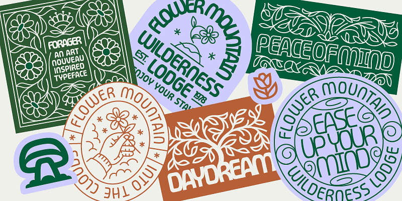

Art deco, but contemporary please
Art deco is one of those things. It's easy to slip into gold frames, Gatsby kitsch and overambitious nostalgia. Pilardoes it differently. The scripture takes the Formal rigour and geometry of European Art Deco, but leaves out everything superfluous.
Pilar was originally created in 2012 for the headlines of the magazine Bol'shoy Gorod (Big City). No coincidence. Editorial environments are mercilessly honest. Either a typeface carries – content or it fails. Pilar has passed and has been further developed.
The result is a geometric grotesque, that appears stable, but not rigid. Clearly constructed, but not cold. Ideal for brands that Attitude, intellect and aesthetics want to connect. Especially in the Branding, in Editorial Designs or on Websites, that want to say more than „we're here too“.
This is exciting for sustainable and value-orientated brands. Pilar doesn't shout. It stands. And that is often the louder statement.
Four stylistic movements – one system, many voices
Now it's getting typographically nerdy. And that's a good thing.
Pilar has four stylistic movements, each with its own alphanumeric glyphs. This means that each letter exists in several variants. These are not gimmicks, but real design options.
The four sets are called:
-
Regularly open
-
Wide closed
-
Narrow
-
Game
The highlight: you can vary within a word or sentence without breaking the visual system. Headlines become dynamic. Logos look customised. Campaigns remain consistent, but not monotonous.
Especially in the Brand design this is worth its weight in gold. A font that adapts without losing its identity saves time, discussions – and ultimately resources. Sustainability sometimes simply starts with good decisions.
For us as a branding agency, this means fewer compromises between aesthetics and function. More room for manoeuvre for real concepts.
Who is behind it?
Behind Pilar stands CSTM Fonts, founded in 2014 by Ilya Ruderman and Yury Ostromentsky. Both do not come from the „we also make fonts“ corner, but from a deep typographic practice.
Both have participated in the Moscow State University of Print studied graphic design. Ilya Ruderman later completed the renowned Master Type & Media at the Royal Academy of Art in The Hague. He has been a tutor, art director and type designer for international foundries and has worked on Neutraface, Graphic and Lava collaborated.
Yury Ostromentsky was for a long time Art Director of BigCity Magazine. Pilar is based on his personal typeface, which was used there. So: real application, real requirements, real feedback.
Her work has received several awards, including Granshan, Modern Cyrillic and the European Design Award. In short: this is not a trend font. This is substance.
Why we love Pilar
Because Pilar shows attitude, without being loud.
Because they Complex brand appearances instead of dominating them.
And because it proves that good typography doesn't need to be explained – it simply works.
For Sustainable, ethical and vegan businesses Pilar is particularly exciting. She comes across as reflective, mature and clear. No gimmickry. No eco-clichés. But design with ambition.
Exactly our thing.