
Forager: When typography starts to breathe
Forager is one of those typefaces where you immediately realise that nobody wanted to design „just another sans serif“.
This was about attitude. About rhythm. About visual friction.
The font unites three very different worlds:
-
the psychedelic opulence of the 70s,
-
the organic lines of Art Nouveau,
-
and the Reduction of modern grotesque fonts (sans serif fonts without small closing strokes).
That sounds like chaos. But it's not.
Forager balances these influences with surprising precision.
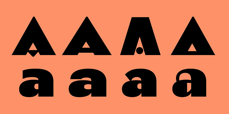
Overlapping as a design principle
The centrepiece of Forager is its Overlap. Letters share space, intersect, interlock. Normally a nightmare for legibility. Not here.
The trick lies in the design:
curved verticals meet Flat horizontal lines. This creates a rounded, slightly angular design language that makes overlapping clearly recognisable. The eye can separate the letters even though they are touching. Typographically clever. Almost cheeky.
The font family includes Five line widths, each in:
-
overlapping variants for maximum effect
-
and closely running versions for more controlled layouts
This makes Forager amazingly versatile – from bold branding and editorial headlines to experimental social media visuals.
Who is behind it?
Forager was designed by Jacob Cummings, published via Overlap Type – is still a young, but all the more exciting typo label under the direction of Kel Troughton.
Overlap Type started in 2023 with a radical rule: Only fonts with overlapping letterforms.
What began as a self-imposed restriction quickly became a creative playing field. Today, Overlap Type goes beyond pure overlap, but remains true to its mission: question conventional rules in font design.
And that's exactly what you can feel in Forager.
This writing does not aim to please. It wants to work.
Why we love Forager
Forager is the perfect fit for brands that don't want to be slick. For sustainable businesses, cultural projects, vegan labels or magazines with high standards.
She says:
We think differently.
We dare to do something.
And we mean it.
Typography is communication.
However, according to –, Forager does not speak arbitrarily.
Additional licence options –, for example for apps or enterprise use –, can be found on www.overlaptype.com.